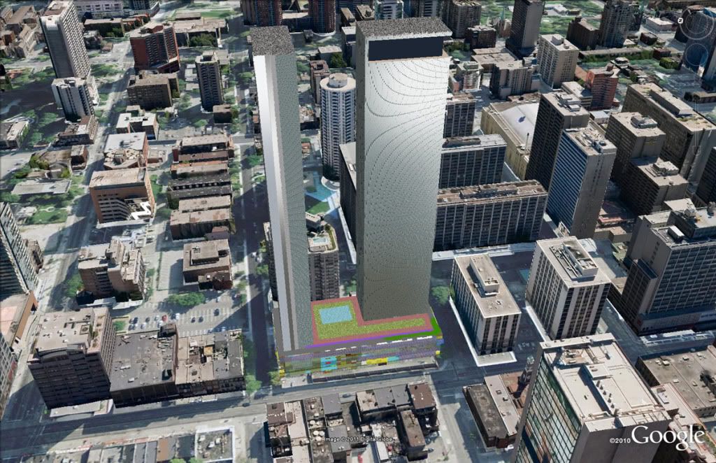
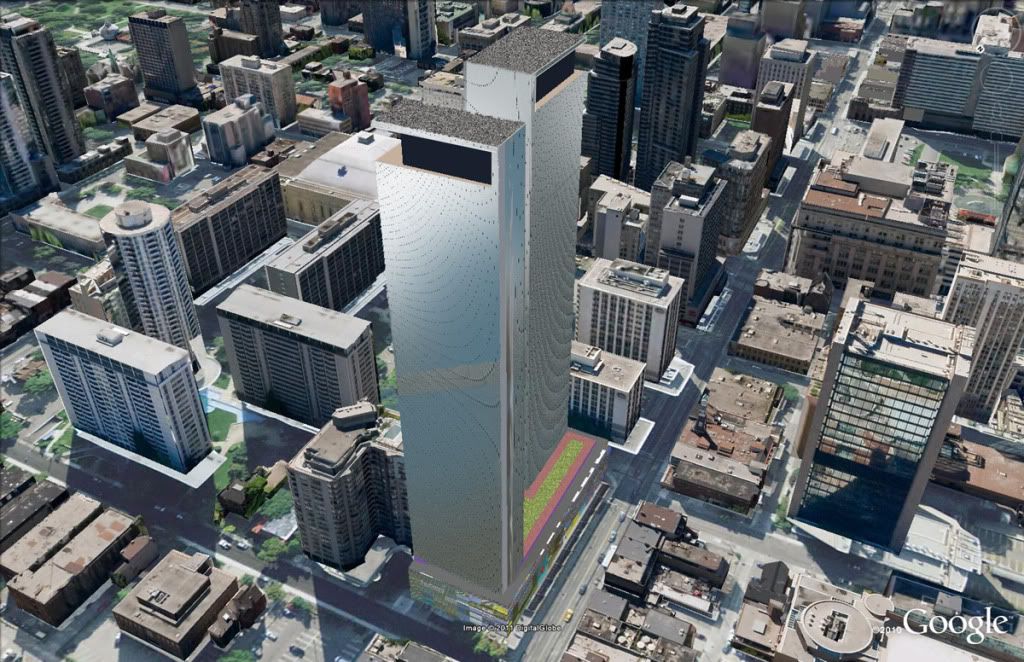
SP!RE
°°°°°°
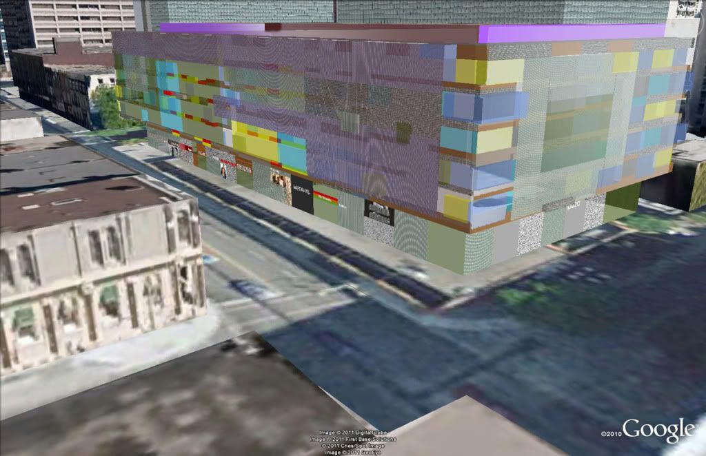
Or they could animate the street/ surrounding area by building units around the parking levels as per Market Wharf. I'll take that option 10x before anything shown above.
Or they could animate the street/ surrounding area by building units around the parking levels as per Market Wharf. I'll take that option 10x before anything shown above.
Or they could animate the street/ surrounding area by building units around the parking levels as per Market Wharf. I'll take that option 10x before anything shown above.
I just hope that the weight of that MASSIVE structure doesn't buckle and cave in on top of the subway line. YIKES !!!
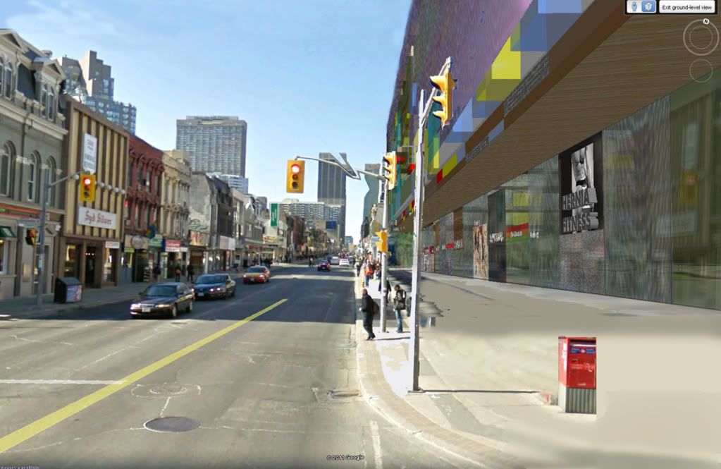
Nice renders CN. 2 round towers with parking at the base sounds to me like Marina City in Chicago. Could we perhaps see a 2011 Toronto version of these iconic towers???
")
...Why not round, a nod to Vaseline Tower further along Alexander Street? How about buildings that are even more slender? How about balconies with an external pattern that spirals its way up?
.