You are using an out of date browser. It may not display this or other websites correctly.
You should upgrade or use an alternative browser.
You should upgrade or use an alternative browser.
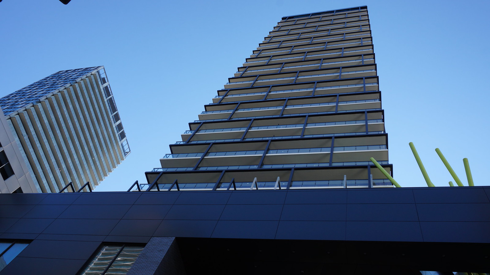
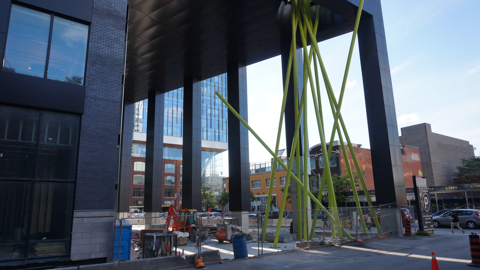
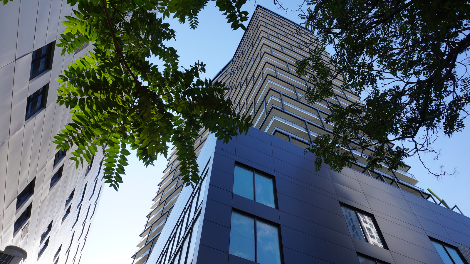
Toronto Tableau Condominiums | 124.05m | 36s | Urban Capital | Wallman Architects
- Thread starter voxpopulicosmicum
- Start date
achender
Active Member
Taken 21 August 2016.
Ah, no wonder nothing seemed to be happening later in the week. Looks like they had to close the whole street?
Miscreant
Senior Member
Member Bio
- Joined
- Oct 9, 2011
- Messages
- 3,616
- Reaction score
- 1,795
- Location
- Where it's urban. And dense.
Yeah, that's a really nice addition.
Gphorce
Active Member
Simply gorgeous, and wow that was fast!
UrbanAffair
Senior Member
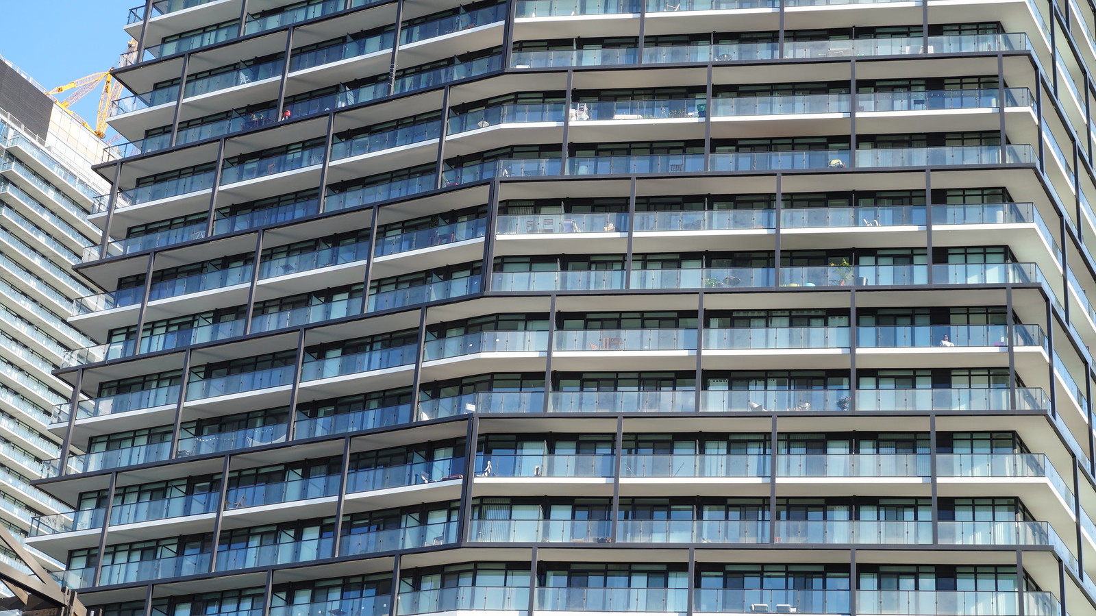
The entire development looks true to (render) form. Great work here.
skycandy
Senior Member
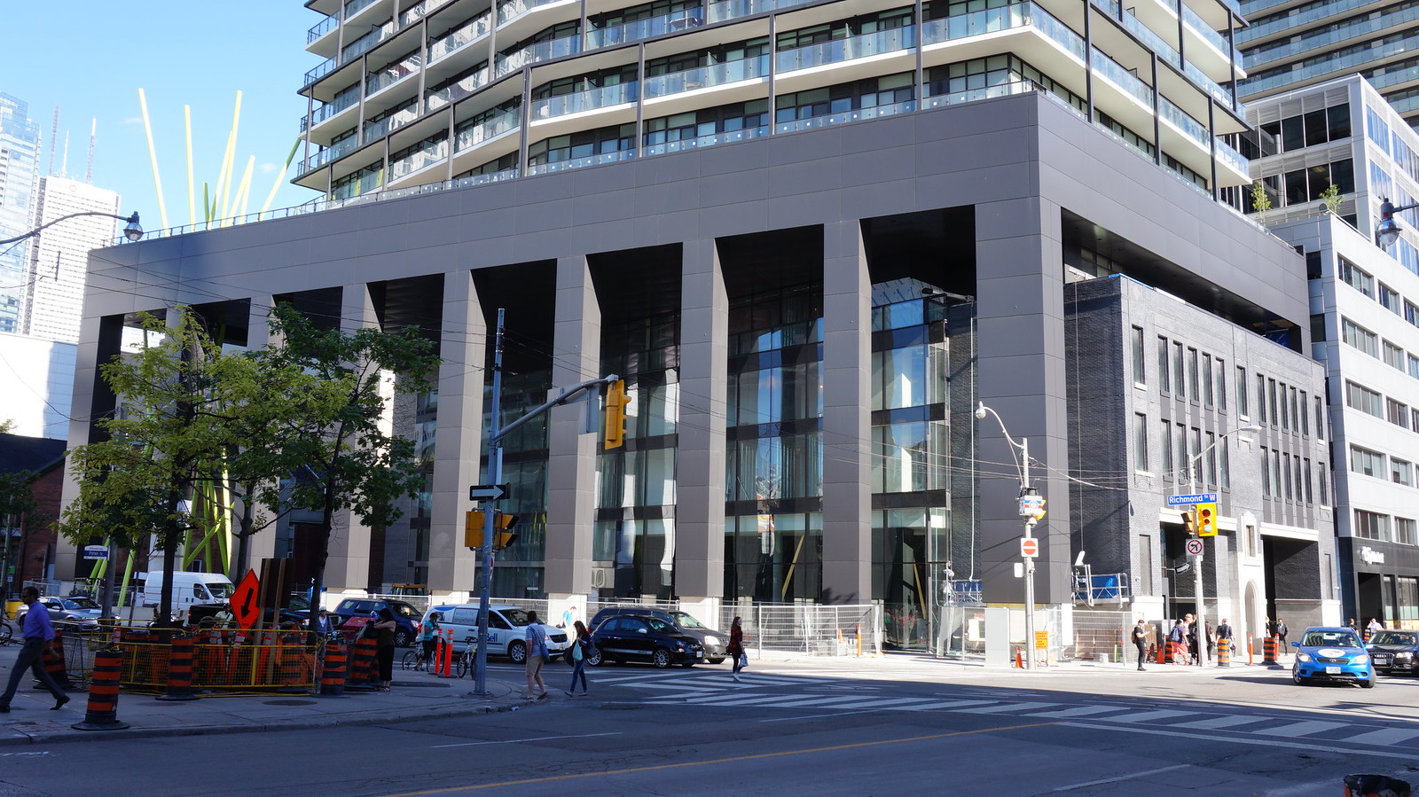
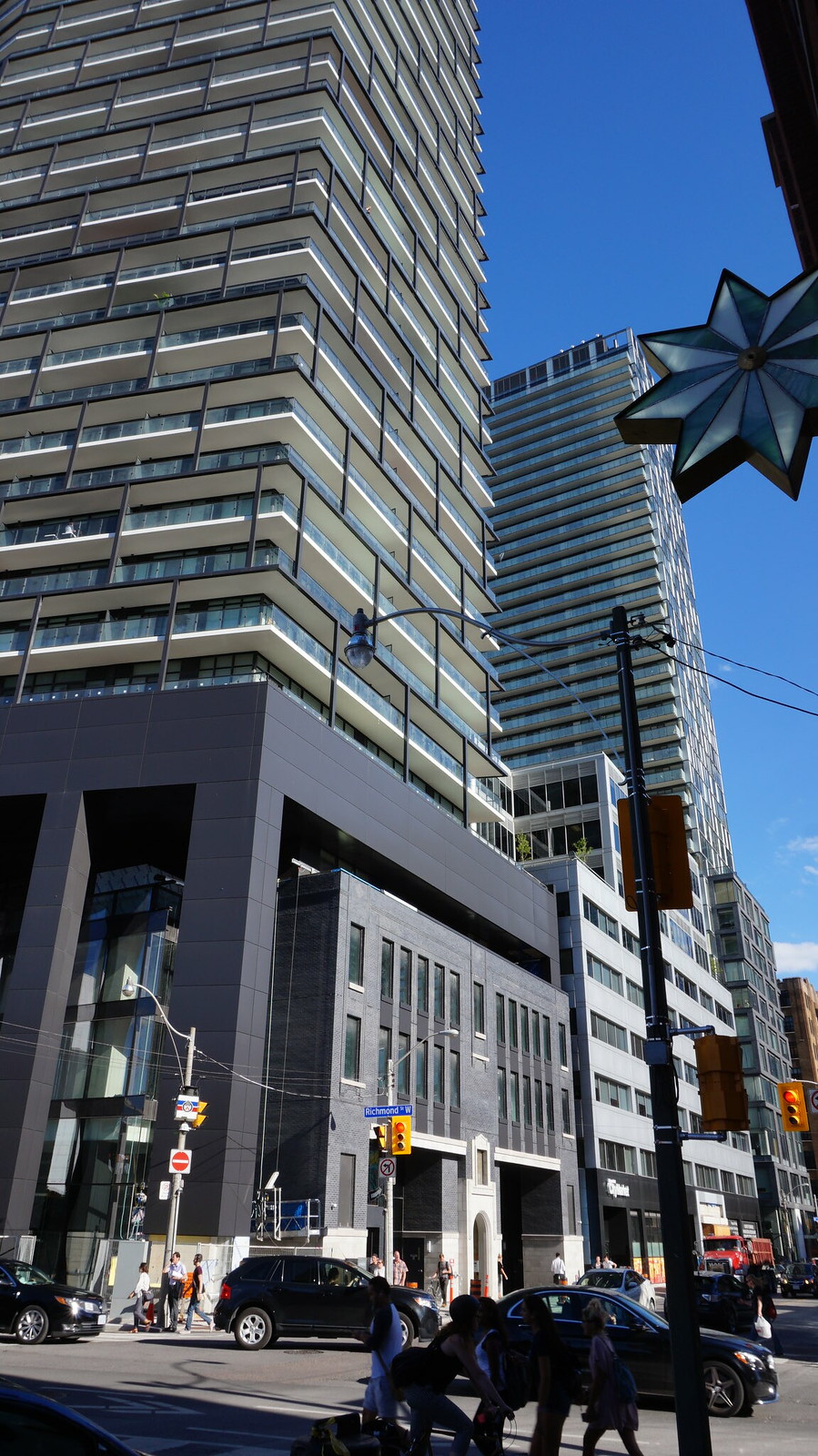
Taken this afternoon...the whole project indeed looks terrific.


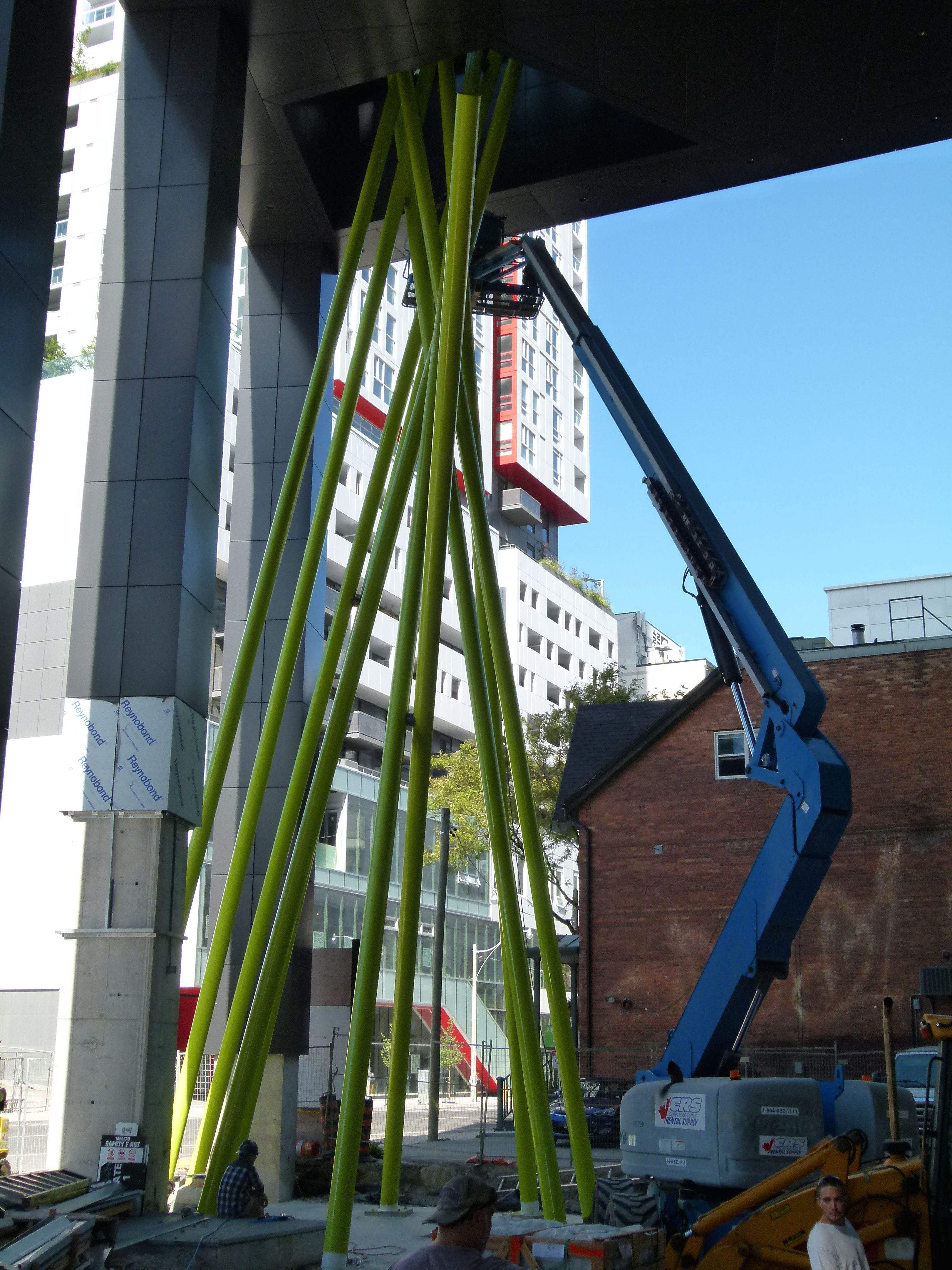
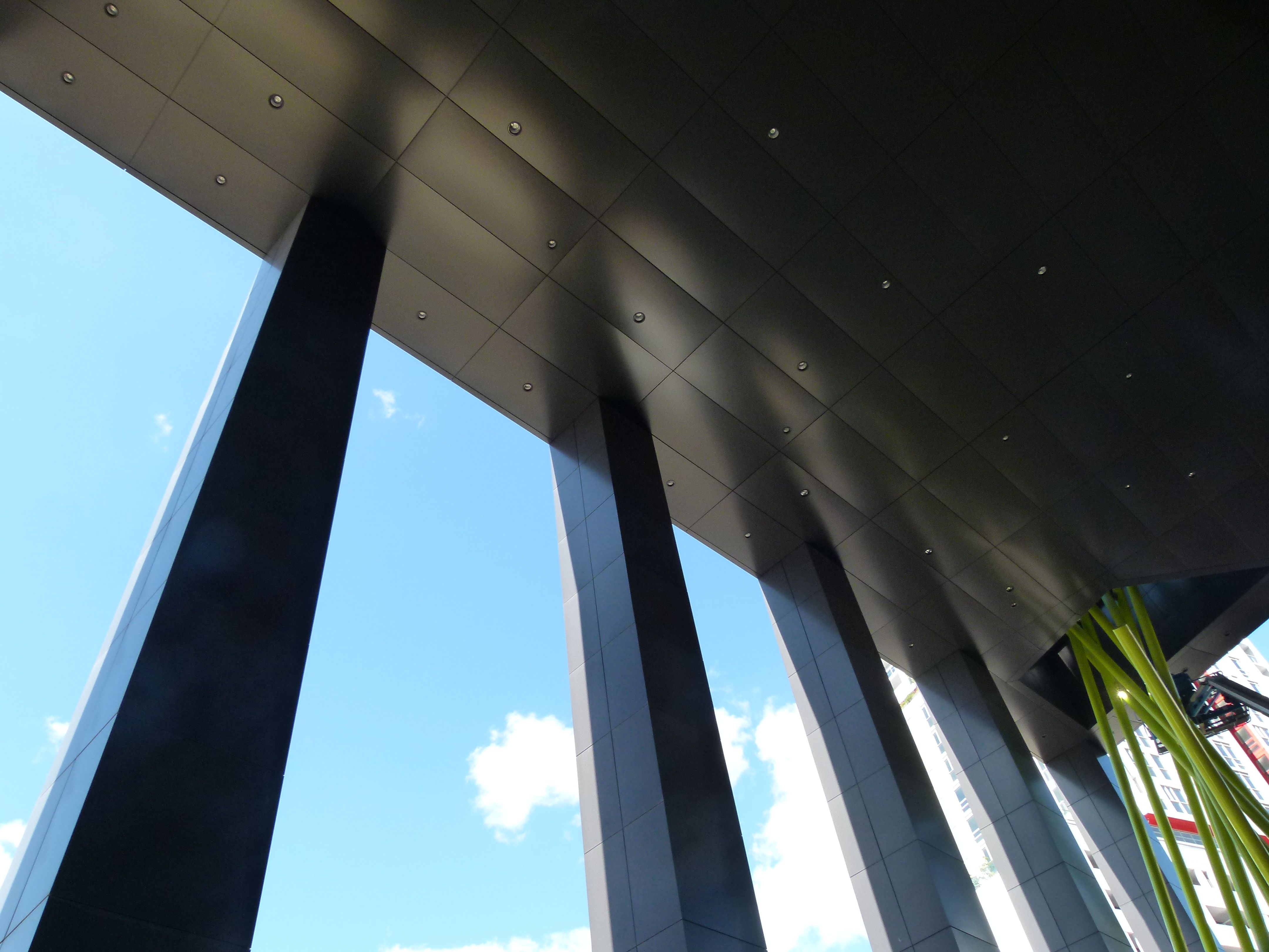
The lobby...
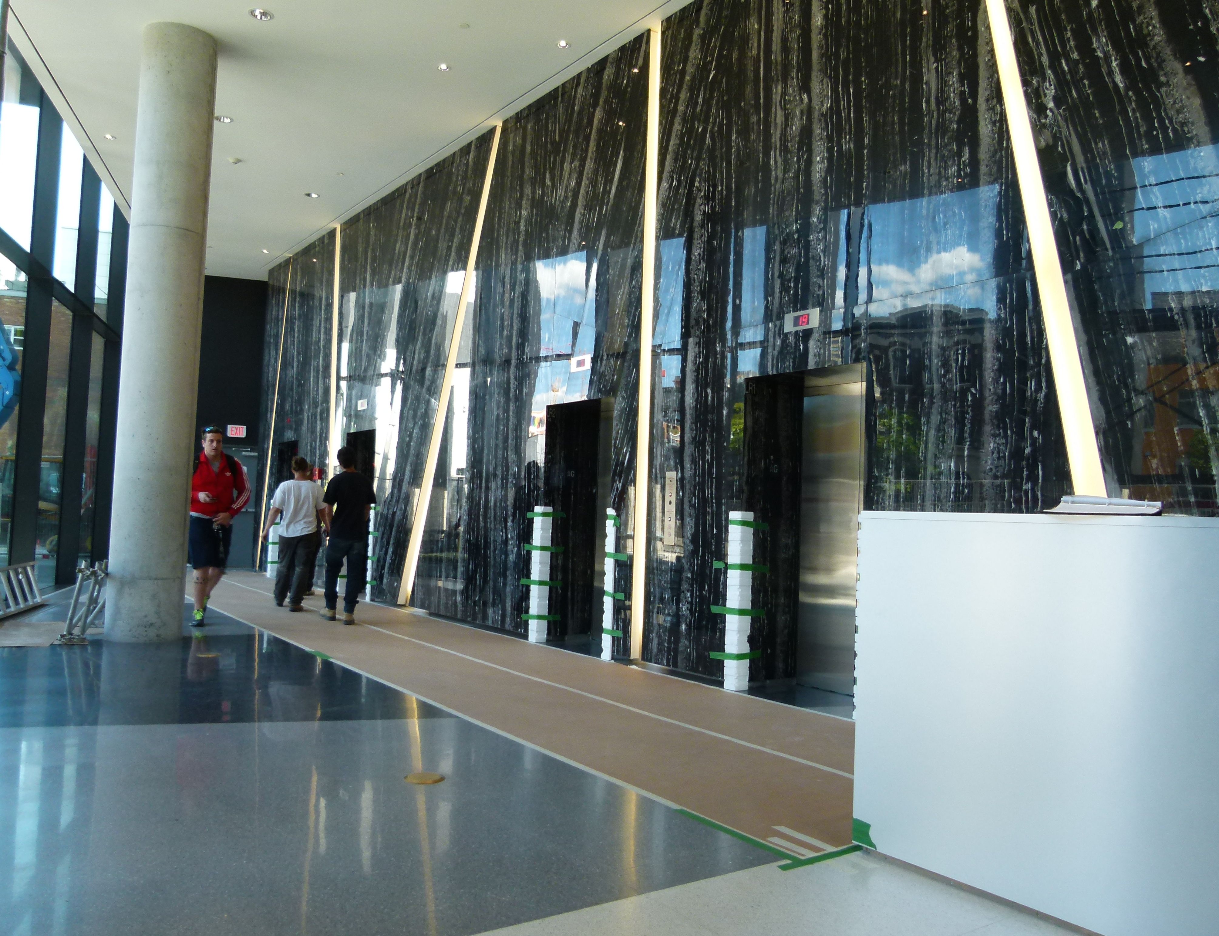
Cool bars of white light, perhaps emulating the green bars outside...
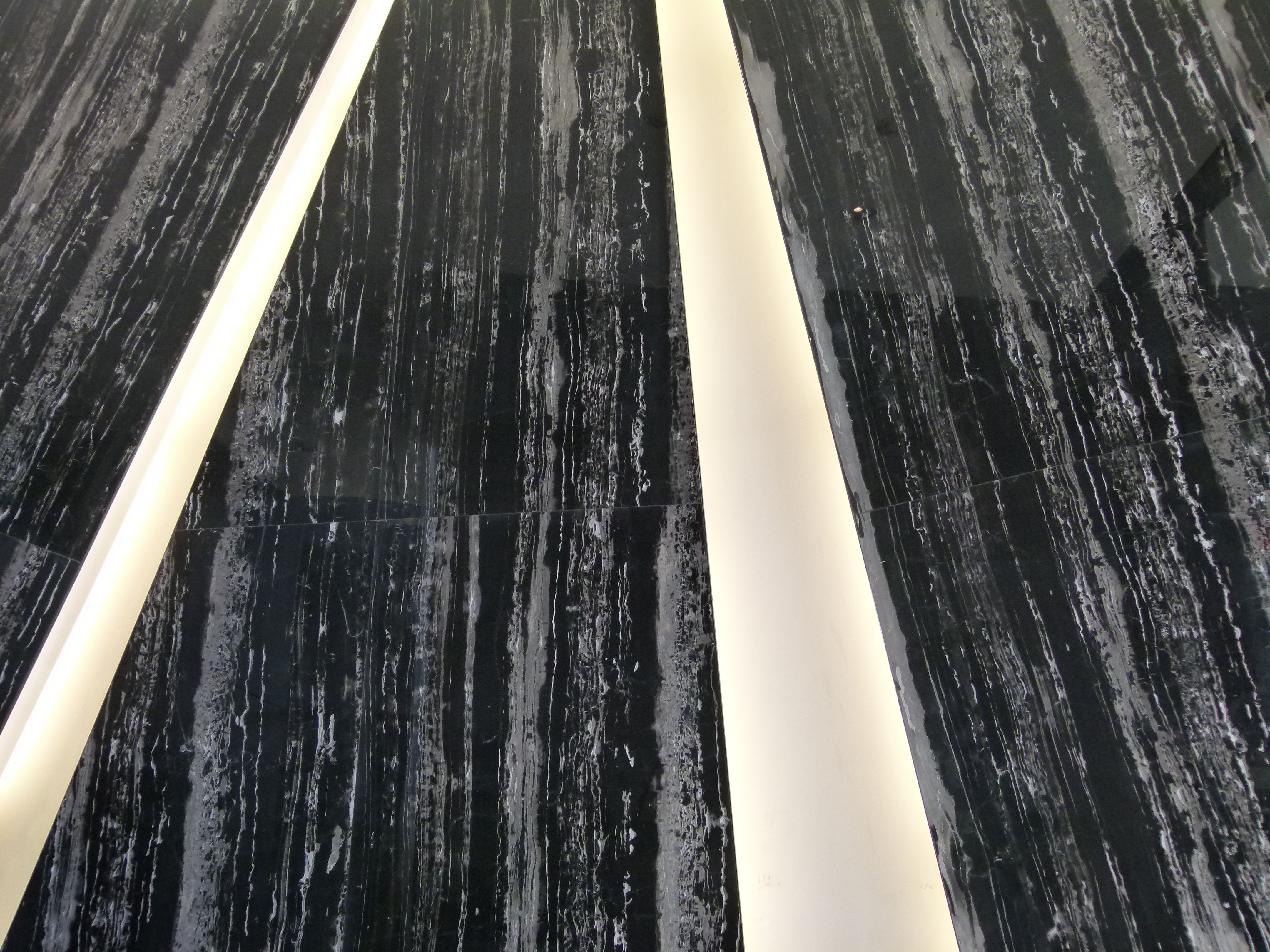

The lobby...
Cool bars of white light, perhaps emulating the green bars outside...
Attachments
-
 Tableau1.jpg1.2 MB · Views: 2,064
 -
 Tableau2.jpg1.5 MB · Views: 2,052
 -
 Tableau3.jpg1.4 MB · Views: 2,027
 -
 Tableau4.jpg1.7 MB · Views: 2,049
 -
 Tableau5.jpg1.5 MB · Views: 2,026
 -
 Tableau6.jpg1.1 MB · Views: 1,993
 -
 Tableau7.jpg1.3 MB · Views: 2,042
 -
 Tableau8.jpg2 MB · Views: 2,025
 -
 Tableau9.jpg1.7 MB · Views: 2,031
Last edited:
Benito
Senior Member
Thanks for the updates, this project looks incredible both inside and out.
stjames2queenwest
Senior Member
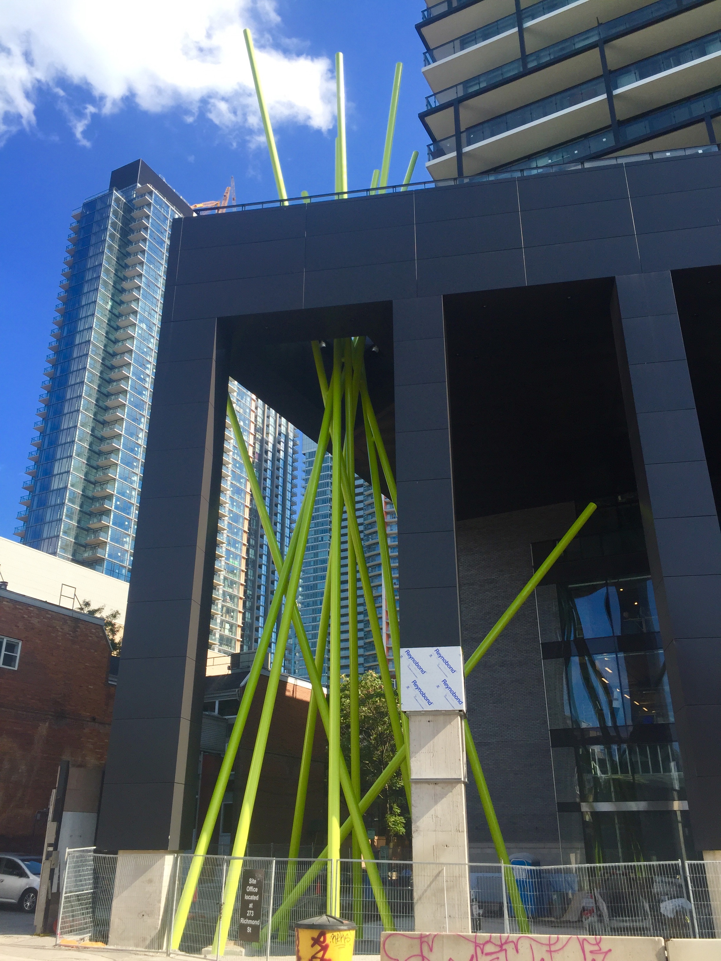
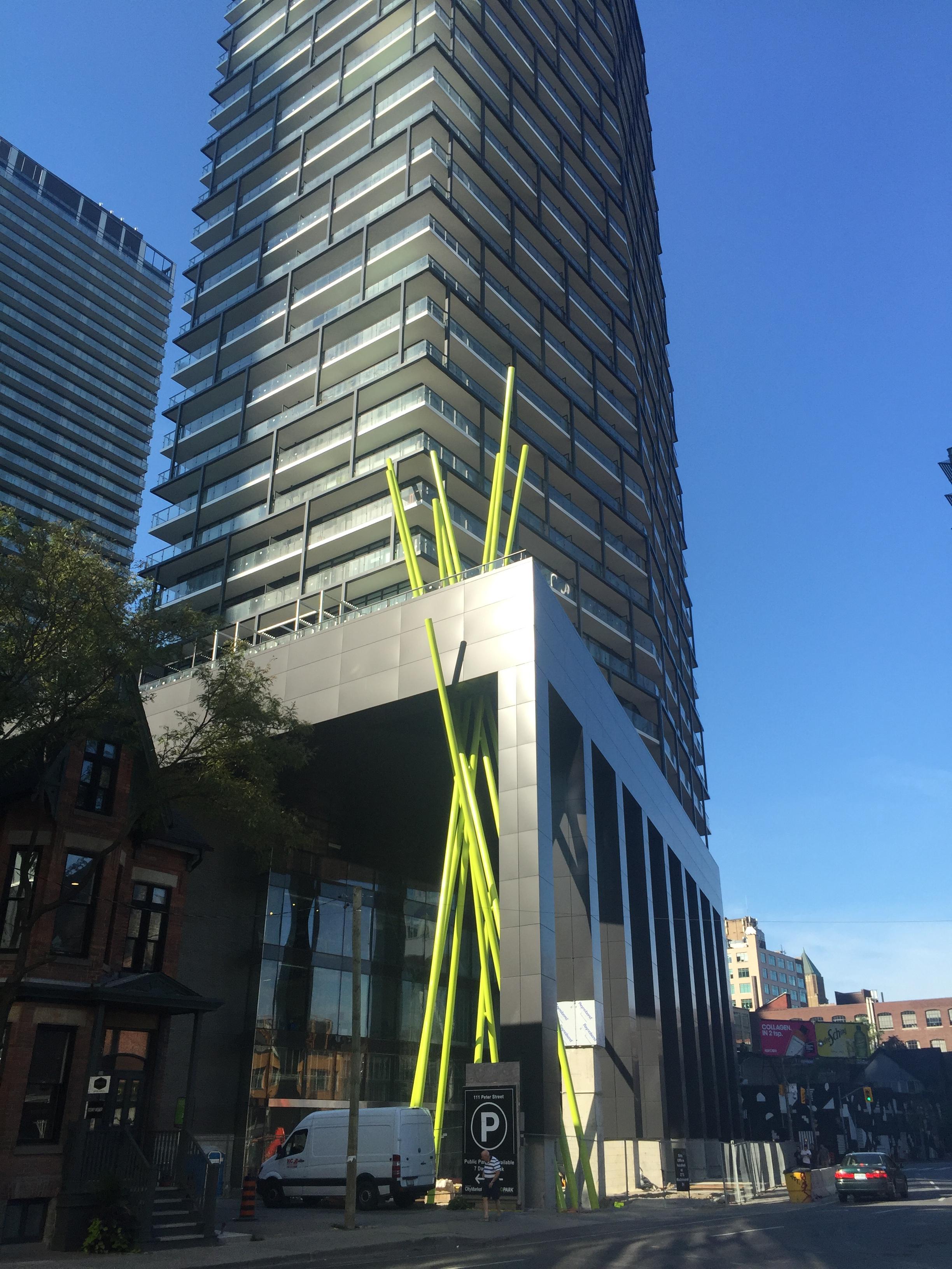
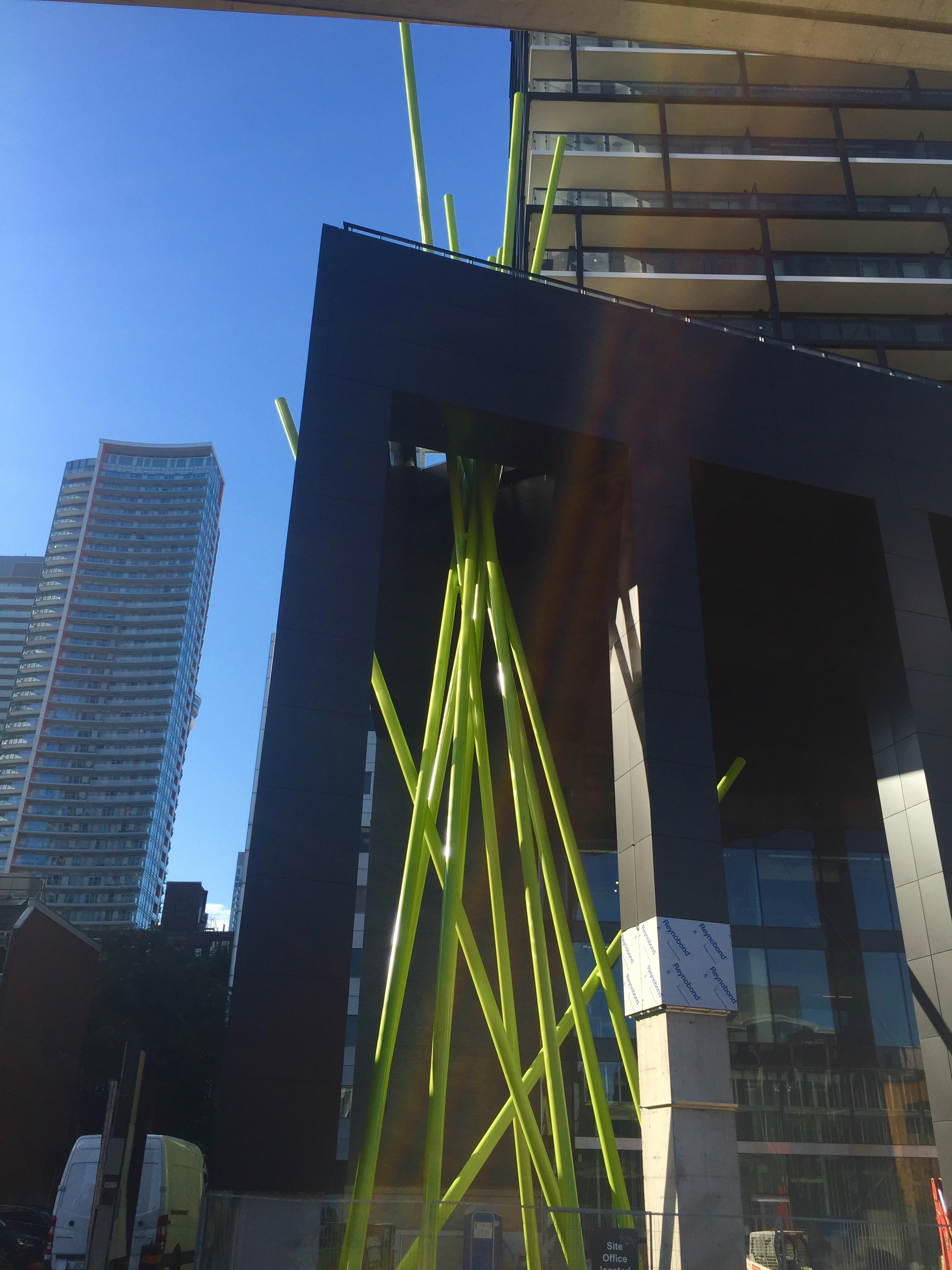
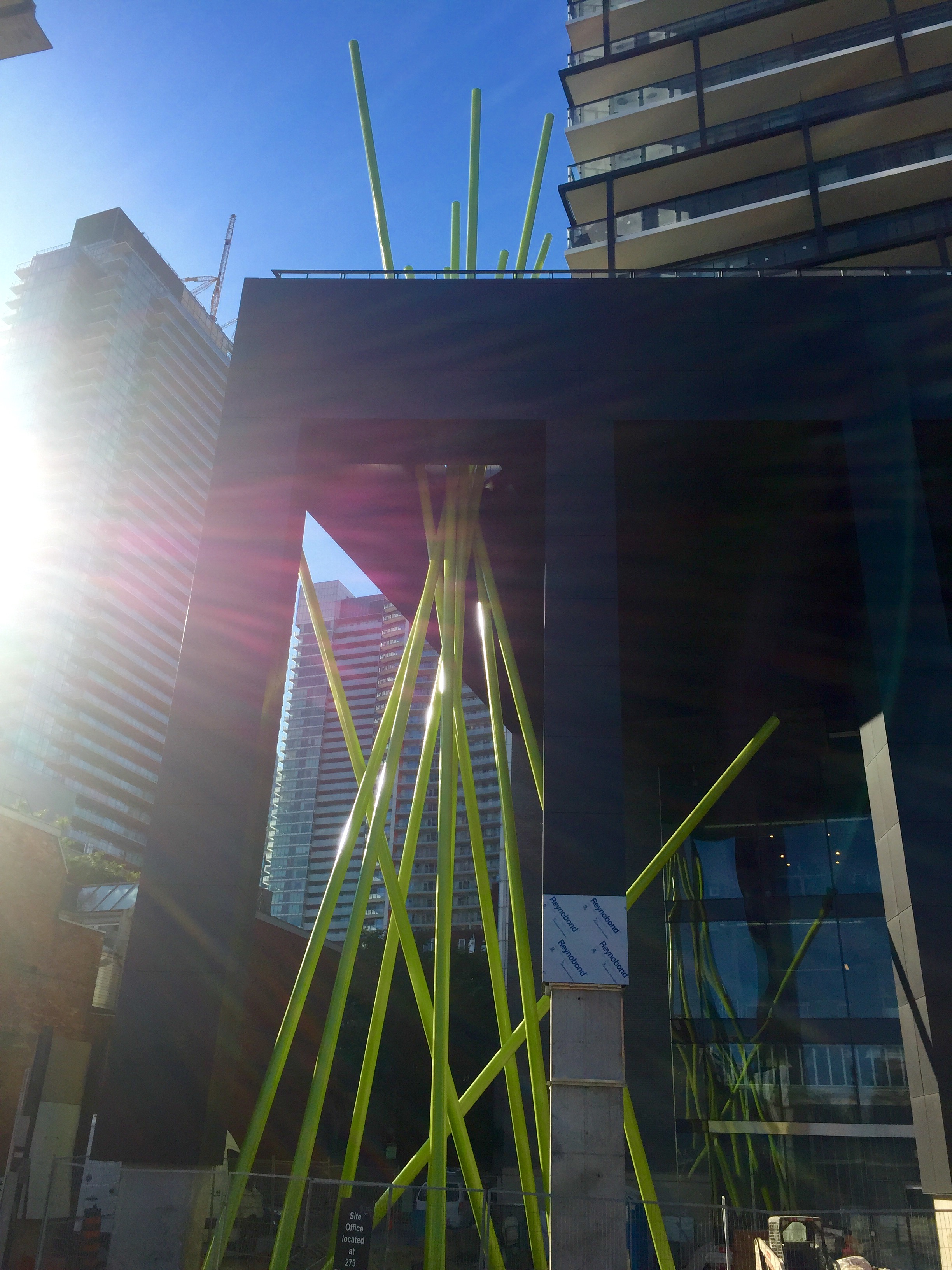
From yesterday and this morning

TheKingEast
Senior Member
Marcanadian
Moderator
Tuesday:
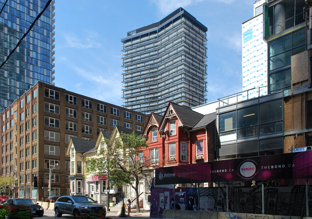 Tableau by Marcus Mitanis, on Flickr
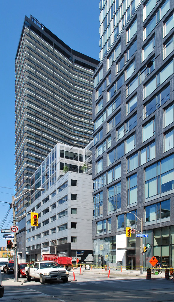 Tableau by Marcus Mitanis, on Flickr
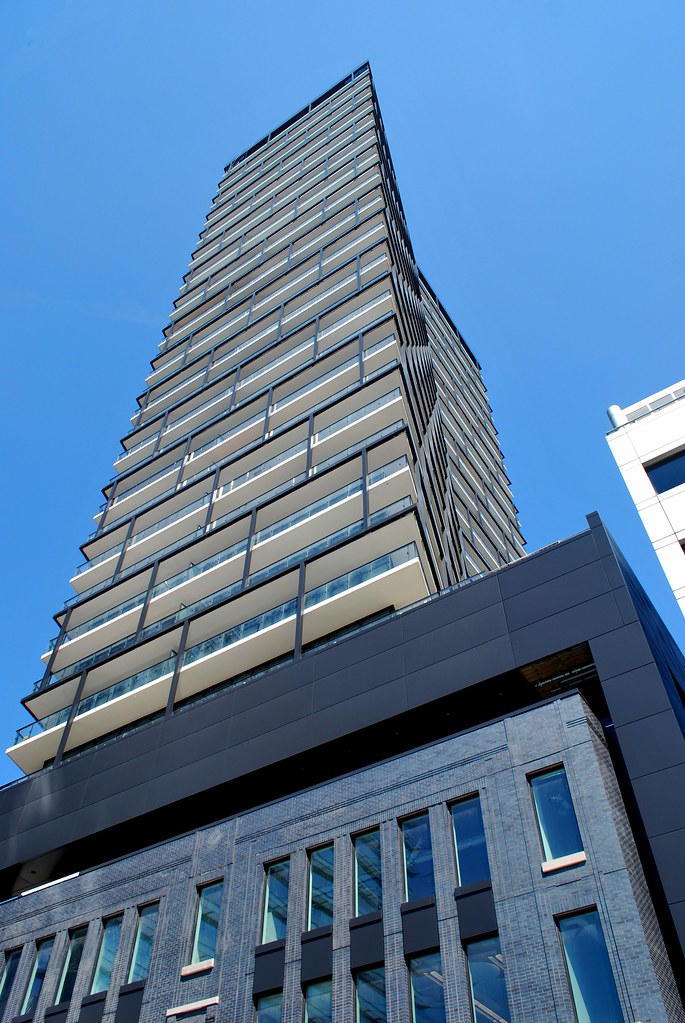 Tableau by Marcus Mitanis, on Flickr
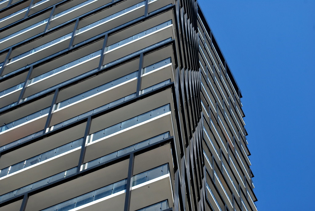 Tableau by Marcus Mitanis, on Flickr
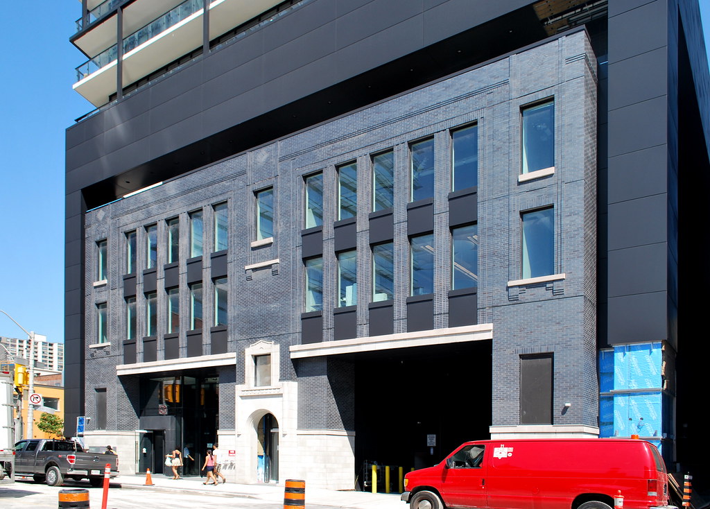 Tableau by Marcus Mitanis, on Flickr
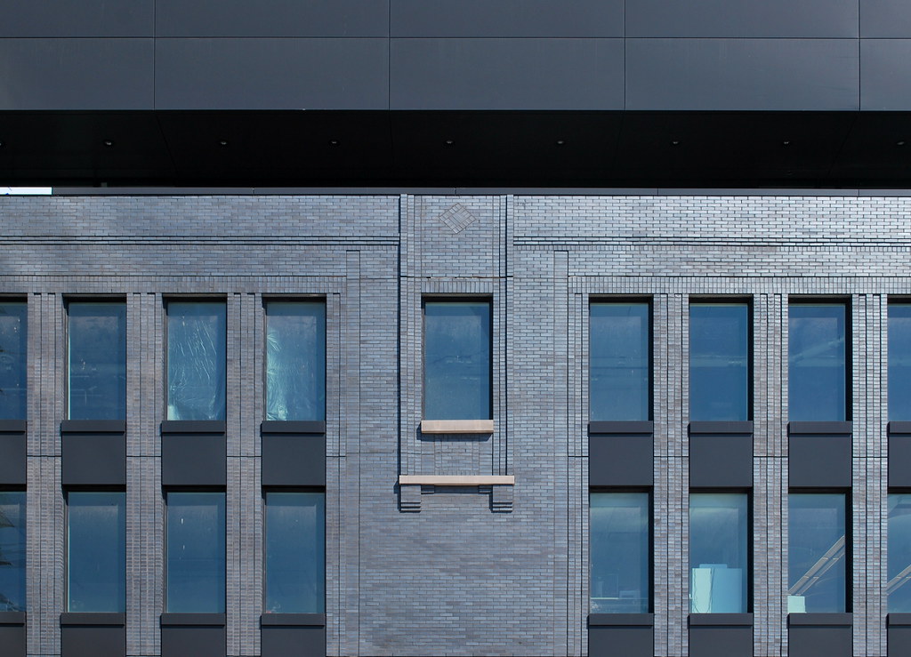 Tableau by Marcus Mitanis, on Flickr
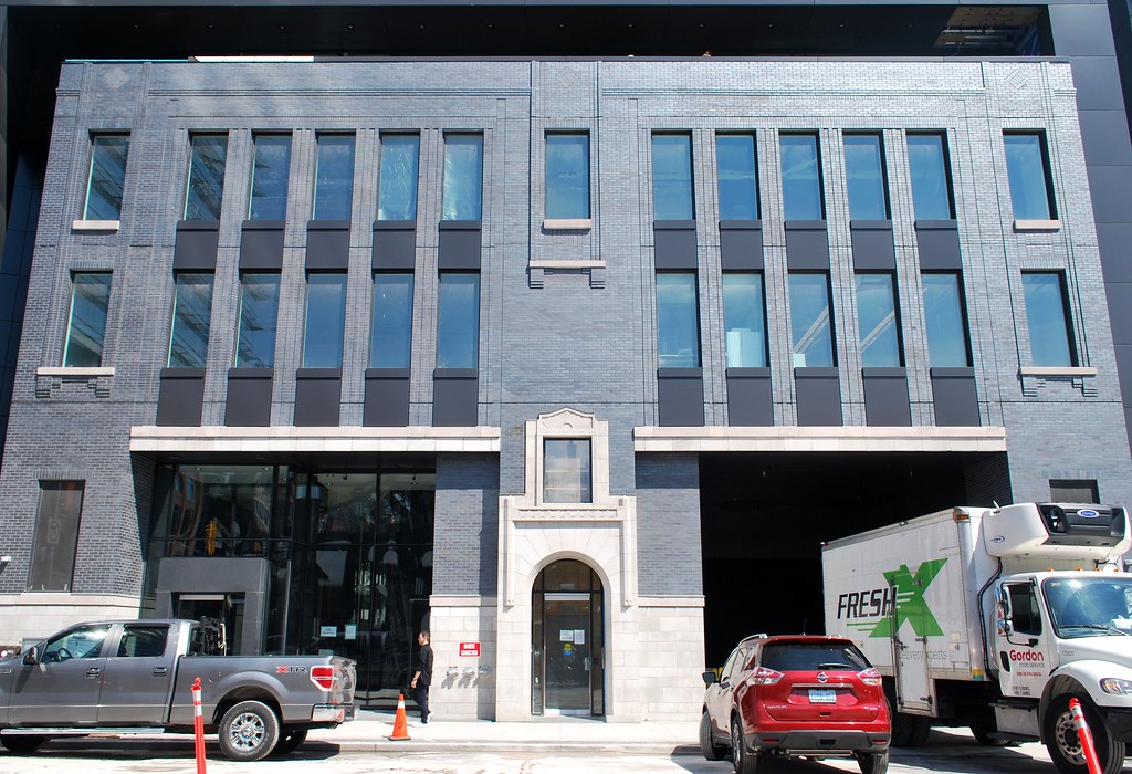 Tableau by Marcus Mitanis, on Flickr
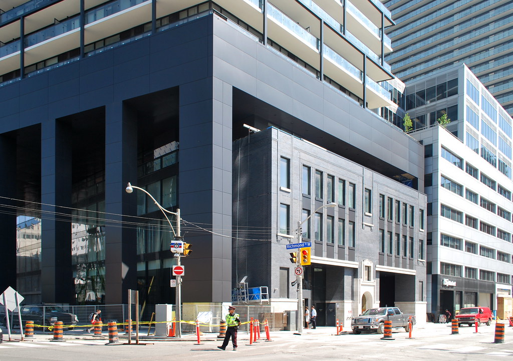 Tableau by Marcus Mitanis, on Flickr
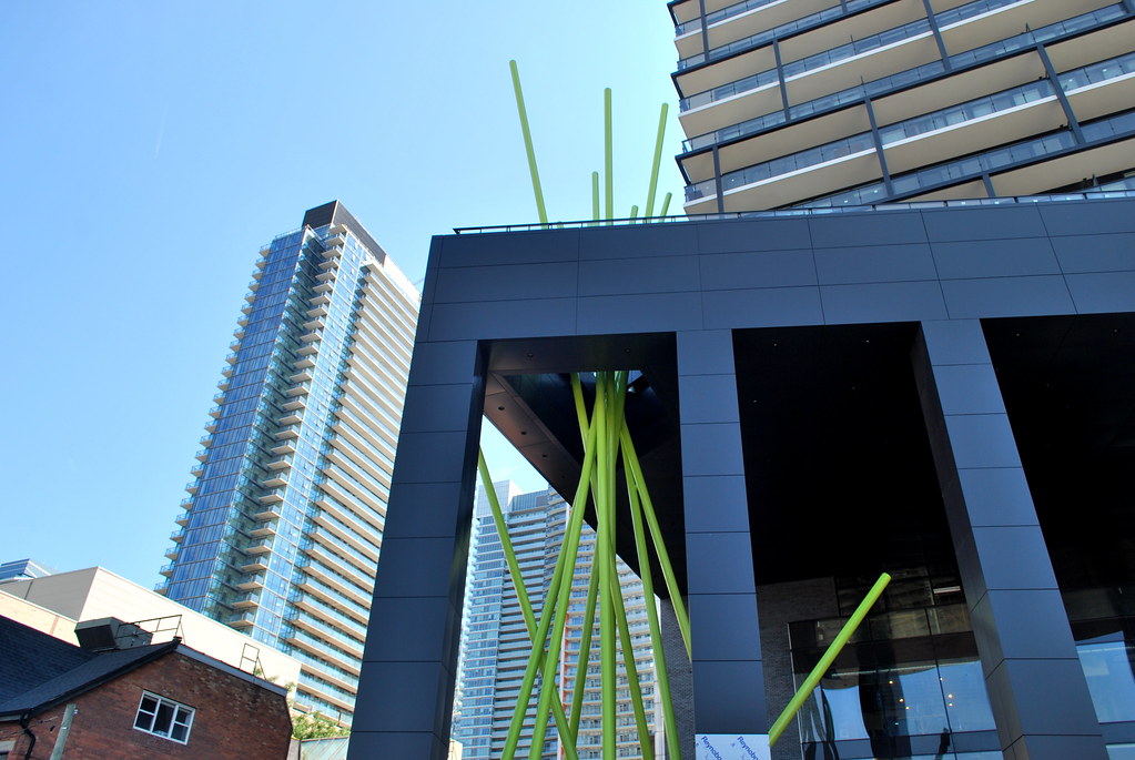 Tableau by Marcus Mitanis, on Flickr
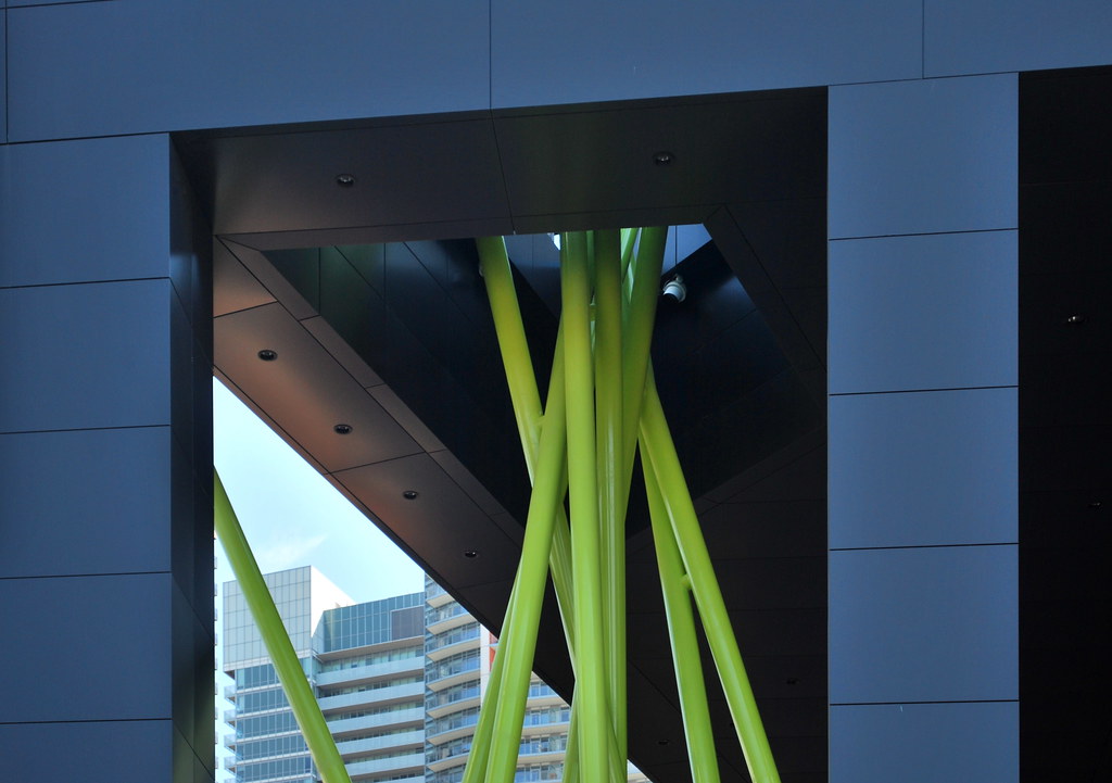 Tableau by Marcus Mitanis, on Flickr
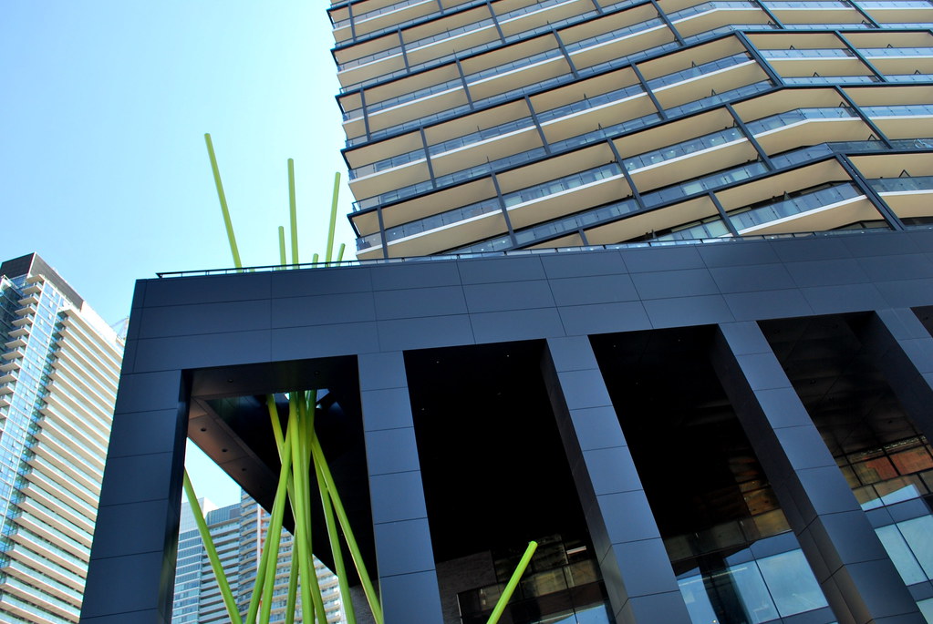 Tableau by Marcus Mitanis, on Flickr
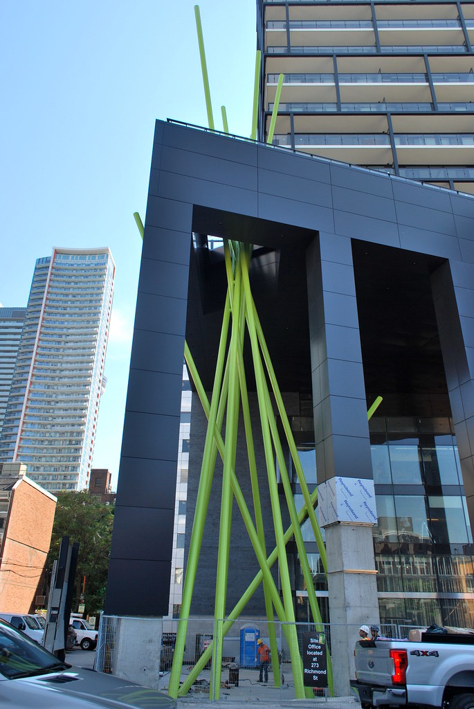 Tableau by Marcus Mitanis, on Flickr
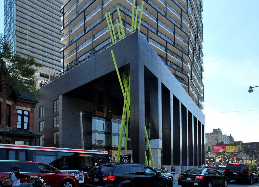 Tableau by Marcus Mitanis, on Flickr
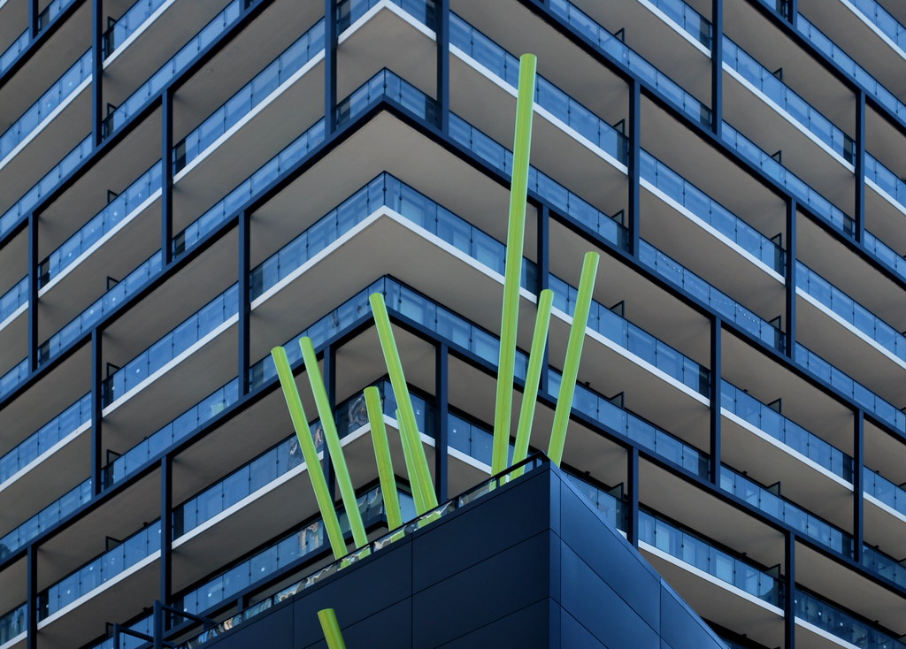 Tableau by Marcus Mitanis, on Flickr
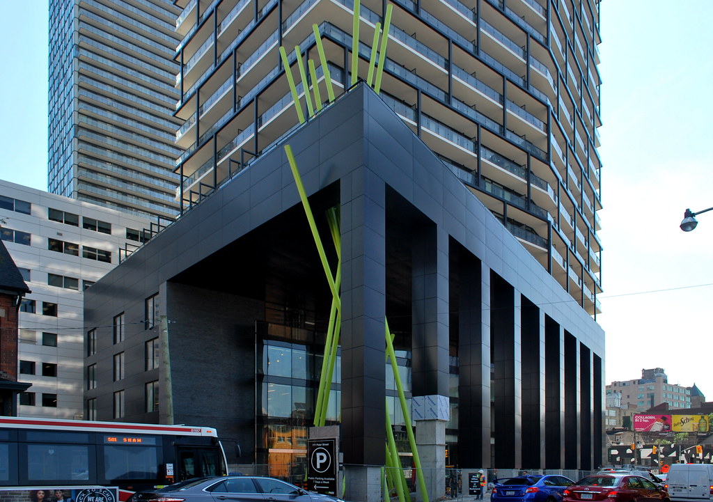 Tableau by Marcus Mitanis, on Flickr
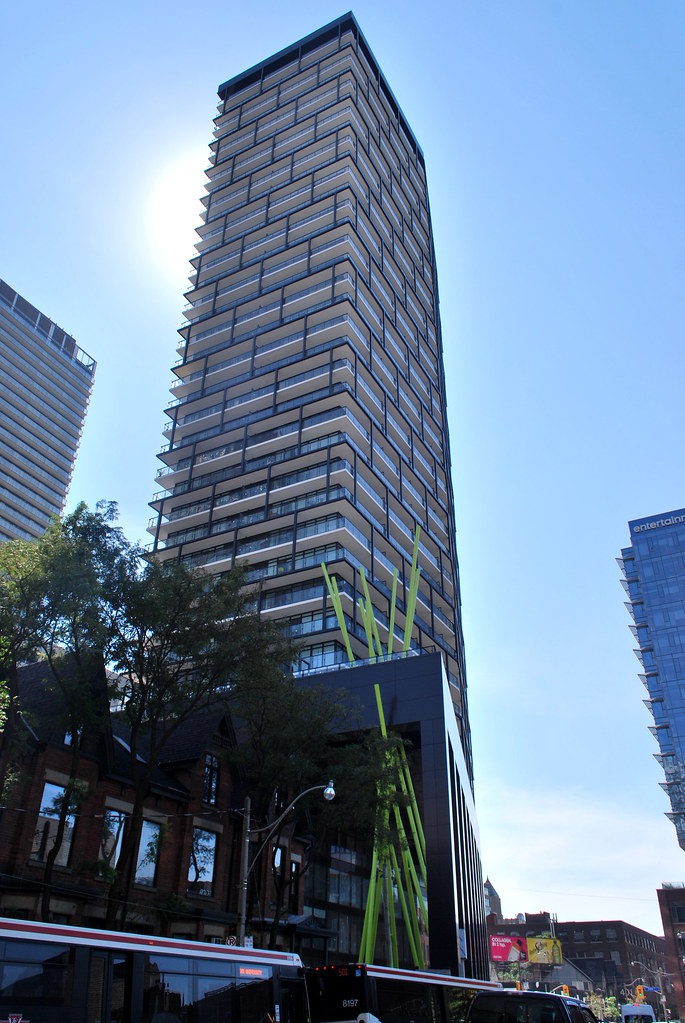 Tableau by Marcus Mitanis, on Flickr
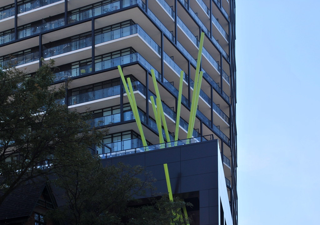 Tableau by Marcus Mitanis, on Flickr
 Tableau by Marcus Mitanis, on Flickr
 Tableau by Marcus Mitanis, on Flickr
 Tableau by Marcus Mitanis, on Flickr
 Tableau by Marcus Mitanis, on Flickr
 Tableau by Marcus Mitanis, on Flickr
 Tableau by Marcus Mitanis, on Flickr
 Tableau by Marcus Mitanis, on Flickr
 Tableau by Marcus Mitanis, on Flickr
 Tableau by Marcus Mitanis, on Flickr
 Tableau by Marcus Mitanis, on Flickr
 Tableau by Marcus Mitanis, on Flickr
 Tableau by Marcus Mitanis, on Flickr
 Tableau by Marcus Mitanis, on Flickr
 Tableau by Marcus Mitanis, on Flickr
 Tableau by Marcus Mitanis, on Flickr
 Tableau by Marcus Mitanis, on Flickr
 Tableau by Marcus Mitanis, on Flickr
Miscreant
Senior Member
Member Bio
- Joined
- Oct 9, 2011
- Messages
- 3,616
- Reaction score
- 1,795
- Location
- Where it's urban. And dense.
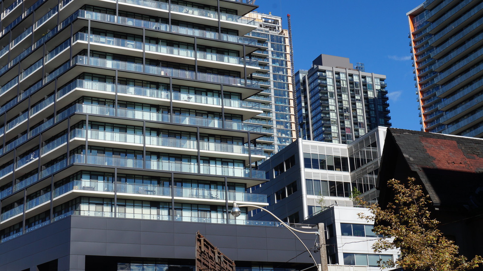
Damn, those pictures are excellent. They really show the finer details in this building. There's beautiful lines. I'm not quite sold on the 'heritage' component, but overall this is such a winner.
jje1000
Senior Member
Damn, those pictures are excellent. They really show the finer details in this building. There's beautiful lines. I'm not quite sold on the 'heritage' component, but overall this is such a winner.
Agreed- definitely a great addition to the block.
The heritage component compromised a bit too much on the original nature of the building in terms of changing the brick color and the gigantic openings at ground floor.
salsa
Senior Member
ADRM
Senior Member
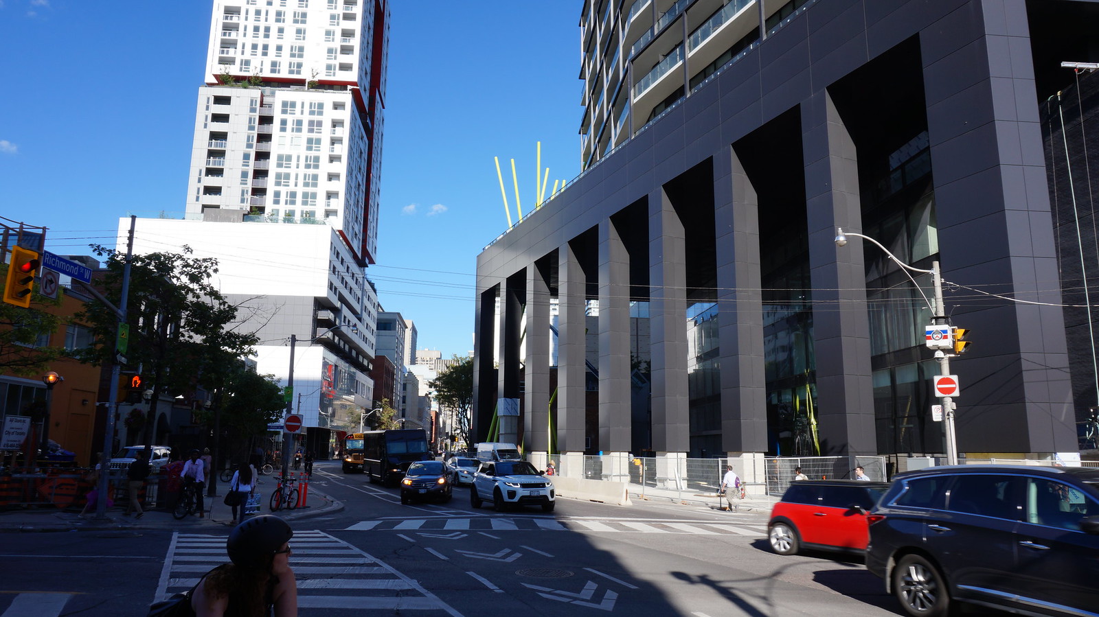
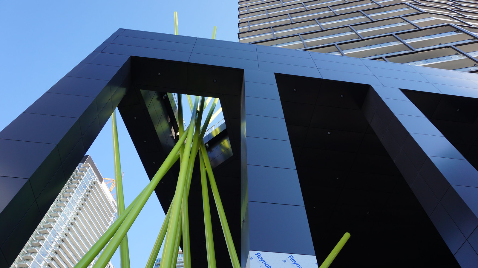
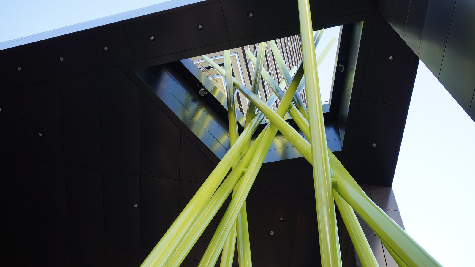
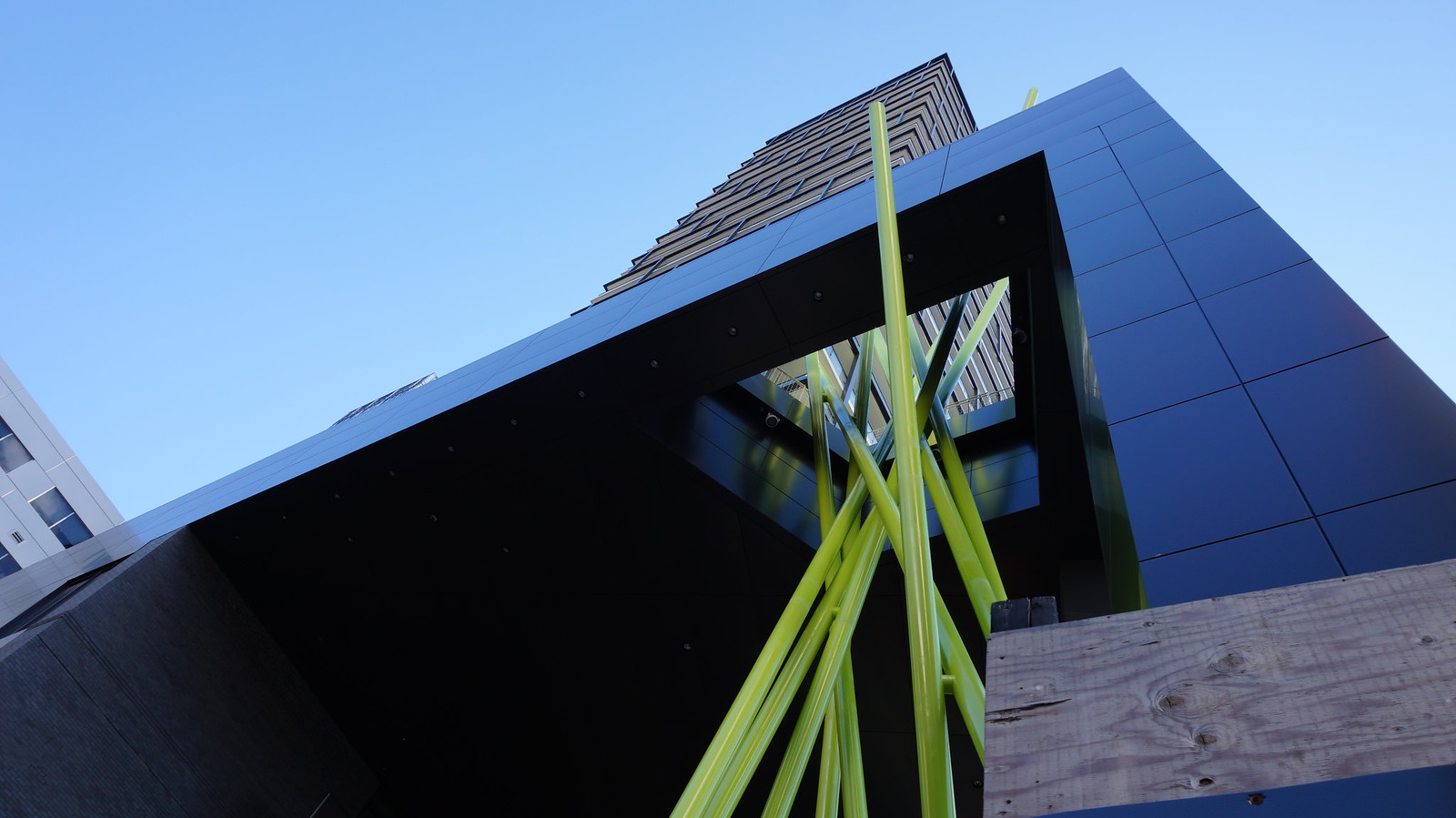
Have to say I think this is one of the better contemporary examples of a public art component actually being well integrated into the design of a building rather than a tacky, tacked-on afterthought, as is the so often in this city. Well done all around on this one.
Bogtrotter
Senior Member
This is my favorite project in the area and quite faithful to the renders. The downtown doesn't seem to have a lot of terminating vistas, or at least few that are taken advantage of architecturally- this looks great. I like the treatment of the west facade and the incorporation of the art component is clever and interesting.


