Toronto St Lawrence Market North | 25.3m | 5s | City of Toronto | Rogers Stirk Harbour

It's like we often go with starchitect firms just to say we had them design our buildings, not because we Yes, it's nice, but it's such a 'Toronto'-RSHP...
Yes, it's nice, but it's such a 'Toronto'-RSHP...


I don’t know if we can truly answer this but I wonder how much of the disappointment that some feel when they see a ‘subpar’ version of an architect’s work is in fact true or just in their expectations.

If this project was dropped in NYC and we walked by - it would be a wonder to behold. No expectations - just a nice building that we didn’t have an attachment to.

But we hear a famous architect is designing something for Toronto so we have great expectations. That coupled with the fact that we watch its development for years with great anticipation to only be let down that it isn't what we had hopped.
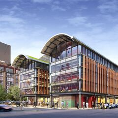
 
It's like we often go with starchitect firms just to say we had them design our buildings, not because we love architecture and a beautiful public realm. It's like the person who buys the cheapest Mercedes just to say he or she owns a Mercedes.
The North Market design won a quite competitive competition and, from what I remember, most UTrs were very happy with it. Of course, being Torontonians, some of us now want something more, or different or taller!
 
The North Market design won a quite competitive competition and, from what I remember, most UTrs were very happy with it. Of course, being Torontonians, some of us now want something more, or different or taller!

Don't get me wrong, I'm still quite happy with this iteration of the market. But wasn't the winning design substantially different than what was eventually built—I recall it being much more angular and unique.
 
The North Market design won a quite competitive competition and, from what I remember, most UTrs were very happy with it. Of course, being Torontonians, some of us now want something more, or different or taller!
Might be worth having a look back to revisit that entry and remind yourself what made everyone so excited. Of course things evolve from a competition submission to construction drawings - you'd be kidding yourself to believe that what won was what we'd end up with - but the degree to which this thing was mercilessly VE'd to death (speaking on behalf of friends then at the City who worked on it from 2012 to about 2015-ish), by folks who didn't and still don't care about the final product, is pretty damn shocking. Remember, this building is very much a product of the Rob Ford / John Tory civic culture where cuts and savings were all that mattered. Truly, Toronto: the city that knows acutely the price of everything but the value of...very little.
 
Don't get me wrong, I'm still quite happy with this iteration of the market. But wasn't the winning design substantially different than what was eventually built—I recall it being much more angular and unique.

This was the winning entry in 2010:

1692154221833.png
 
the degree to which this thing was mercilessly VE'd to death (speaking on behalf of friends then at the City who worked on it from 2012 to about 2015-ish), by folks who didn't and still don't care about the final product, is pretty damn shocking
I remember that staff report where RSHP told the city they'd VE'd as much as they could, basically "if you want the RSHP name on your building, this is as bare bones as we'll go".

To the architects' credit, the result is still excellent, but nothing like that original competition entry.
 
Outside of The City playing the *cheap-arsed developer here, I prefer the arched roofs...

...but I can't help be dismayed that we lost a lot other interesting elements in getting to what we got now. /sigh

*Note: I'm not sure they saved a whole lot when they tendered the construction of this out to dodgy builders.
 
Might be worth having a look back to revisit that entry and remind yourself what made everyone so excited. Of course things evolve from a competition submission to construction drawings - you'd be kidding yourself to believe that what won was what we'd end up with - but the degree to which this thing was mercilessly VE'd to death (speaking on behalf of friends then at the City who worked on it from 2012 to about 2015-ish), by folks who didn't and still don't care about the final product, is pretty damn shocking. Remember, this building is very much a product of the Rob Ford / John Tory civic culture where cuts and savings were all that mattered. Truly, Toronto: the city that knows acutely the price of everything but the value of...very little.

The way it turned out is a testament to the strength of the ideas in the original proposal, and an indictment on the complete lack of attention to details from our civic "leaders".

AoD
 
The way it turned out is a testament to the strength of the ideas in the original proposal, and an indictment on the complete lack of attention to details from our civic "leaders".

AoD
I think we can also blame the incredible delays in getting to this point and the City's chronic lack of $$ (due to an unwillingness to increase taxes!)
 
This was the winning entry in 2010:

View attachment 500287

I think all of the entries would have gone through the same V.E / refining processes this went though - I am not sure the other designs could have been executed as elegantly as this given the cost restrictions.
 
I think all of the entries would have gone through the same V.E / refining processes this went though - I am not sure the other designs could have been executed as elegantly as this given the cost restrictions.

Doubtless that is true; (That any other design would have been subject to similar pressure to VE)

Of course, it should not be true.

The design competition had (I'm assuming) a proposed construction budget.

A huge factor here was the delay in getting started.

Had this thing gone to tender in 2011/2012 it likely could have been built for less than the V.E.'d version 8 years later.

Time is money.

Architects charge fees for VE'ing their designs; inflation is a @#$#

****

Side note, I do think the added colour in the final version is welcome.
 
Last edited:
Delays or not, their commitment to details is clearly not there.
As @NorthernLight says, the costs increased due to delays and the frills were removed due to lack of $$. If it had moved faster it could have been better for no more $$. That said, it's a pretty decent building that I, at least, am looking forward to patronising.
 

Back
Top