News   Nov 07, 2024
 674     0 
News   Nov 07, 2024
 287     0 
News   Nov 07, 2024
 774     1 

Toronto Reference Library Renovation (Moriyama + Teshima)

It seems to me that adding the corner is taking a long time; the hording has been up there for over a year.
IMO... it doesn't add anything appealing to this building. Although I will say I was inside a few weeks ago and it's quite nice, it's just hard see past the exterior.
 
I hope that this is the most current thread. The shots are of the new entrance and some of the open spaces on the northeast corner. The renovations are still ongoing and are extensive and should greatly transform the building for the better. Even now and on such an overcast day the amount of daylight reaching the inside has been increased substantially.

IMG1570-L.jpg


IMG1575-L.jpg


IMG1576-L.jpg


IMG1579-L.jpg


IMG1581-L.jpg


IMG1582-L.jpg


IMG1584-L.jpg


IMG1588-L.jpg
 
Looks alright, took an excessively long time to complete though.

Flipping through the pages of this thread and seeing pics of the old entrance brings back good memories from high school days and hanging out here to do projects. Now it's a great place to meet cute international students. lolz
 
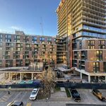
I went to check out the new Cube entrance today: it's hard to believe that it took this long to create, as it seems to offer so very little.

The colour of the metal that frames it is unrelated to just about anything else on the exterior of the building. It just sits there, awkwardly, unintegrated. Just in case this made the cube seem unique, light and glassy, all of its structural supports are extremely thick and clumsy looking. Given the ease with which structural glass is being utilized just about everywhere in the world these days, this seems like a real failure. The ceiling overhang is really low at the entrance - without even ceiling lights in it, and there are only two revolving doors set far away from each other, away from the corner, one on on each side of the glass planes as they meet the ground. The entire thing seems dull and slightly inadequate.

Once inside, it's alright, but it's not exactly soaring, and not exactly intimate. There's a perfectly ordinary stairway to nowhere - to a small catwalk on the inside of the cube's second storey, which also leads nowhere. I haven't checked the plans for awhile, but I hope that this catwalk is eventually going to lead somewhere other than the dead ends that flank it. I'm not sure how it could, unless they're going to alter the cube they've just built, or have plans to break through the brick wall. The catwalk could be a good place to put displays or go-go dancers, one supposes.

Once inside, you're still not inside, as you still have to go through another set of entry doors set some distance from the initial ones. This is all a bit awkward.

I found it very disappointing, architecturally. It's really no more remarkable than the back entrance of a shopping centre. I hope the rest of the renovations to the library work out to be more inspired than this particular bit.
 
Last edited:
I agree; yeah, I know, Ajon paying tribute to his dad's initial Beaubourg-of-books scheme, but it still feels like a clumsy, feeble, crammed-onto-the-streetline tack-on...
 
Have to agree - the addition is a really poor match with the original building - offering none of the warmth and at the same time don't have enough to stand on its' own merits. Yuck all around - this is RioCan architecture.

If they are going to use glass - they really should have consulted how Apple design their iconic entrances instead. I have a feeling it would have been a far superior fit. If only they used the spider clamp type of support for the entire box (like Shangri La) instead of just for that inclined inner wall above the second set of entrances it would have been so much better.

AoD
 
Last edited:
A really nice restaurant should go in this space I think. I haven't been here in years--before the internet was readily available I spent 8 hours a day here. It's really the only reason I'd go to Yorkville, even though I lived nearby in the Annex. Must investigate--have the bed bugs been banished from the stacks?
 
It looks so cold and sterile compared to the original building. A bad match and inferior to the feel of the building that came much earlier. Hmmm.
 
A really nice restaurant should go in this space I think. I haven't been here in years--before the internet was readily available I spent 8 hours a day here.

A café is slated to go in - I want to say another Red Rocket Café, but I don't think that's right. One of the local indies, I believe, at any rate.
 
I agree with the critiques. This looks like it was meant to be an addition to the Thornhill Community Centre, not Toronto's most important library. It subtracts, rather than adds, to the building.
 

Back
Top