Toronto Opus and Omega on the Park Condos at Concord Park Place | ?m | 36s | Concord Adex | IBI Group

Not all of the below is directed at you personally SP!RE.

One can see what one wants in a design: if one starts with an automatic prejudice against everything P+S does then of course it will be seen it as being without interesting features, or even better explained, merely "terrible" or "bottom of the quality scale". Yes, the design is pretty simple here—the towers are crimped slabs with full length balconies—but that can be read by others as clean, as plain and simple as that. That's my take and is in no way an apology. Take your arrogant accusation somewhere else.

The context is what it is and dumping on the designers because there's a laneway down one side is ridiculous. You have a sloping site here, and the loading end of a major furniture store immediately to the east. What would you prefer there? On the north side you're half a block south from where Concord will be building their pedestrian street-level amenities: shops are going into the Tango towers.

Why does every linear foot of sidewalk have to have a shop window up against it, no matter where it is in the city? From some members here it's like if a building has vehicular access it has committed an unpardonable crime. A little less dogma and little more understanding of differing milieus within the GTA would go a long way to making these less black-and-white conversations. There are shades of gray in the world. Wow.

42

Upon reviewing P+S and IBI Group's portfolio, I'll admit that they're a mixed bag with some good projects and some of the most generic buildings built in the past ten years. When they're bad though, the buildings are quite uninspiring. I didn't start with prejudice against them. That comment came after the first one that was critical of the architecture. This project looks quite bad in its blandness and lack of design flourishes on the tower's facade. I've heard enough complaints about slab towers to know that few people appreciate "simple" skyscrapers with almost no architectural detail--not even the minimalist details like creative spandrel and balcony placements. It's only "clean", when it's new. I make no apologies for these remarks to the developer, architects and buyers because I love my city too much to see low-quality architecture go up without speaking out. As for the retaining wall, it will probably be quite visible some day as the area changes. It could have some art, landscaping, or interesting cladding.
 
The scale and built form of this 'neighbourhood' clearly discourages walking, cycling, and transit ridership. None of these towers is particularly offensive on its own, they all look like nice places to live in, but quite clearly they are designed to be very car-centric, and that's an enormous wasted opportunity.

That whole area is currently terrible for pedestrians. If someone was walking by that lot and you asked them 'what would you like to see here that would simultaneously increase density and improve your experience walking through these streets... these 2 towers would not be it.
 
it's a commie block with glass, pure and simple, easiest way to turn a community into a ghetto.
 
The interiors are definitely better than what's being offered in other North York projects. I even heard they are offering roller blinds as a standard! The floor plans look quite usable with minimal wasted space. The architecture is very plain and doesn't make a purchaser feel proud to live in this building. I guess there is only so many different designs an architect can draw without sacrificing efficiency and at the same time maximizing salable area.
 
The interiors are definitely better than what's being offered in other North York projects. I even heard they are offering roller blinds as a standard! The floor plans look quite usable with minimal wasted space. The architecture is very plain and doesn't make a purchaser feel proud to live in this building. I guess there is only so many different designs an architect can draw without sacrificing efficiency and at the same time maximizing salable area.

hey concord is going to show toronto how to use grey with this project!!
 
I'll admit that I am prejudiced against P+S, but in my defence my prejudice is based on their long and storied history of designing architecturally insipid buildings.
 
it's a commie block with glass, pure and simple, easiest way to turn a community into a ghetto.

I think you need to learn a little about what a commie block actually is. People in East Berlin or Moscow would have died for something like this.
 
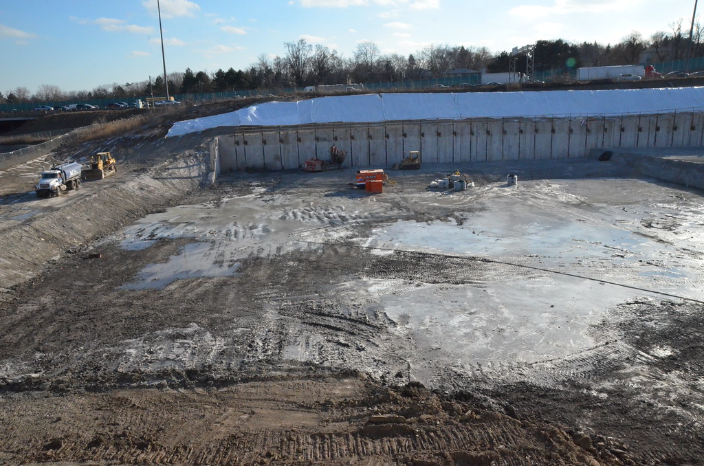
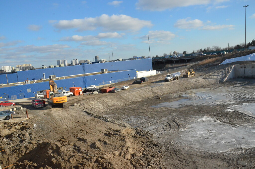
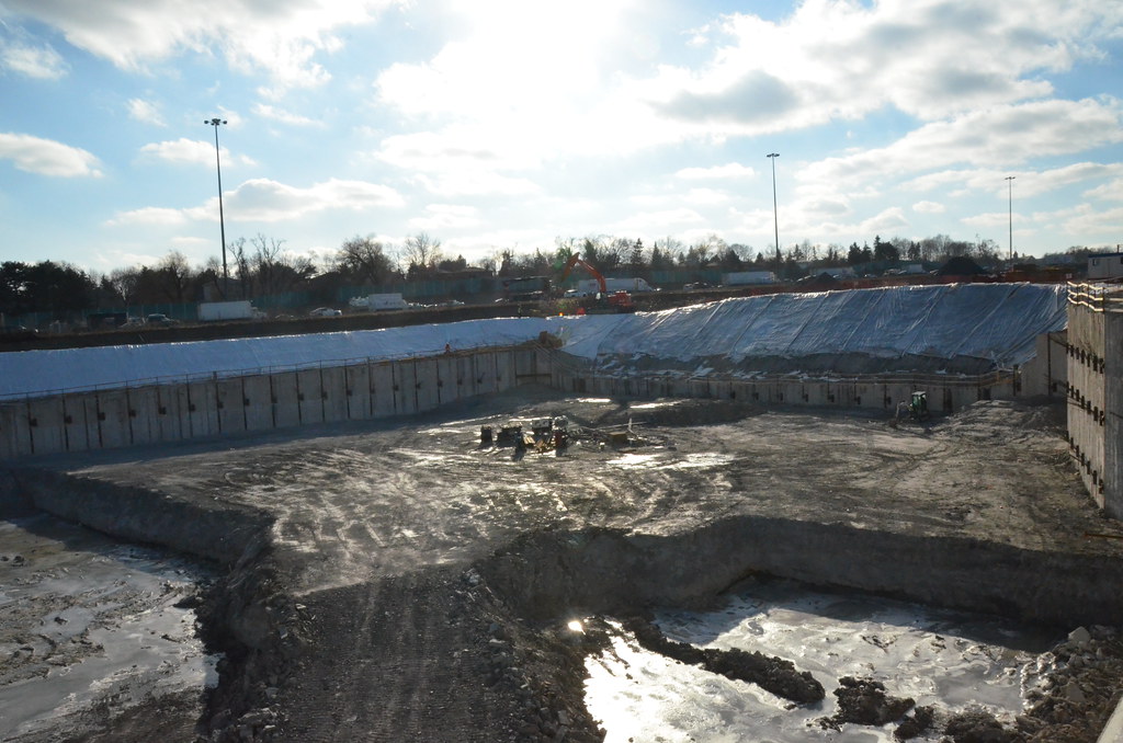
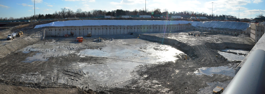
Construction has started on this project and you can watch it from Tango Driveway
 
Last edited by a moderator:
Jan 22
Still a lot of excavation to be done and no rush to do it.
16370125635_71caf7381a_b.jpg


16344157506_73801f406b_b.jpg


15747699144_f5ca52ee4f_b.jpg


16183920519_49d734eb4c_b.jpg
 

Back
Top