Toronto Motion On Bay Street | ?m | 29s | Concert | IBI Group

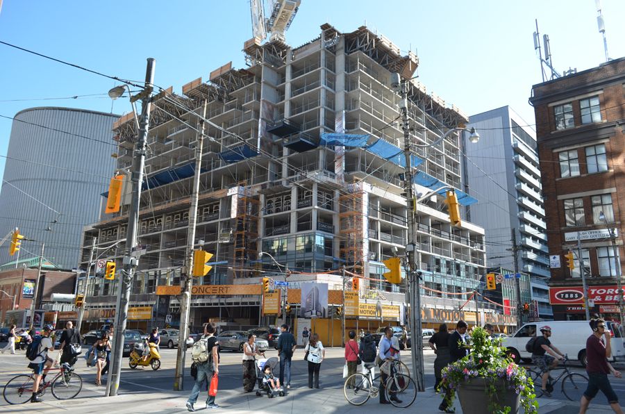
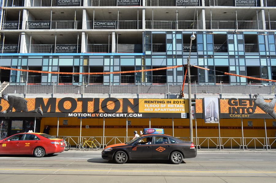
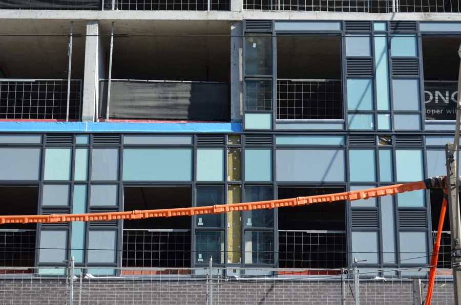
There's a bunch of different facade treatments on this one, so that might not look so horrific once we see it in context. I really wouldn't want to see an entire tower clad like that tho

And there lies the big question mark. I like it too, but a large part of the building clad in it, I'm not so sure. If I recall from the rendering there are several different cladding treatments on the Dundas and Bay Street sides of the building. We'll know in a few months, but I've got a good feeling about this building.
 
2012june26046b.jpg


2012june26048b.jpg


2012june26049b.jpg
 
This will converse very well with the YWCA a block or so away: they are two expressions of the same language.

42
 
I was really excited for this project but those colours they chose for the spandrel are horrendous together. I think that glass is going to look incredibly messy when it's all said and done. :(
 
I'm liking the colours and the pattern of the spandrel. Never expected to hear myself say "like" and "spandrel" in the same sentence. I also think it was a good call with the black/charcoal colour or this would be far too monotone. I just hope the other areas of the building don't have quite as much going on or it may cause visual overload.

looks like they used the leftover spandel panels from the Queen & Portland building.
There are similarities but so far I think this one looks like it's being executed better.
 
On the walk to work.


Under the lighting in Geekaroo's photos the brick looks similar to Casa's, which isn't a bad thing. I'm encouraged by what we seeing here so far too.
 
the patterning formed by the different tonalities of spandrel is definitely fun. I hope that the tower portion is differentiated somehow as I feel it may look silly and overly busy to have the whole thing covered in the exact same way. I hate the massing of this building at this location as I do for its neighbour next door. To me that whole block (Bay from Queen to Dundas) would have more ideally been reserved exclusively for government/institutional uses and appropriate architecture. It seems typical Toronto to have run of the mill rental units / condos neighbouring City Hall so closely. Also dont like that this is built right out to the side walk. Something set back from the corner with a public square containing sculpture and greenery would have continued the theme established at City Hall. Ah well, this intersection is already screwed up on the other 3 corners so why not make it 4 of a kind. For such a central crossroads of two of downtown's most important streets this ends up being wholey forgettable intersection and infact detracts from the statement made by City Hall.
 
Really? The part I like most about this building is its size and that it comes right to the sidewalk. Typical Toronto is leaving giant alienating gulfs of wasted space between buildings and the sidewalk, which really bothers me. This, however, is a refreshing bit of New York style unapologetic urbanity and comprehensive use of space.
 

Back
Top