Toronto Lumiere Condominiums | ?m | 32s | Lifetime | Wallman Architects

While this opinion is by no means universal, Lumiere carries certain elements of style seen in Toronto buildings and enhances them in a new iteration. Other than 790 Bays exceptional provenance, what elements of it's exterior would you warrant worthy of integration in new designs? Re the Regent Park buildings, I would say I dislike the placement of so many blank walls: it must be like a tomb on those floors. However, I'm not advocating their replacement, as they are unique, memorable, and (according to anecdotal accounts) good to live in.
 
While this opinion is by no means universal, Lumiere carries certain elements of style seen in Toronto buildings and enhances them in a new iteration. Other than 790 Bays exceptional provenance, what elements of it's exterior would you warrant worthy of integration in new designs?

Why is that question even worth answering? Essentially, look at it the way that a meat processor looks at a cow or a pig, where every element that can be made "useful", is.

This is one of those cases where the divide btw/ UT's "new design/construction" geeks and "heritage/existing conditions" geeks gets reeealllly conspicuous...

I would concur with the comment regarding the divide between the camps, however I would prefer to characterize the non-heritage group as being more focused on design, merit and value to the environment, as opposed to retaining structures simply because of their age, no matter how ugly, how much a blot on the landscape they might be. In my opinion, the two sets of silos remaining on the waterfront should be memorialized in pictures and books, even film and videos for those who are so moved, but then be removed to no longer blight the scene. There are many heritage buildings with specific historic significance, many older buildings with architectural merit and / or visual appeal which I am complete agreement with preserving - we have lost far too many of them. However, just because something is old, a reminder of the past, does not in my mind constitute sufficent justification to preserve ugliness.

With respect to the Butalist style of architecture in particular - just because a building is a good representative sample of the Brutalist style does not, again in my opinion, justify its preservation per se. I am not aware of too many professions which try to memorialize their (in my opinion) lessor accomplishments.

AHK
 
I would concur with the comment regarding the divide between the camps, however I would prefer to characterize the non-heritage group as being more focused on design, merit and value to the environment, as opposed to retaining structures simply because of their age, no matter how ugly, how much a blot on the landscape they might be.

However, consider that because of where the respective groups are coming from, one's mileage may vary re definitions of either "design, merit and value to the environment" or "ugly blots on the landscape"--as is the case here re Continental Can. Under the circumstances. that's where the so-called non-heritage, design-conscious camp may be tying its design-discernment knot way too tight, to the point where it becomes the pompous-prick urban version of a "no denim" dress code. (In that regard, it may say something that the critical moment for the rise of the heritage movement coincided with the era when hippies displaced Mad Men, so to speak.)

So, whether you like it or not, the heritage-awareness trajectory has, over the past half century, boxed your kind of clumsy overdiscernment in. (Though bear in mind that my critique works both ways, i.e. just as much to the self-styled "heritage types" who overapply Prince Charles-ian monstrous-carbuncle jabs at the Libeskind Crystal et al--after all, those are the sorts who hypothetically feed your jaundice, as well.)
 
this tower has very unique dimensions. It looks different on every single side and it's hard to get a grasp around the whole picture. it's weird.
 
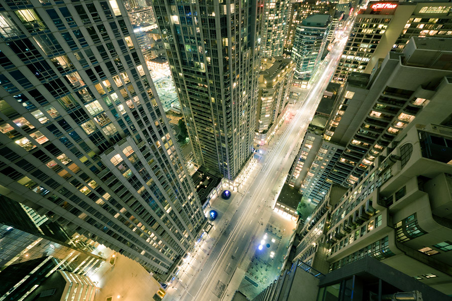
And now for some pics. by me, ironically NOT of ground level:

lumiere1.jpg


lumiere2.jpg
The picture with the top part of the building in the sky reminds me a photo from the Lumiere booklet (by the builder).
 
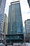
Lumiere looking fab...

Click on the thumbnail to enlarge, then click again on the image for full size.

 
Podium update today

Click on the thumbnail to enlarge, then click again on the image for full size.

 
Great base on a great tower with great urban design. Also great to see retail coming soon. Just great.
 

Back
Top