Toronto L-Tower | 204.82m | 58s | Cityzen | Daniel Libeskind

Looking back a few pages, actually looking for pics and information, one would think that pre-mature comments made about the building would have been edited or deleted by those who we're not aware that the building was not completed yet. Just sayin
 
Nice building, but I think it's fair to criticize what has happened at ground level with the public square (minus fountain) and the appearance of the Yonge st side. Judging by the preponderance of posted images taken from a distance, I guess most people are not as interested in the ground level execution.
 
Last edited:
I agree and appreciate all the people taking the time to post pics of L-Tower on here. I Can't understand all the criticism I'm reading in the last couple pages.

L-Tower set the bar much higher for new condo construction in Toronto. I love the look and design of this building. Also the builder and contractors working there are all terrific and should be very proud of such an amazing icon.

This was the most complicated and difficult condo building in Toronto to date. If you cannot appreciate the hard work, cost and dedication that has gone into this building, there is another reason why anyone would trash-talk L-Tower. Could it be tower envy?
Well said Jag ...
 
I agree and appreciate all the people taking the time to post pics of L-Tower on here. I Can't understand all the criticism I'm reading in the last couple pages.

L-Tower set the bar much higher for new condo construction in Toronto. I love the look and design of this building. Also the builder and contractors working there are all terrific and should be very proud of such an amazing icon.

This was the most complicated and difficult condo building in Toronto to date. If you cannot appreciate the hard work, cost and dedication that has gone into this building, there is another reason why anyone would trash-talk L-Tower. Could it be tower envy?


sir we really appreciate the work of all the people. from the designers to developer and all those people who put together those slabs of glass and concrete we appreciate their hard work. no doubt this building is very beautiful and unique in design.
some times we have a lot of expectations from something or someone and always things do not happen according to our expectations. I had some expectations from this building and I got frustrated and started making stupid comments when the things were not according to my expectation. well I am sorry and really appreciate the building and really appreciate the work of everyone who worked on this project or people who are working on other projects. Cheeeeers!! :)
 
Today:

DJH40UV.jpg


7Y5OoCr.jpg
 
because it's not finished yet? :confused:
 
How should it have been handled better in your opinion?
 
I assume the crane will be coming down fairly soon; the cladding seems almost done.

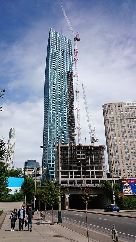
I must say I agree with Lost in the Wilds that the cladding and the mechanicals on the top are a bit of a disappointment. However, my main 'beef' with the building is that it does not really look too good (at the moment anyway) at street level but I am prepared to withhold judgement until it is finished. (I must say I also withheld judgement on how Aura met the street and they "failed' dismally.)
 
How should it have been handled better in your opinion?

Well the cladding on this building just plain sucks. It looks extremely cheap (even the curtain wall portion). I mentioned before that this building would have looked much nicer with One57 quality cladding. And to leave those ventilation stacks exposed (as shown in the photo above) is just plain lazy. Surely they could have been concealed somehow. Then there's that bare concrete wall behind them. At the very least that should be painted blue. Don't even get me started on the vents on the south side, or the base of this tower (the embarrassing corrugated plastic panels esp.)
 
Well the cladding on this building just plain sucks. It looks extremely cheap (even the curtain wall portion). I mentioned before that this building would have looked much nicer with One57 quality cladding. And to leave those ventilation stacks exposed (as shown in the photo above) is just plain lazy. Surely they could have been concealed somehow. Then there's that bare concrete wall behind them. At the very least that should be painted blue. Don't even get me started on the vents on the south side, or the base of this tower (the embarrassing corrugated plastic panels esp.)

As I said - it's not finished up there

http://urbantoronto.ca/news/2014/07/l-towers-top-fitted-windows-filling-equipment

Taken on July 13, the image highlights four vent pipes sticking out over the building's concrete crowning ridge, a sight that from below had some photographers with long lenses rather concerned. The concern was premature however; the final strips of cladding are still to come. The clips for them can be seen fastened to the concrete above, while in the shot below taken from just below shows that more of the framing is now in place; the effect of the vents will be minimized by the final cladding soon enough.

As for the vents - they need to be up there - there's 4 floors of mechanical equipment - HVAC units in particular - there is no other way of ventilating those.

It's not your typical building where you can stick a mechanical box on the top of it and hide the vents like so many other buildings in the city
 

Back
Top