Toronto L-Tower | 204.82m | 58s | Cityzen | Daniel Libeskind

I don't understand why there was no attempt to cover those pipes on the roof. I'm sure any decent artist could have turned it into an interesting decorative feature. To just leave it as pipes, is like Trump Tower just leaving that industrial-looking crows nest around the light. How you can build brand new, sleek towers and then leave raw, unpainted junk showing, just blows my mind. I just don't notice that happening on large, high profile buildings in other large cities. It shouldn't be happening here. It's stupid, unresolved details like this, that ruin a building for me. Small details are important and they can make or break a building.

This building was already ruined when the first piece of cheap looking plastic mullions/window wall was installed. The glass on this tower should have been of similar quality as One57 in NYC. Why design should a bold, beautiful tower and cover it in such banal cladding? What on earth were they thinking? This tower could have been phenomenal, even without the boot.
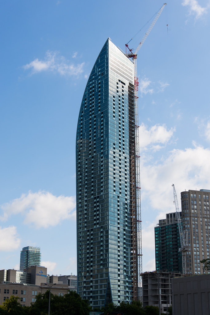
 
This building was already ruined when the first piece of cheap looking plastic mullions/window wall was installed. The glass on this tower should have been of similar quality as One57 in NYC. Why design should a bold, beautiful tower and cover it in such banal cladding? What on earth were they thinking? This tower could have been phenomenal, even without the boot.

While that would have been nice, I don't think anyone was willing to pay One57 prices at the L Tower.
 
Could you link me a review or two? I quickly tried searching and didn't come up with much and would like to view them.

By reviews, I meant posts in this forum rwgafd?* each building as it's built
 
Using curtain-wall cladding would not have made units in L Tower cost the same as a unit in One57.

Precisely. I even find the curtain wall cladding on the north facade to be pretty bland. This tower could have been so much nicer than it has turned out. This and The Ritz both have great designs, but poor quality cladding.
 
14608399327_8694c784d7_b.jpg

DTG_6347r by crobart, on Flickr


Yeah, it's definitely awkward. Not a deal breaker by any means but it could have been handled better. Even just shifting it one panel to the left so that it lined up with the columns of balconies immediately below would have produced a more pleasing result.
 
I agree with your position on this building, but IMO, the Ritz has some of the nicest cladding in the city.

I don't mind the north facade of the Ritz. The south side is horrendous though. And the zippered profile feature would have looked better with darker cladding (as was shown in the renderings).
 
This building was already ruined when the first piece of cheap looking plastic mullions/window wall was installed. The glass on this tower should have been of similar quality as One57 in NYC. Why design should a bold, beautiful tower and cover it in such banal cladding? What on earth were they thinking? This tower could have been phenomenal, even without the boot.

Agreed. The way I see it, is that buildings with phenomenal/out of the ordinary designs tend to go out on the cheap in terms of cladding/final details with the design at its core justifying success. Prime examples of these types of projects are Absolute World, the Crystal @ the ROM, L tower, and even Emerald Park to a lesser extent. Most people don't pay attention to things like cladding, because most people are only taken away by the designs of the buildings.
L tower's form is quite amazing (even without the boot) but the skin of the building could have been done a lot better.
I do prefer the Ritz's glass, it's a quality cladding but I don't like how washed out it looks, much of which is due to the green-tint-colour being so similar to RBC Centre next door. It gets lost in the mix. This includes minor details like the Zipper-liner on the edge of not making it to the top.

But ya, imagine L tower with One57's south side cladding. THAT would be phenomenal. I understand it's a 'billion dollar building', but the curves are accented perfectly without looking messy and loud imo:

One57_Ext-Overall_(c)Aric_Austermann.jpg

Source: http://www.skyscrapercenter.com/ima...0005/One57_Ext-Overall_(c)Aric_Austermann.jpg
 
As much as I hate L Tower's window wall, it looks MUCH better than One57's cladding to my eyes. What a disaster.

are you serious? look at the cladding it looks like coloured aluminum stripes. it is so cool. I would love to get something like that in Toronto.
 

Back
Top