You are using an out of date browser. It may not display this or other websites correctly.
You should upgrade or use an alternative browser.
You should upgrade or use an alternative browser.
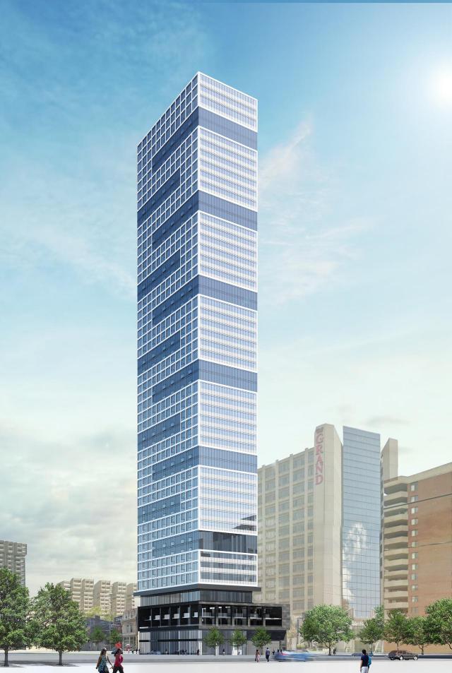
Toronto Grid Condos | 157.88m | 50s | CentreCourt | IBI Group
- Thread starter AlbertC
- Start date
Kingscourt
New Member
something looks very odd with the design at the top of this tower. I dont feel it matches the render and has the extra white space probably for the mechanical penthouse but it differs from the very clean cut that the render had. I don't know, probably my OCD but it bugs me.
mr24
New Member
Agreesomething looks very odd with the design at the top of this tower. I dont feel it matches the render and has the extra white space probably for the mechanical penthouse but it differs from the very clean cut that the render had. I don't know, probably my OCD but it bugs me.
ChesterCopperpot
Senior Member
Are you looking at the right render because it looks like advertised?


Auraz
Active Member
Irishmonk
Senior Member
I can't believe how much more attractive this building is compared to the Diamond designed POS next door. From a distance--and certain angles--the Grid is actually one of the more striking buildings in the core.
Kingscourt
New Member
Yes i am looking at the render. Are you looking at the building? If you did you would notice the top portion's framing and windows are totally different than the render. The render makes it seem as if the entire design is in unison from the beginning of residential flooring all the way to the top; the reality is nowhere close at the top.Are you looking at the right render because it looks like advertised?

ADRM
Senior Member
Yes i am looking at the render. Are you looking at the building? If you did you would notice the top portion's framing and windows are totally different than the render. The render makes it seem as if the entire design is in unison from the beginning of residential flooring all the way to the top; the reality is nowhere close at the top.
I, too, think the building looks essentially identical to the render.
Stefan
Active Member
Are you referring to the last 2 rows of windows at the top? They definitely don't seem to be the same as the rest of the building:

Yes i am looking at the render. Are you looking at the building? If you did you would notice the top portion's framing and windows are totally different than the render. The render makes it seem as if the entire design is in unison from the beginning of residential flooring all the way to the top; the reality is nowhere close at the top.
stjames2queenwest
Senior Member
It’s a pleasant surprise in my books.
Kingscourt
New Member
BingoAre you referring to the last 2 rows of windows at the top? They definitely don't seem to be the same as the rest of the building:
View attachment 165766
maestro
Senior Member
Still looks cheap. Like the Rob Ford of suits; a knockoff of Tom Ford.
I expect to find its twin in the UAE somewhere albeit at a higher quality in material and design. Not just wallpaper but, articulation and maybe the punched windows extended to the sides. This one and 411 (which I do like) remind me of McMansions with a fancy limestone front exterior and beige stucco on the sides.
I expect to find its twin in the UAE somewhere albeit at a higher quality in material and design. Not just wallpaper but, articulation and maybe the punched windows extended to the sides. This one and 411 (which I do like) remind me of McMansions with a fancy limestone front exterior and beige stucco on the sides.
Last edited:
ChesterCopperpot
Senior Member
Yes i am looking at the render. Are you looking at the building? If you did you would notice the top portion's framing and windows are totally different than the render. The render makes it seem as if the entire design is in unison from the beginning of residential flooring all the way to the top; the reality is nowhere close at the top.
Are you referring to the last 2 rows of windows at the top? They definitely don't seem to be the same as the rest of the building:
View attachment 165766
Firstly - the quality of the render isn't great so you cannot even see on the render if the top 2 rows on the north elevation are the same design
Secondly - the drawings posted to the city site showed that it would look different from the windows below. The top 2 rows are essentially a spandrel screen in front of the double height MPH level.

Thirdly - it's a render
neuhaus
Senior Member
The windows on the mechanical penthouse are not actually windows but looks to be spandrel, so it looks different than the floors below.
I must admit I never liked the design on paper as it looked like a crude video game depiction of an office tower and its superficial patterning of a very flat building, but the layers of mullions and unintended bands of spandrel going in both directions give it an almost enlarged plaid effect. I like it much more than the collage of condo design cliches of the Gupta building next door.
I must admit I never liked the design on paper as it looked like a crude video game depiction of an office tower and its superficial patterning of a very flat building, but the layers of mullions and unintended bands of spandrel going in both directions give it an almost enlarged plaid effect. I like it much more than the collage of condo design cliches of the Gupta building next door.
Rupert Pumpkin
Active Member
I love what this brings to the skyline....this is sharp and distinct.
