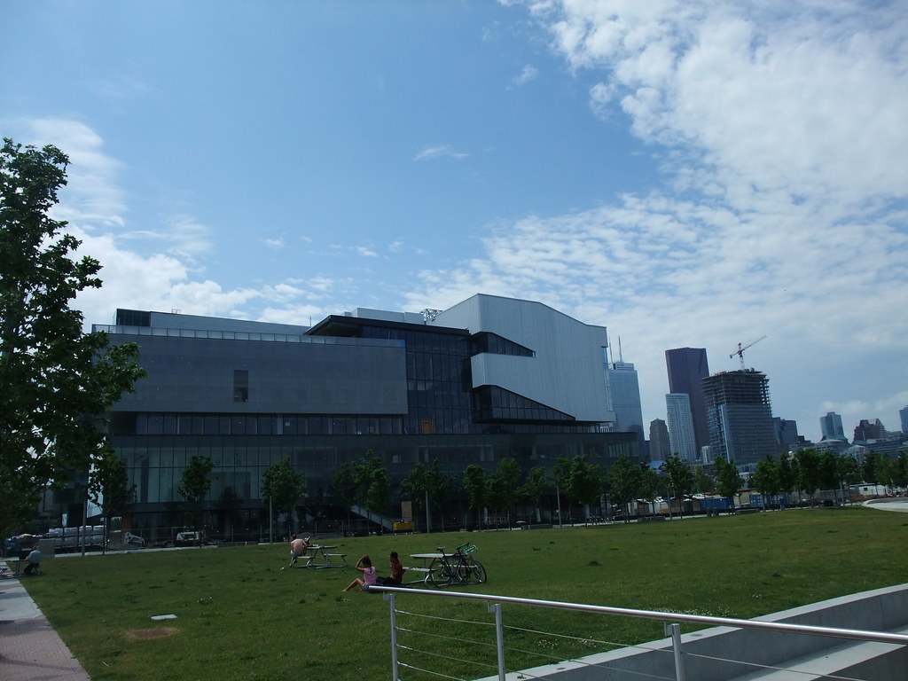
Toronto George Brown College Waterfront Campus | ?m | 8s | George Brown | KPMB

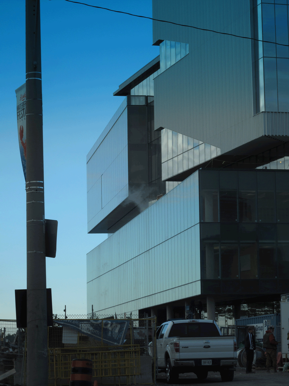
Kalzip panels - not your standard corrugated steel aka garage variety. They look good and the composition of the narrow building, reads like something you would see in Japan, as opposed to Toronto. I am overall impressed by the work and design of this building - I think it puts Corus to shame..
 
I'm ok with investing a little more in the buildings that house our educational institutions, especially ones on the waterfront. These aren't port-a-packs after all! I'm not suggesting gothic spires but these buildings should be made to last and should inspire. I'm not quite sure yet what to think of this particular effort though and will wait a little longer to see how the picture comes together. I can't say I'm loving it thus far.

I have mixed feelings about this building as well -- and admittedly it could all come together at the end.

They clearly wanted to mix up its form and go for something unconventional and interesting. But I think the quality of the cladding materials might be letting them down.

Imagine that instead of corrugated aluminum, there was titanium or zinc. Then it would sleekly glisten in the sunlight, and be far more pleasing to the eyes.

The intent behind GB and their architects is worthy of an A. But the execution, so far, perhaps a C.

But with decent finishing touches on its landscaping, it could potentially go up to a B or B-.
 
48194914.gif
.

Wow. Great photo. You even managed to make the corrugated portion not look like a work trailer.


These two photos show how the contrast of the corrugated cladding fails in the overall composition. In thedeepend's photo, the angle and lighting makes the tones of the various building elements look great. In the second photo, which unfortunately is how it looks most of the time, the tone of the corrugation appears almost white in contrast to all other elements of the composition. It's not the fact that it's corrugated, but the fact that it's too bright.

I think it's a beautiful building that will look even better once the connecting north phase is complete, I just hope the corrugated cladding darkens with age.
 
Last edited:
The business-park aesthetic for this stretch of the waterfront is rather uninspired, to say the very least. It's the design version of accountants in casual wear trying to be all 'hip hop' at the company party.
 
The East elevation is attractive (apart from the bright silver cladding) but the rest looks a bit like a stiff 80's suit with a snazzy bow-tie. KPMB can be so conservative and full of themselves, their latest design for the condo overlooking the new West Don Lands park is similarly highly mannered and up-tight.
 
GB is turning out alright, though after repeated visits, I'm still finding that white siding on the upper portion to be a real error. It really attracts the eye as it's so dominant, but it never resolves into something interesting or pleasing. It's too bad this had to happen on a building that is carefully calibrated to be interesting all around.

Thanks for that photo, rdaner.
Gee, those two buildings don't really spell e-x-c-i-t-e-m-e-n-t, do they? (business-park aesthetic...too true, tewder).

I hope the two lots north of these buildings go out of their way to have a lively, colourful and engaging street presence along Queen's Quay when they're built up. Another repeat of anything as hermetically dull as the south-west corner of Corus would be an awful mistake. Personally, I'd like to see an entertainment complex go in on the north-west parcel - multiple theatres, bars, retail, etc., all stacked up.
There's a development in Denmark called Sluseholmen that I've mentioned a few times on here. Although the buildings are not small in and of themselves, the facades were divded and slightly varietgated from one another. A different architect was asked if they would design one section of each facade. The result was harmonious, appealing and engaging. Link here. An approach like this, or variations on it, might go a long way to avoiding the creation of an accidentally sterile district - or the outlandish twinning and tripling of buildings we're seeing around Southcore.
Has anyone heard anything about any kind of interest, sales, development or speculation on the land across the street, on the north side of Queen's Quay? It'd be great to hear that was going ahead, too. Right now, we're a long way from what all those 'New Blue Edge' renderings are showing.
 
Last edited:
We can only hope to get something as great as Sluseholmen in Toronto. I can imagine something like that working really well in the portlands, part of which could be carved up with a network of small canals. As for GB & especially Corus, in time when all the trees mature and other buildngs appear, we won't have to look at those facades as much.

GB is turning out alright, though after repeated visits, I'm still finding that white siding on the upper portion to be a real error. It really attracts the eye as it's so dominant, but it never resolves into something interesting or pleasing. It's too bad this had to happen on a building that is carefully calibrated to be interesting all around.

Thanks for that photo, rdaner.
Gee, those two buildings don't really spell e-x-c-i-t-e-m-e-n-t, do they? (business-park aesthetic...too true, tewder).

I hope the two lots north of these buildings go out of their way to have a lively, colourful and engaging street presence along Queen's Quay when they're built up. Another repeat of anything as hermetically dull as the south-west corner of Corus would be an awful mistake. Personally, I'd like to see an entertainment complex go in on the north-west parcel - multiple theatres, bars, retail, etc., all stacked up.
There's a development in Denmark called Sluseholmen that I've mentioned a few times on here. Although the buildings are not small in and of themselves, the facades were divded and slightly varietgated from one another. A different architect was asked if they would design one section of each facade. The result was harmonious, appealing and engaging. Link here. An approach like this, or variations on it, might go a long way to avoiding the creation of an accidentally sterile district - or the outlandish twinning and tripling of buildings we're seeing around Southcore.
Has anyone heard anything about any kind of interest, sales, development or speculation on the land across the street, on the north side of Queen's Quay? It'd be great to hear that was going ahead, too. Right now, we're a long way from what all those 'New Blue Edge' renderings are showing.
 
Last edited:
The design bothers me a lot less than the use of materials - and the same criticisms leveled against Southcore can be applied here as well - where are the warm, natural materials like brick, wood or stone?

AoD
 
They are both crimes against humanity AoD, though where Southcore might be a misdemeanor these projects are worse given the waterfront location. That any designer could look around at the setting here and come up with these building schemes is mind-boggling and should be grounds for penance on their part, obligatory community service (at the very least).
 
Corus and George Brown may seem unambitious, but I find them rather pleasant and calming. Southcore, on the other hand, I find soul-crushingly banal.
 
The design bothers me a lot less than the use of materials - and the same criticisms leveled against Southcore can be applied here as well - where are the warm, natural materials like brick, wood or stone?

Well, the architects of George Brown and Corus have gone for a look that's tied more to the harbour's industrial past. I suppose that if it's wood you want, there's always Quadrangle's design for the pannelled interior of Corus Quay, though it doesn't strike me as a very good match for the building.
 
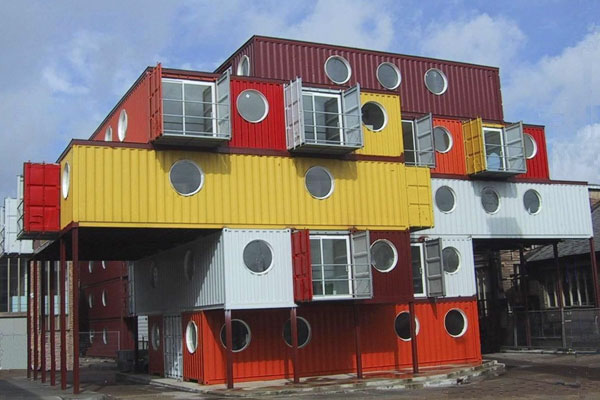
I appreciate the inspiration here and the shipping/industrial waterfront aproach but feel they pulled their punches with Corus and G. Brown.


shipping_containers.jpg


container-city-ii.jpg
 

Back
Top