Northern Light
Superstar
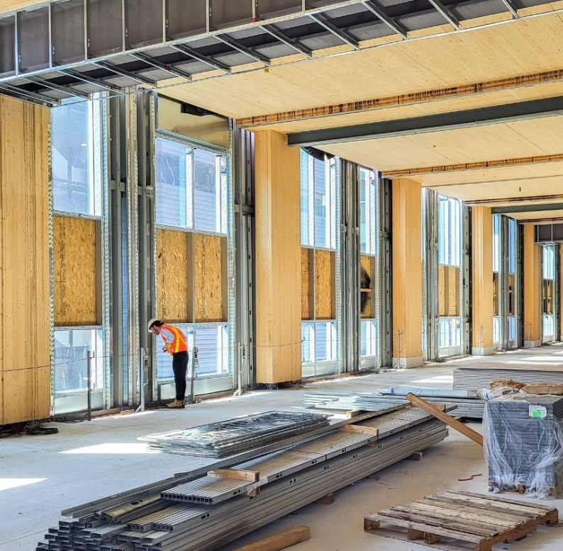
A peek inside from the WT Board Mtg docs:

We do not know how much work is going on INSIDE. The cladding may not be finished but the building is (fairly) weatherproof.No offence intended to the construction workers or anything but progress here seems awfully slow for a low-rise building. It takes them weeks just to add a few more layers of cladding and it barely looks any closer to completion months after topping out.
I had doubts about this building being ready for classes in January but seeing this progress they might just make it! Taken 28 October.
It's not grey = YAY!
The more of these shades in out urban fabric - the better. I think Sixty Colborne might have started this trend back in the day, showing that bold colors of the orange-copper-metallic variety manage to create a warm and welcoming allure among the sea of cold glass boxes and grey spandrel galore. I'm glad it didn't go unnoticed and more and more projects start to venture in this direction. Some examples off the top of of my head: Aqualuna, St. Lawrence Market North, elements of The Well (though some of these are executed better than others).It's also not some chosen-by-committee "don't offend anyone" colour like beige, off white, charcoal, light brown, etc., which is refreshing.