steveve
Senior Member
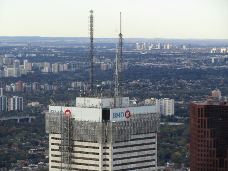
Nicetommy's pic is very impressive!  it almost looks silvery! Like aluminum panels (but not). and i like the ripple effect it can have.
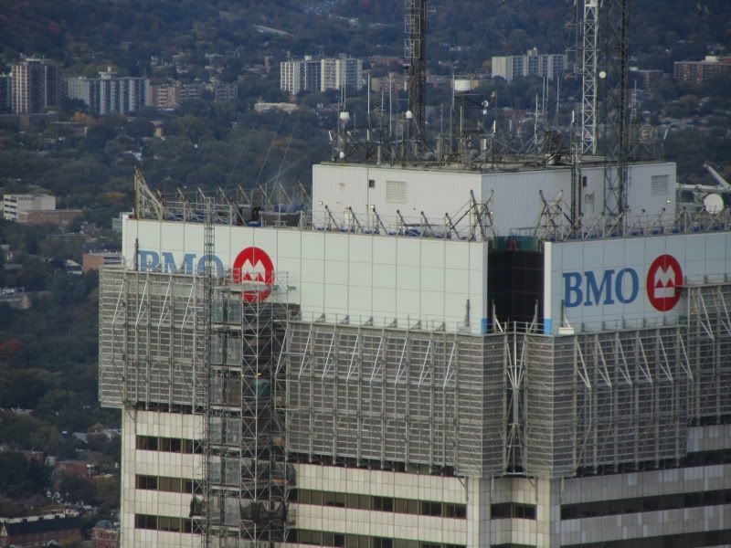
Quick question... i understand that there is a white layer behind the glass to give it the "white" look. was it possible to implement any colour you want behind the glass?. it would have been epicly cool if they used a different colour like blue, gold, black, etc... !
it almost looks silvery! Like aluminum panels (but not). and i like the ripple effect it can have.Quick question... i understand that there is a white layer behind the glass to give it the "white" look. was it possible to implement any colour you want behind the glass?. it would have been epicly cool if they used a different colour like blue, gold, black, etc... !