Toronto First Canadian Place Rejuvenation | 298.08m | 72s | Brookfield | MdeAS Architects

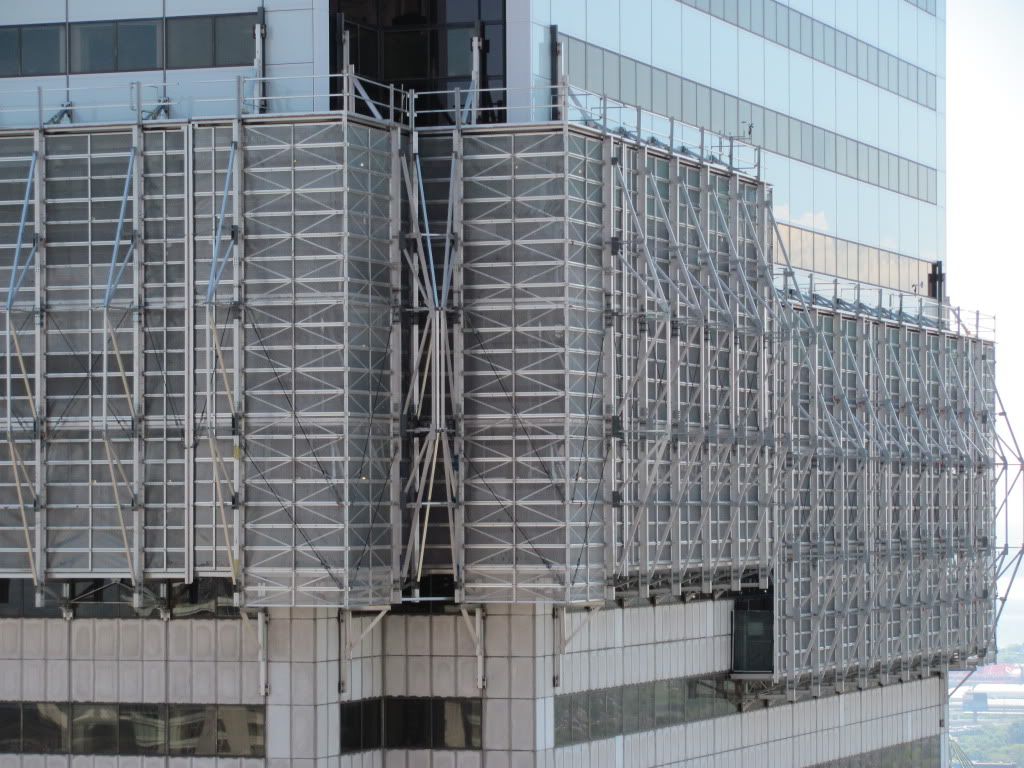
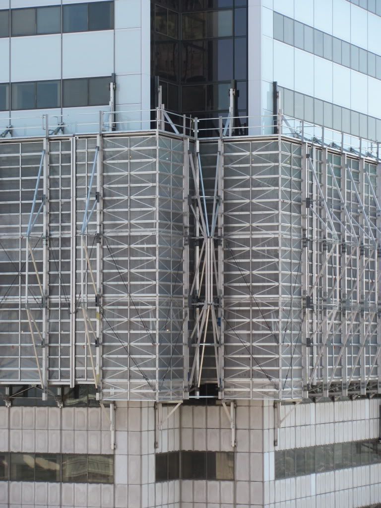
It got very bad but not quite as ugly as in that photo. I think the photo editing ended up exaggerating its appearance.

Photo editing was minimal, that's more or less how it appeared that day with the lighting and camera settings. I did have a polarizing filter on at the time though, which probably enhanced the contrast between tiles a bit.

I should also add the bronze tint of the TD Centre windows affected the white balance and hue of the photo as well.
 
Last edited:
I'd have to think it looks worse simply because you looking at them from a much closer distance than usual and not on an angle. From farther away on the ground level the titles blur into one another. But from across the street looking at them straight on, they're individual deformities just stand out much more.

I have a shot taken from an airplane (last Tuesday, by my husband, as we circled around to land at Pearson). It's actually surprising how obvious the issues with the old tile are, especially with the contrast with the new. Hopefully I can post that shot in the next couple of days.
 
Recent pic

June 3, 2011


X9ctj.jpg
 
nice looking shot Red Mars! its amazing how much better the city looks with blue skies and some greenery...

i agree, and funny how all of the financial district towers look all new and shiny! (accept for the top part of commerce court), the antennas are the only giveaway that this tower is ancient.
 
i agree, and funny how all of the financial district towers look all new and shiny! (accept for the top part of commerce court), the antennas are the only giveaway that this tower is ancient.

Haha, ancient. I guess to you younger ones anything over 20 years old is ancient.
 
I'd have to think it looks worse simply because you looking at them from a much closer distance than usual and not on an angle. From farther away on the ground level the titles blur into one another. But from across the street looking at them straight on, they're individual deformities just stand out much more.

I would agree. I get a very close view of the old curtain wall every day, and it's pretty hideous.
 
Haha, ancient. I guess to you younger ones anything over 20 years old is ancient.

LOL! what i find cool, is that a tower(s) like the TD Centre, is older than FCP, yet, looks newer compared to the old marble at FCP, i understand they are completely different materials (steel vs marble), but nonetheless, shows that the Mies buildings are timeless. :D
 
^ I think these may be some of the best corner closeup shots I've seen with both the new and old cladding for comparison! Great shots and thanks for sharing :)
 
Just for everyone keeping score, the floor progress counter in the lobby of FCP is now at the 47th floor.
 

Back
Top