Toronto Emerald Park Condos | 128.92m | 40s | Bazis | Rosario Varacalli

yep, Aura would look great in that green. Now it is just one of those greys.

I actually think the blue works well with Aura as the curved upper portion tends to reflect/blend in with the sky nicely.

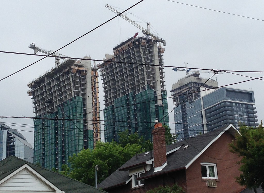
That last pic of Jack's looks awesome. loving the intense greenery echoed by the strip of high-rises along Yonge. taken with a drone?
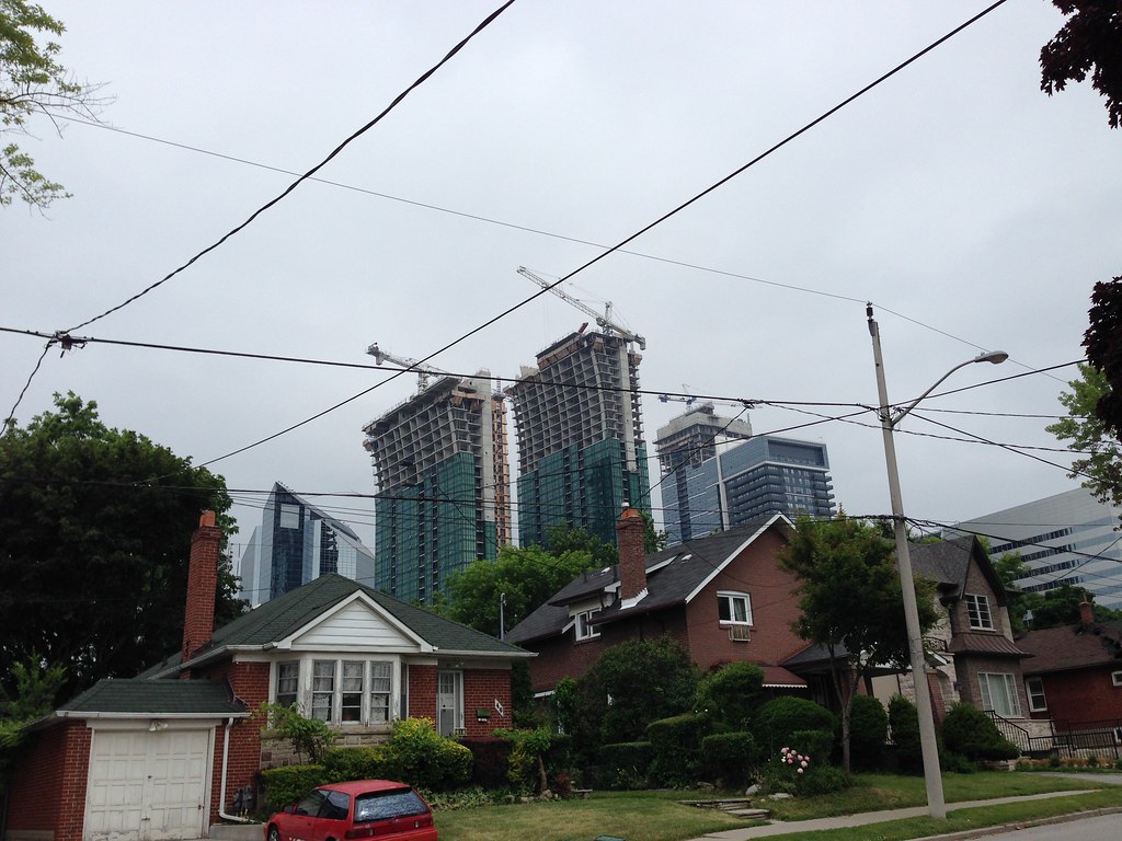
 
Time to get that drone closer to some big buildings!
 
Time to get that drone closer to some big buildings!

We are starting to get a bit more comfortable with it. Recent flights have been mostly altitude testing and low level strafing, and we still feel like a grassy comfort zone is needed. It won't be long before I can convince the owner of the thing to take it in to the concrete jungle, but there is a learning curve with the camera and flight controls operated separately
 
That is so great that you have access to a drone with a camera! I can't wait to see future photos once you polite are more comfortable with it.
 
AA.jpg
 

Attachments

  • AA.jpg
    AA.jpg
    96.7 KB · Views: 1,938
Call me an architectural philistine if you will, but I'm liking these towers. The flare is a simple but elegant gesture, and the towers have character. I don't hate the cladding.
 
Green is so polarizing that it seems a waste to use in something permament like architecture. Even though it uses window wall--which is cheaper and uglier than curtain wall--if it were black, impressions would be more consistently positive.
 
Green is so polarizing that it seems a waste to use in something permament like architecture. Even though it uses window wall--which is cheaper and uglier than curtain wall--if it were black, impressions would be more consistently positive.

I like the green. Certainly different than the many shades of gray and black that are used on most new buildings.
 

Back
Top