You are using an out of date browser. It may not display this or other websites correctly.
You should upgrade or use an alternative browser.
You should upgrade or use an alternative browser.
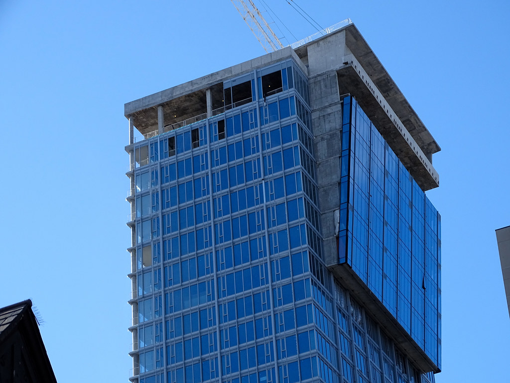
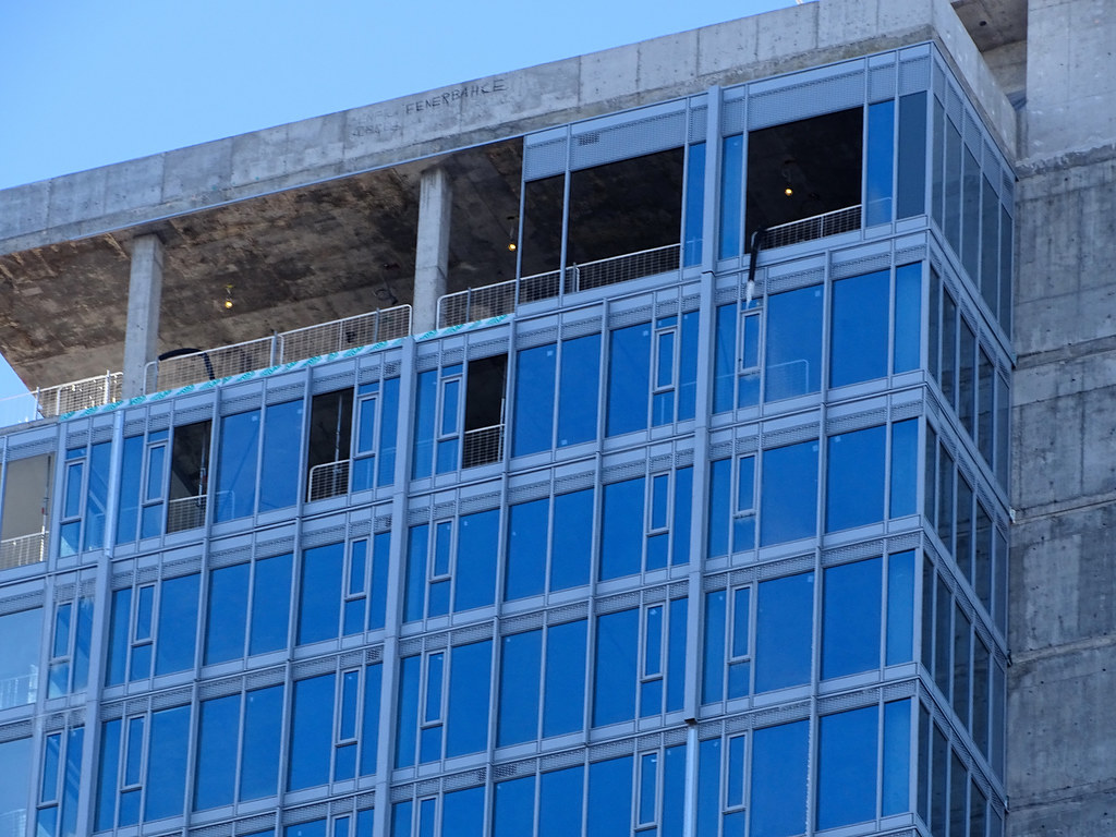
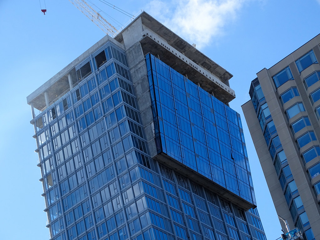
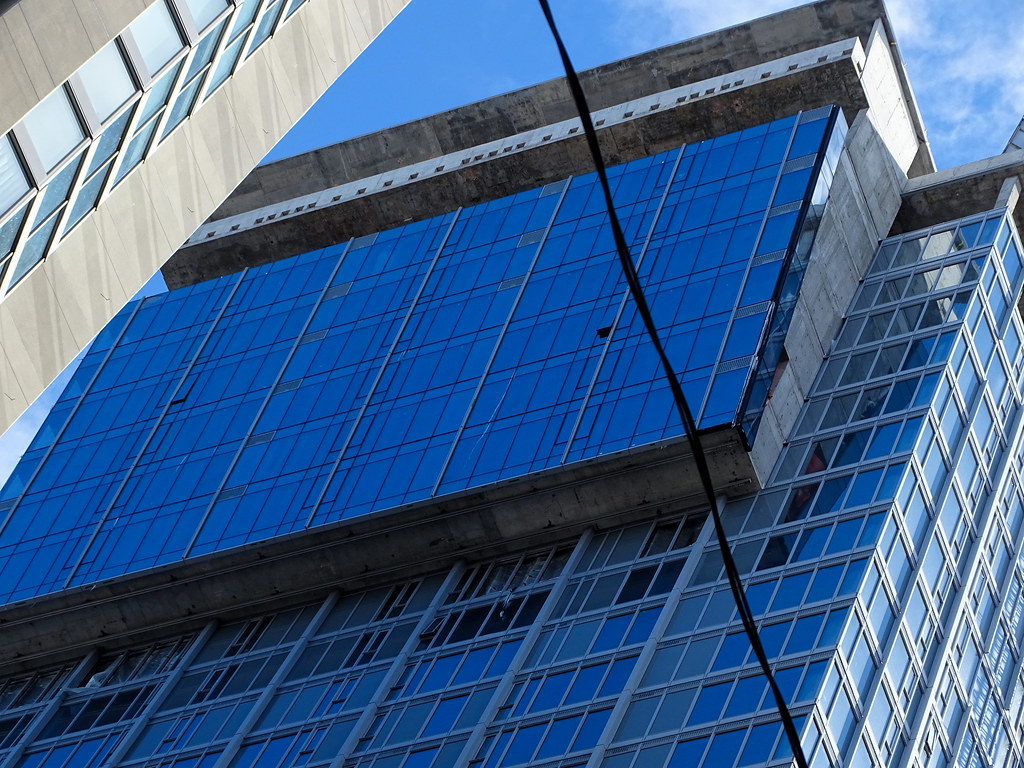
Toronto Cumberland at Yorkville Plaza | 124.96m | 40s | Camrost-Felcorp | WZMH
- Thread starter AlbertC
- Start date
Jasonzed
Senior Member
.dwg
Active Member
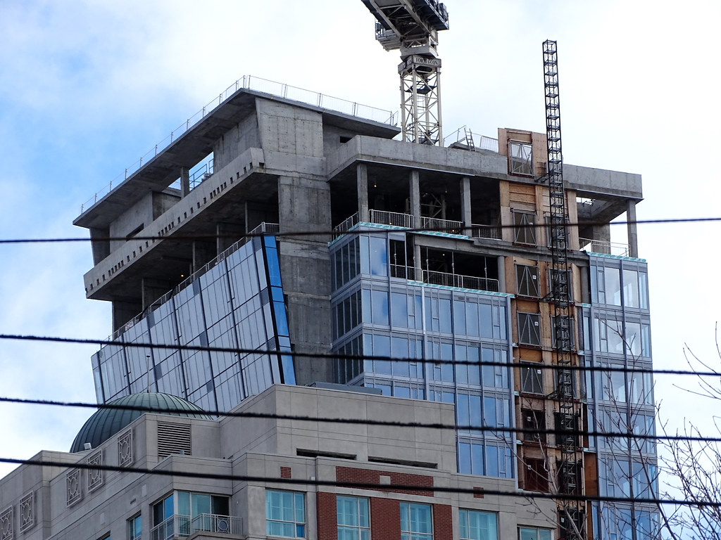
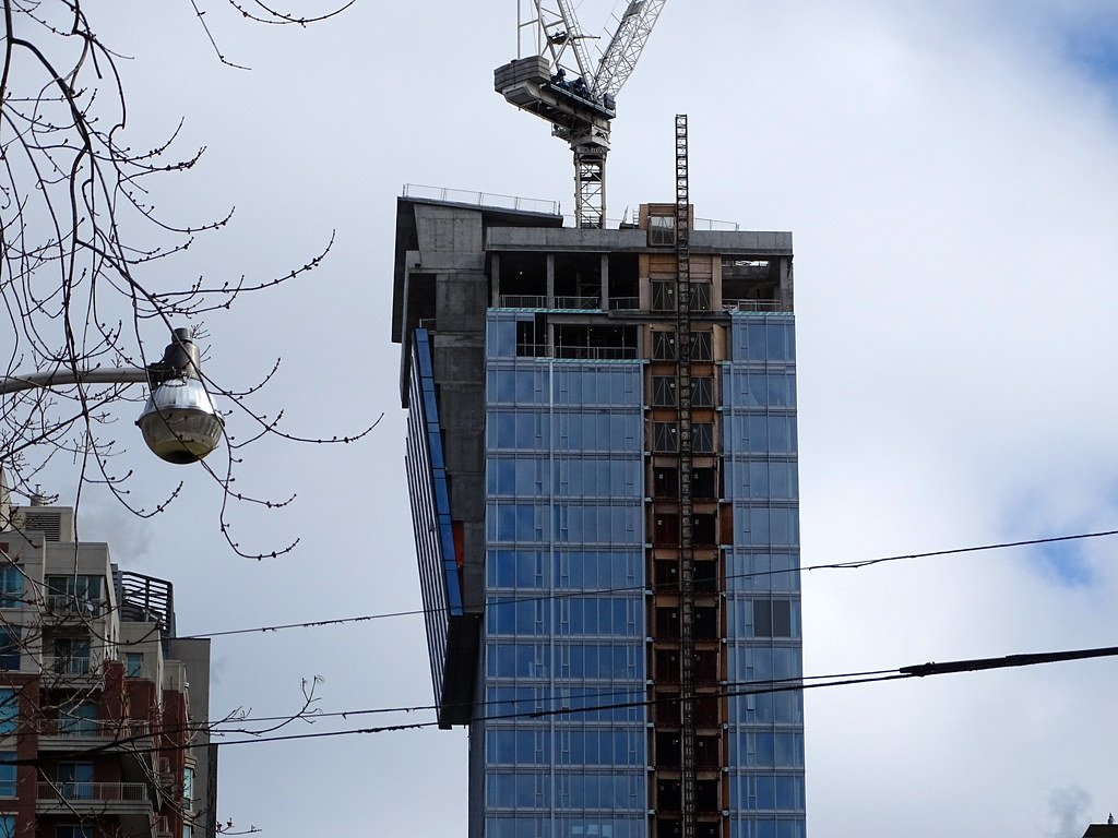
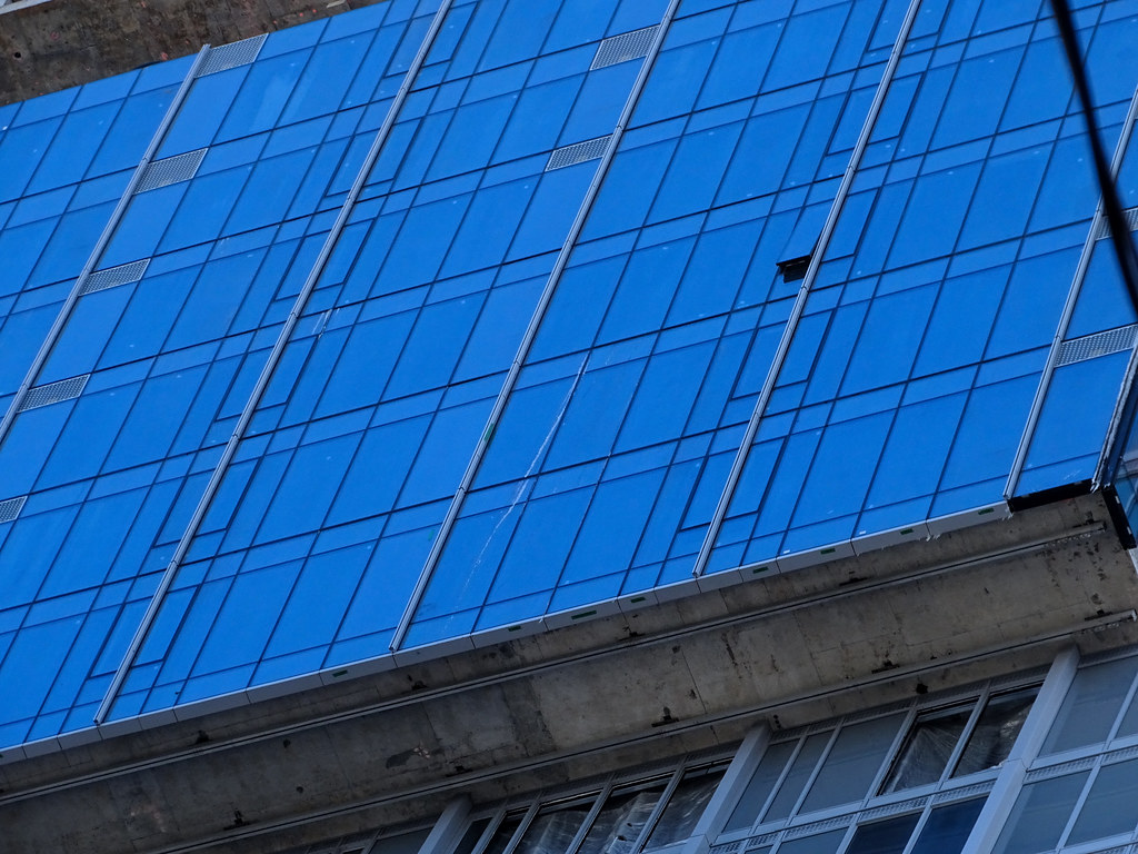
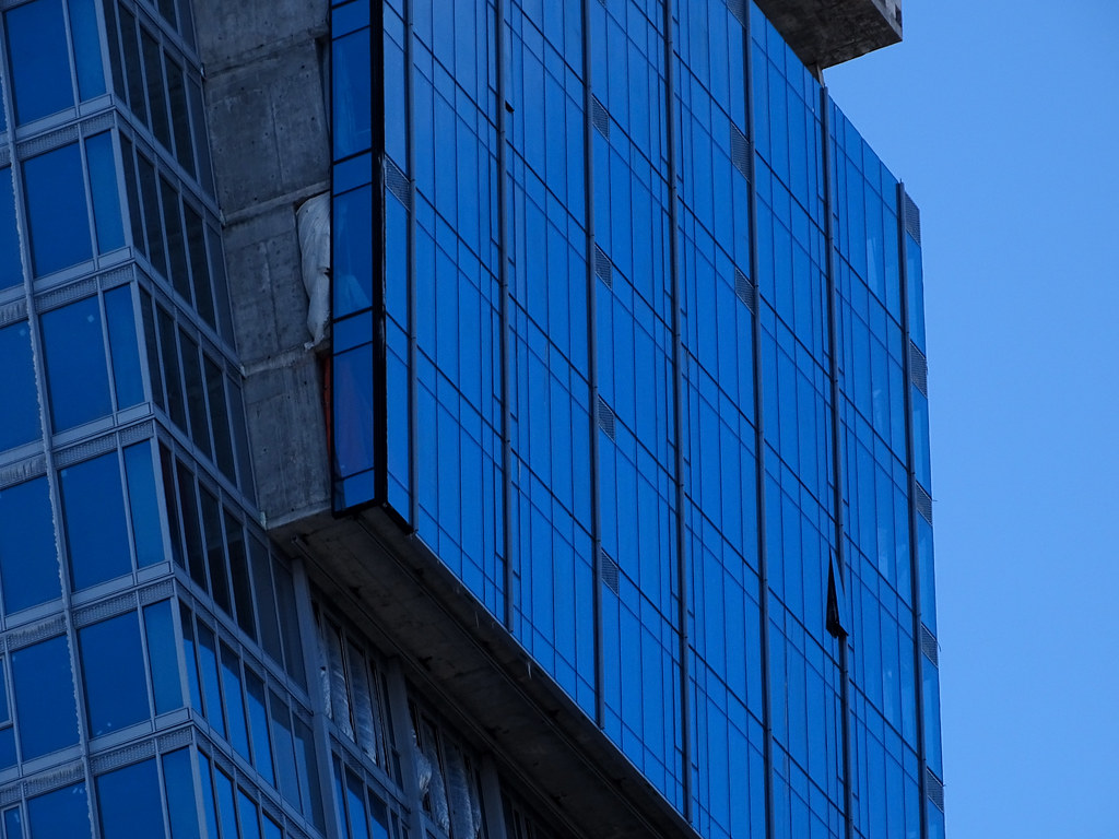
If the main design feature is so clumsy and ungainly to the project, then why bother including it at all?
And what drove that idea in the first place? It looks like it's staring down imposingly on the old Four Seasons so your gaze is directed right into other people's units below you. If it was framing some sort of vista maybe it would make some sense but it looks like a weak attempt to "make the building look more interesting".
And what drove that idea in the first place? It looks like it's staring down imposingly on the old Four Seasons so your gaze is directed right into other people's units below you. If it was framing some sort of vista maybe it would make some sense but it looks like a weak attempt to "make the building look more interesting".
The building's north face carbuncle is there just to maximize square footage that would have been on a higher floor, had the building not be cut down to fit below the Queen's Park view corridor.
42
42
Downtown Toronto
Active Member
Member Bio
- Joined
- Oct 19, 2016
- Messages
- 536
- Reaction score
- 1,561
- Location
- Yorkville/Downtown Toronto
December 18th 2018

Benito
Senior Member
Today.

Red Mars
Senior Member
Pic taken Jan 12, 2019

Miscreant
Senior Member
Member Bio
- Joined
- Oct 9, 2011
- Messages
- 3,616
- Reaction score
- 1,795
- Location
- Where it's urban. And dense.
This is a slowburner if there ever was one. Nice to see it's just about there.
AlbertC
Superstar
greenleaf
Senior Member
Unrelated to this project, but this parking lot should be a park. Or what if a single story of public housing were built over the parking lot and the housing had a green roof?

ADRM
Senior Member
Unrelated to this project, but this parking lot should be a park. Or what if a single story of public housing were built over the parking lot and the housing had a green roof?
View attachment 172248
As TVO's John Michael McGrath is (rightly) fond of saying, all municipal politics ultimately boils down to parking.
greenleaf
Senior Member
As TVO's John Michael McGrath is (rightly) fond of saying, all municipal politics ultimately boils down to parking.
Yep.
I am not opposed to parking here and I know it is well used BUT why not give the space double use!? (This goes for every single TPA lot in the city. And every single subway entrance/exit on the TTC.)
drum118
Superstar
Feb 16
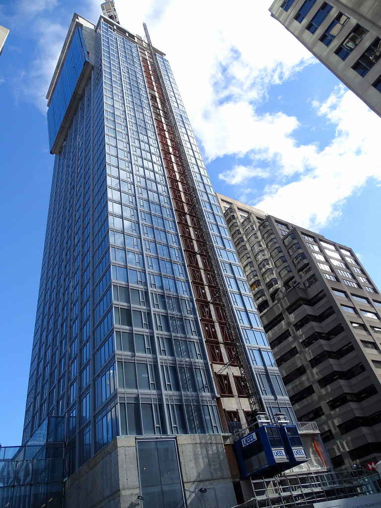
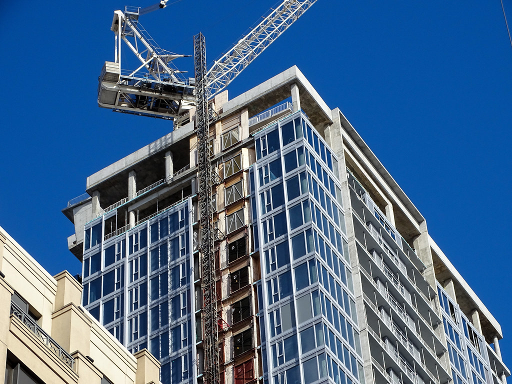
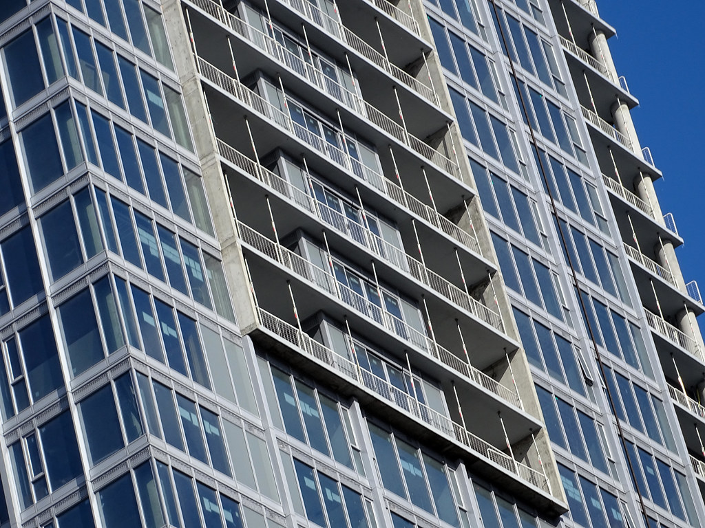
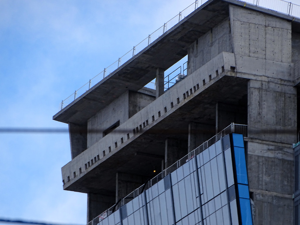


Midtown Urbanist
Superstar
I prefer Galatasaray