junctionist
Senior Member
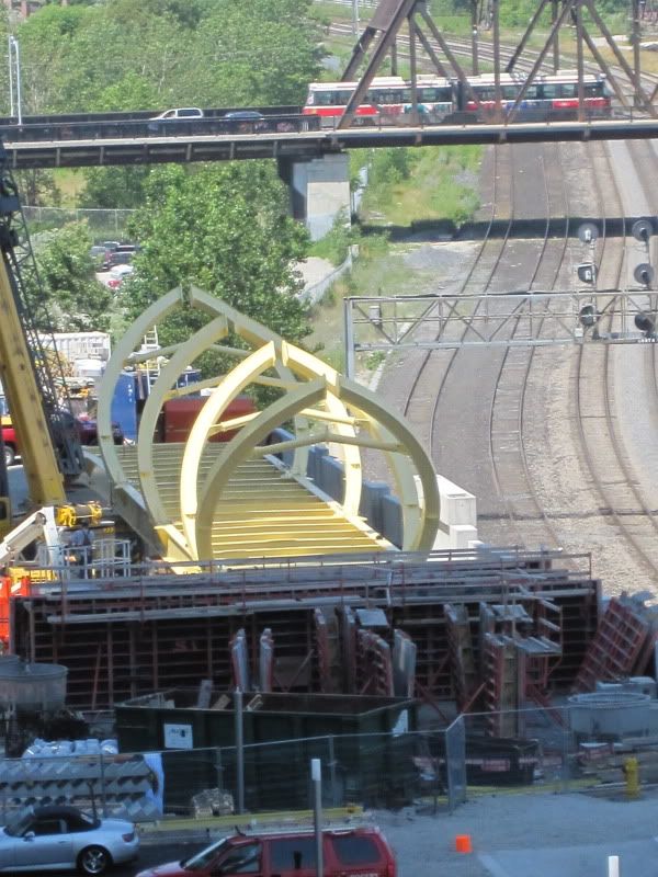
So the "iron horse" head concept seems to have become more like a snake (ie. perhaps symbolic on how ConCord got away with this!). The yellow will likely look great day one, but in a few years, it will become a bit stained as certainly the City grime and lack of maintenance painting will become an issue.
In my opinion, if this is it and nothing else, ConCord did not deliver what they promised in the last public meeting that the bridge would be significantly "artsied" up and special lighting would come into play. Let's hope the yellow is to deliver more impact at night with some lighting. Let's hope there is more than this.
Thanks for posting Ed!
S'Bus
Though it could be better, the current version doesn't look dull in terms of design, even if the color is taken out of the equation. At first I wondered why yellow was chosen, but against CityPlace's grey backdrop, a bright colour makes sense. The hue of yellow could use some tweaking perhaps to be slightly brighter. It definitely should have some quality architectural lighting.


") )
)