Toronto Canary House | 50.3m | 13s | Dream | BDP Quadrangle

They are probably just using extra leftover bricks to fill in areas because they are the correct size / texture and can be tinted to match

This building is a bit of an oddball though - it's kind of a mutant that was expanded various times over the years. Given the industrial location and use of the building, it's unlikely that matching bricks and aesthetics were a priority when these additions were built.


Screenshot 2024-04-24 at 1.26.36 PM.png
 
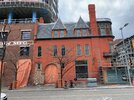
I imagine the red will fade in time, it’s not terrible. II enjoy the broken brick texture up top and the unpainted brick on the side. It's like kintsugi. At this point I’ll take anything not a glass curtain wall.
 
I love the restoration of the heritage building. It looks like the brick was painted which I normally don't like as I prefer natural brick but, in this case, the color really "pops" and makes the building stand out in a way natural brick would not. It was probably the most viable option from a restoration standpoint. Everything about this project and the adjoining new district is perfect.
 
That ground floor elevation though:

View attachment 561810


😭
What is this, Time and Space? I don't understand how this ground floor treatment was decided upon, other than maybe a last minute cheapening. I guess I'll stare up at the sky next time I come here.
 
the neighborhood is starting to feel more busy, presumably because of the rental buildings starting to lease up. the grocery store really is a game changer for making the area feel fully livable. i think this is going to be one of the most desirable areas of the city in a few years once these remaining developments wrap up and the lower donlands park opens. really cool seeing the years of planning and construction come to fruition
 

Back
Top