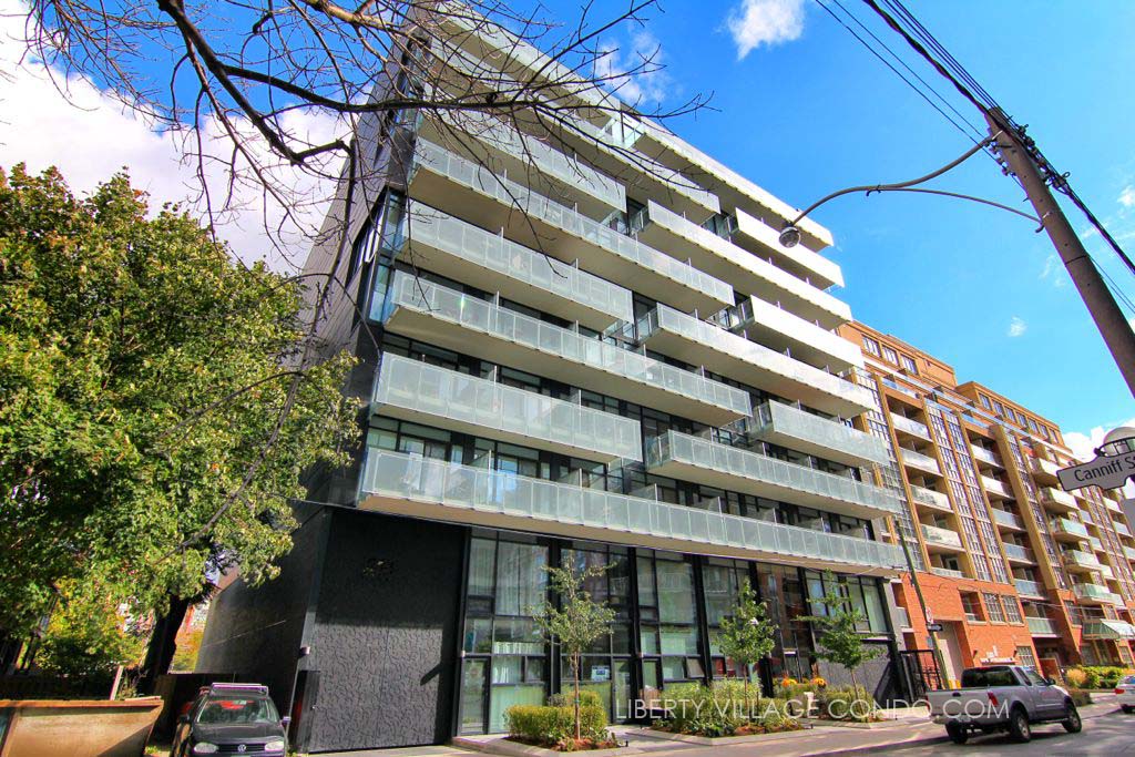
Toronto Bauhaus Condos | 110.9m | 32s | Lamb Dev Corp | a—A

It would be tough to find another building as overpowering as the Globe and Mail building currently is on its surroundings. It's a small site. A skinny point tower of 25 storeys would be barely noticeable as it would also be lower than Globe and Mail building. IIRC, G+M is 85 metres. 25 storeys is less than 80.

This is interesting; I don't necessarily agree that G+M feels like a gross over-development, but it raises I think an under-discussed point in Toronto development. A chunk of our current Planning regime assumes that the podium-and-point tower is the preferred form from an urban design (and amenities) standpoint, but that's not a tenet I particularly (or at least uniformly) agree with. Give me a skinny but well-designed, 40-storey tower that meets the ground well over a fat, uninspiring podium with a 20-foot glass wall at-grade, any day of the week. Right now, in many instances, our Planning regime favours the latter.

That's a little bit of an oversimplification, but I think it's important to continually challenge various assumptions on which other decisions are based, especially as certain parts of our city fills out.
 
I may be unduly jaded but I think 17 storeys would be VERY much less than hoped for. Brad just got 25 floors approved at 53 Ontario thanks to the OMB - the City thought that was too tall. Height is certainly not everything but it cannot be ignored.
Well, I did say of a similar height, not a similar number of storeys. The 17 office storeys of the Globe and Mail Centre (273 feet tall) is more like a 26-storey condo. Because of the Globe and Mail, a 26-storey much skinnier condo would not feel out-of-place here.

42
 
Well, I did say of a similar height, not a similar number of storeys. The 17 office storeys of the Globe and Mail Centre (273 feet tall) is more like a 26-storey condo. Because of the Globe and Mail, a 26-storey much skinnier condo would not feel out-of-place here.

42
Let's wait and see what he wants, and what it looks like:-> I agree that in principle a thin condo the height of the G & M would probably not be too out of scale.
 
This is interesting; I don't necessarily agree that G+M feels like a gross over-development, but it raises I think an under-discussed point in Toronto development. A chunk of our current Planning regime assumes that the podium-and-point tower is the preferred form from an urban design (and amenities) standpoint, but that's not a tenet I particularly (or at least uniformly) agree with. Give me a skinny but well-designed, 40-storey tower that meets the ground well over a fat, uninspiring podium with a 20-foot glass wall at-grade, any day of the week. Right now, in many instances, our Planning regime favours the latter.

That's a little bit of an oversimplification, but I think it's important to continually challenge various assumptions on which other decisions are based, especially as certain parts of our city fills out.

I didn't say a gross over development. I said it overpowers everything that currently exists around it by its sheer bulk and its reaching height. Some additional towers upwards of 25 storey would be most welcome now. I actually wish the Globe was a couple storeys taller at the same density.
 
Did we not learn our lesson nearly a decade ago?

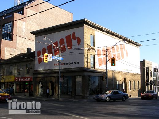
Bauhaus-Condos-King-Sherbourne-Oct-31-2008-DSCF0402.jpg
 
aA or Core should be able to pull off inspired Bauhaus design. Clean, minimal. Lot of glass; lot of mullions.
 
"Bauhaus is a new condo development by Lamb Development Corp. and Fortress Real Developments currently in preconstruction at 284 King Street East, Toronto. The development is scheduled for completion in 2021. The development has a total of 205 units."

205 Units
30 Stories

https://www.buzzbuze.com/ca/bauhaus

BUT THIS PLACE SAYS:

"Bauhaus is a new condo development by Lamb Development Corp. Prices are estimated to be starting from $300,000+ and the project will feature a total of 190 units at 20 storeys. Bauhaus is estimated to be completed in 2020 and will be located on 284 King Street East in Toronto."

http://www.condoroyalty.com/bauhaus-condos

found this on google says the architect is TACT Design INC:

bauhaus-condos-lamb-development-toronto-mycondoclub.jpg
 
Last edited by a moderator:
I have to say, I'm pretty consistently impressed with what I see from Lamb. It's obviously hard to tell from a single image, but it looks pretty sleek. The only thing I'm not a fan of is the awkward relationship to the building on the right. The podium of this tower could line up with the roofline of the building next door, or simply remain at one height (the height of the rest of the podium), and it would be much better.
 
found this on google says the architect is TACT Design INC:

bauhaus-condos-lamb-development-toronto-mycondoclub.jpg
Well, real estate agent Andrew Lafleur at truecondos.com has screwed that image up somewhat hilariously, as well as most of the rest of the info on that page. That's an early image of what became King + Condos. That was TACT, and the first redevelopment there was to be called Bauhaus in, like, the 1800s or something. Catch up Andrew!

42
 
I have to say, I'm pretty consistently impressed with what I see from Lamb. It's obviously hard to tell from a single image, but it looks pretty sleek. The only thing I'm not a fan of is the awkward relationship to the building on the right. The podium of this tower could line up with the roofline of the building next door, or simply remain at one height (the height of the rest of the podium), and it would be much better.

Makes sense. I also happen to like that a gap filling addition wasn't just thrown in for the sake of a beefier street wall. I do find the loading dock entrance (?) a little too utilitarian. Here was an opportunity to do something more Toronto, etc. Recreate or buy a small heritage facade being stored or facing demolition and squeeze it in the space.
 

Back
Top