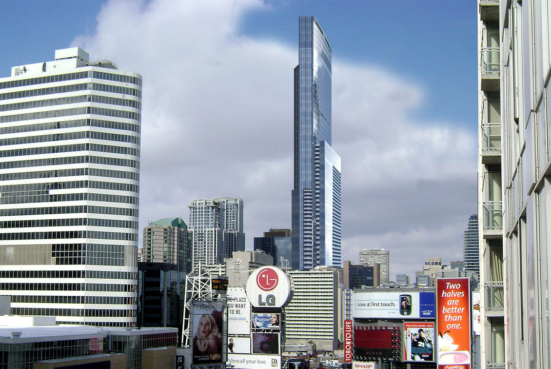
Toronto Aura at College Park | 271.87m | 78s | Canderel | Graziani + Corazza

You actually think the original kitchy base was better than the version we have now??

They should have forbidden the developer to develop the land...period. Or force them to work with aA or Nomade architects. That would've been the best solution.

As it stands, it has a committee-designed base and shadowing issues with a craptacular top. It reminds me of the last generation Toyota Celica: one designer did the back another committee did the front: disastrous!

The City of Toronto's planning department has its priorities totally wrong--the last thing they should worry about is shadowing issues (all objects cast shadows--duh!) rather they should demand (dictator-style) good design; if good design is aA what the hell would stunningly great design be? And what do bureaucrats know about contemporary architecture? Even if they had a few Toronto architects around a table--Toronto being a small community of architects I highly doubt anything of substance could be accomplished without starting some cry-baby feud.

As it stands, the committee merely allowed mediocre architecture to continue to get built in Toronto. Yet they get to congratulate each other in the Press, get to hang out with the developer etc because the "committee did it." Bullocks imho! The committee, or team of mediocrity imho, allowed a developer with a history of crappy buildings to ultimately get his way.
Forbidding someone from developing their own land would get laughed out of the OMB in two minutes flat. And telling them which architect they can work with would get thown out of court in about 30 seconds. I don't remember shadows being a big issue - the building is 800 plus feet tall. The city's issues were with the design. There weren't any major height reductions that I can remember.

You keep moaning about Toronto architecture. Which cities meet your standards?
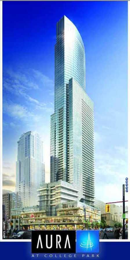
 
I don't know, I definitely find the current design, post review panel, to be significantly better in pretty much every way than the initial design some time back. It's nowhere near as potentially disasterous now.
 
I think urbandreamer is pretty much the lone voice for the opposition here. While I like aA much better than G+C too, without turning this country into my own banana republic, I can't outlaw G+C, so I am glad they had a design panel to critique their work. The input they got from the panel definitely improved this plan immensely.

42
 
This building is awkward but the design review process has certainly helped the base out (and lord knows this firm needs help when it comes to the base of a building).
 
I stand with UD on this one. Building looks awkward to me. And it looks like its turning its back to the core.

Not sure what you mean by this Ed.

I think the rendering could be perceived as awkward but the tower doesn't turn it's back in any direction... the upper portions of the west half of the curtainwall climbs from south to north, connecting with the east half of the curtain wall which continues to climb from north to south to the tower apex (nodding to the financial district if you will).

Based on the original elevations and the commitment to curtainwall for the upper part of the tower... I'd strongly suggest that this tower will be far more successful/attractive than the renders suggest (notwithstanding the much-maligned architects and developers).

And I think the "designed by committee" base is very attractive indeed.

Hoping for green glass of course...
 
auralead.jpg


It could just be the rendering but this looks to me like the backend of the tower. Maybe it would look different to me if it actually sat right on Gerrard and not set back with that odd 8 storey podium addition.
 
Part of the community consultation process resulted in various set-backs. The developer shifted the location of the tower due to a variety of concerns through a consultation process that lasted close to a year-in-length. Virtually all aspects to the design have gone through numerous changes beyond what the general public has seen in various renderings and drawings posted on urban toronto - changes that a major such as the shape and orientation of the tower, to a multitude of minor shifting of elements such as moving the podium back two feet here and then a foot there... or shifting exterior lighting for safety to view protection screens, to material/colour palates and the list goes on and on. This thing has been designed to death as every stakeholder wants thier various issues resolved. Love it or hate it, almost everything you see in the design/rendering was an outcome of either the public/stakeholder consultation process with the city/planning department or the design review process.
 
I noticed that the sales centre is open and a huge model now graces the lobby. I've been too busy to go in, but hopefully somebody can take a picture of it.
 
And we can use that amazing render that 3D did now....

^ what's your source?

I'm still planning on watching the "85 storey" version rise (assuming the city allows it and the market supports it). I think 280 metres would be just the skyline exclamation mark that is needed between the main core and the exploding Bloor/Yorkville skyline.


aura-pov.jpg
 

Back
Top