News   Nov 07, 2024
 671     0 
News   Nov 07, 2024
 286     0 
News   Nov 07, 2024
 769     1 

Toronto Architecture From The 1960's and 70's

pman: When these buildings are bad, they are very bad. HBC and, I think, Four Seasons are bad. And even the best of them tend to have failings where they meet the street.

But you can't blame the architects entirely for the mistaken planning ideas of the time. A building was something you drove to rather than approached on foot. Urban plazas and setbacks make more sense in that context.

So at the Sheraton the internal gardens relate beautifully to the interior spaces, but the Queen St frontage is basically ignored. Even Nathan Phillips Square tries consciously to shut out the street instead of relate to it.

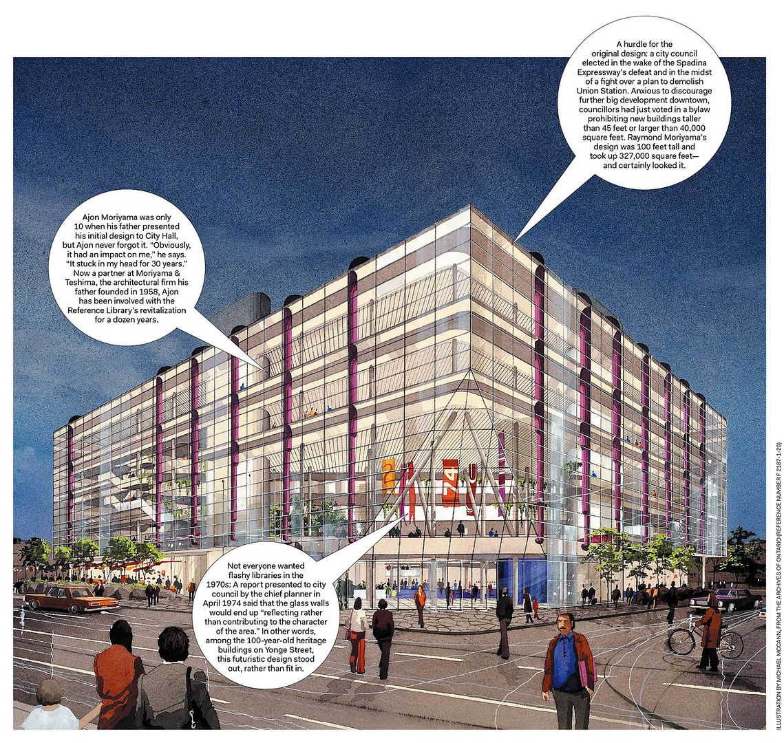
As to the Reference Library: Moriyama's original plan was for a cube of mirrored glass. The brick and the setbacks were forced on him by politicians and the community.
 
8fba05e4.gif

01a41969.gif


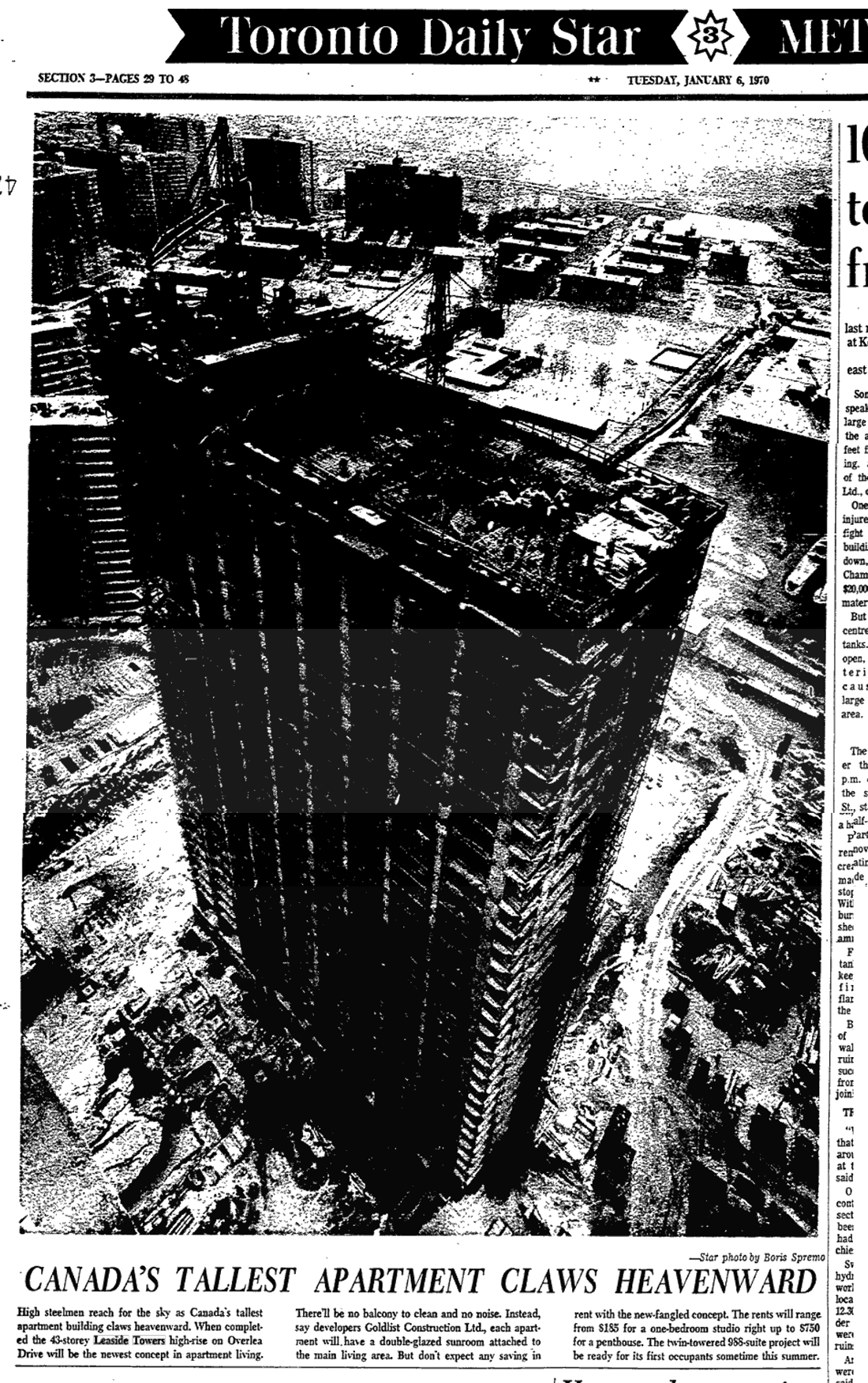
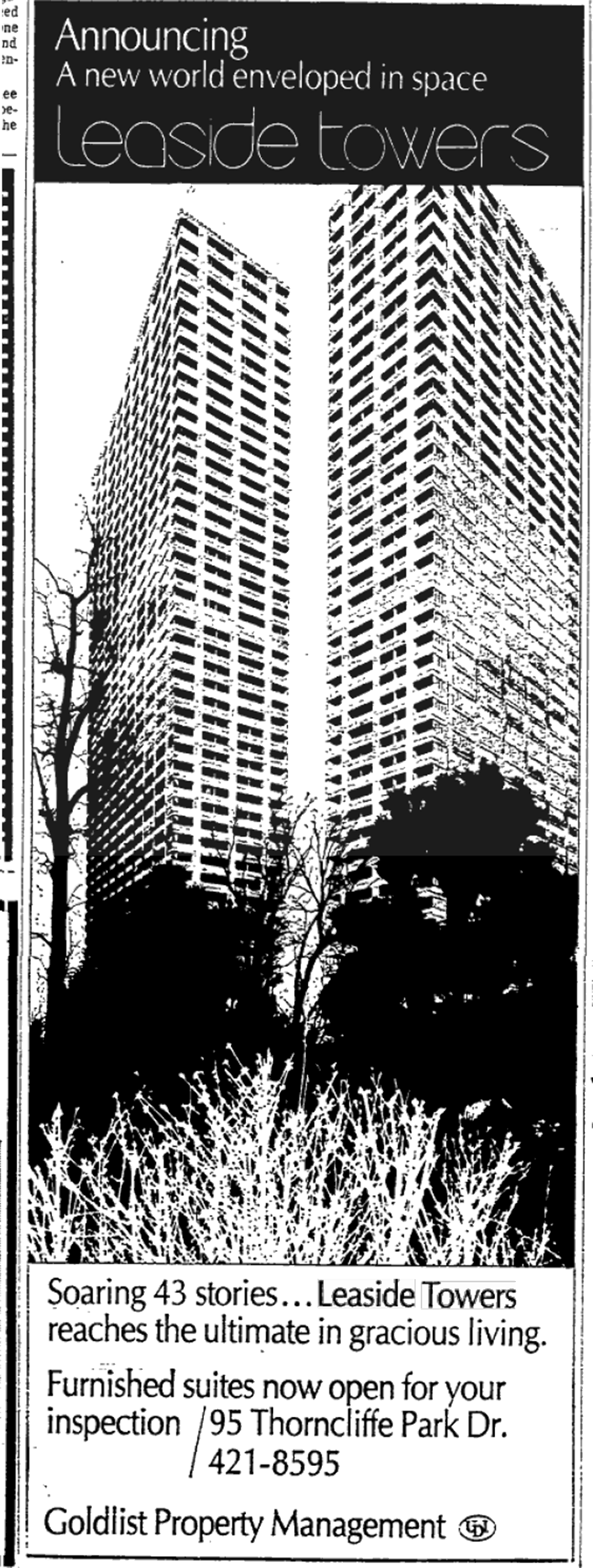
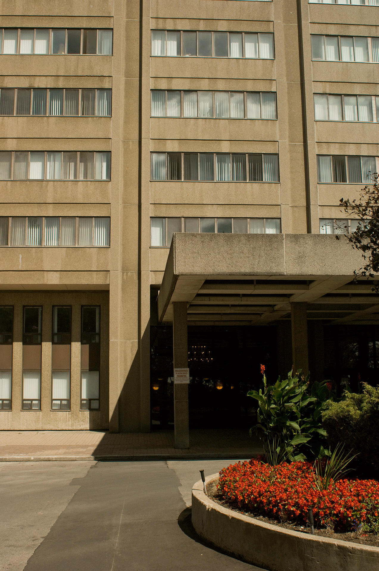
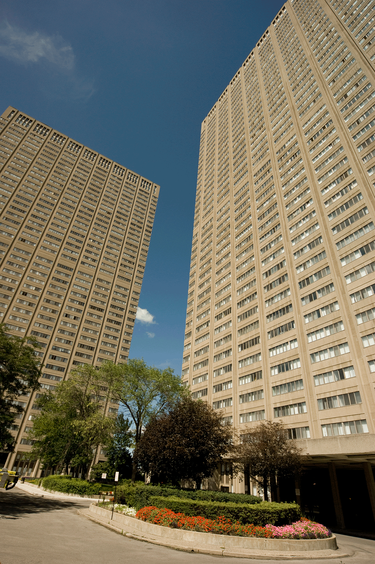
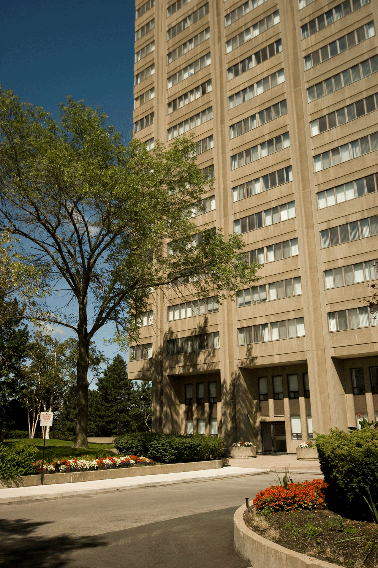
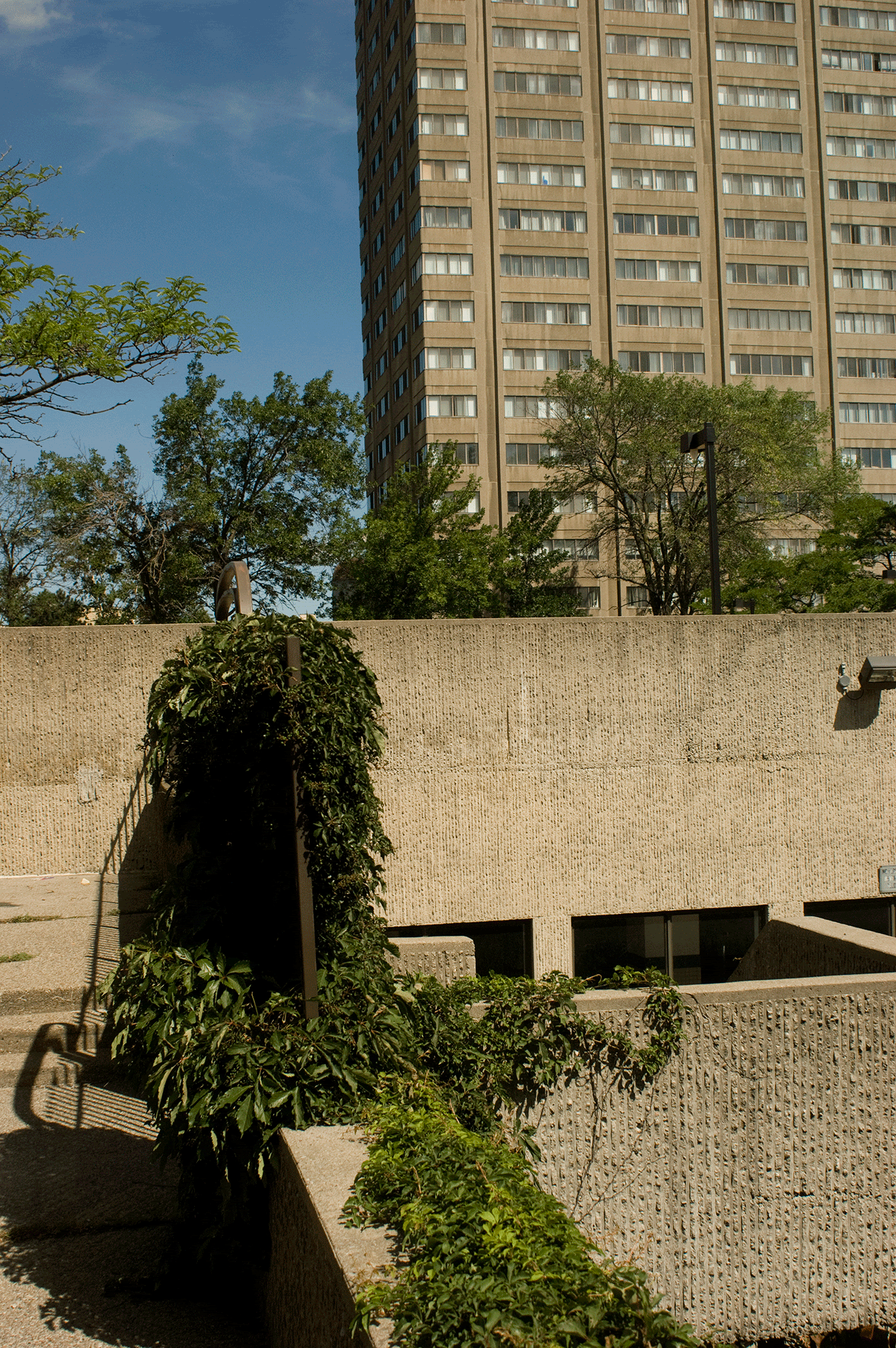
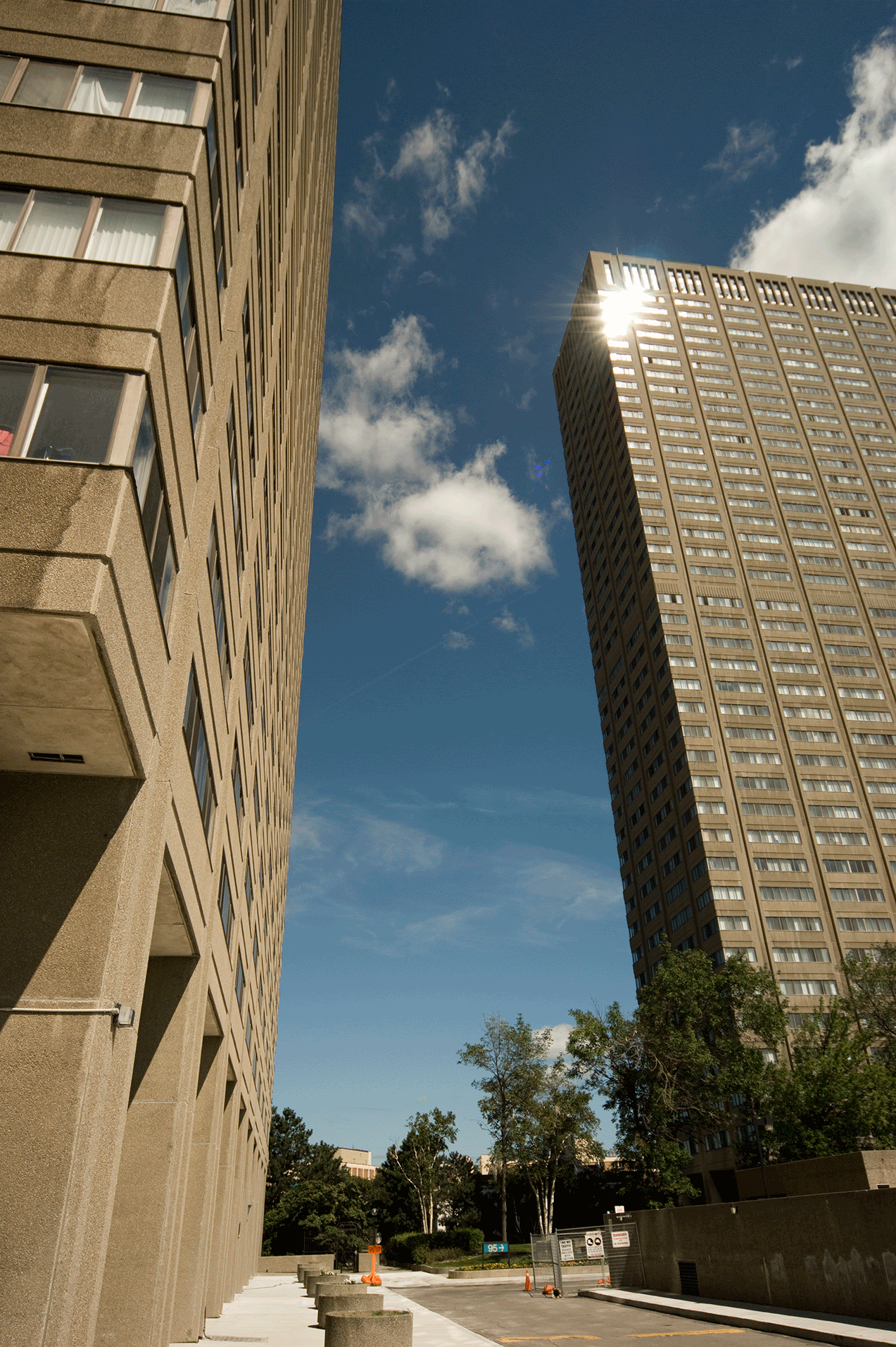
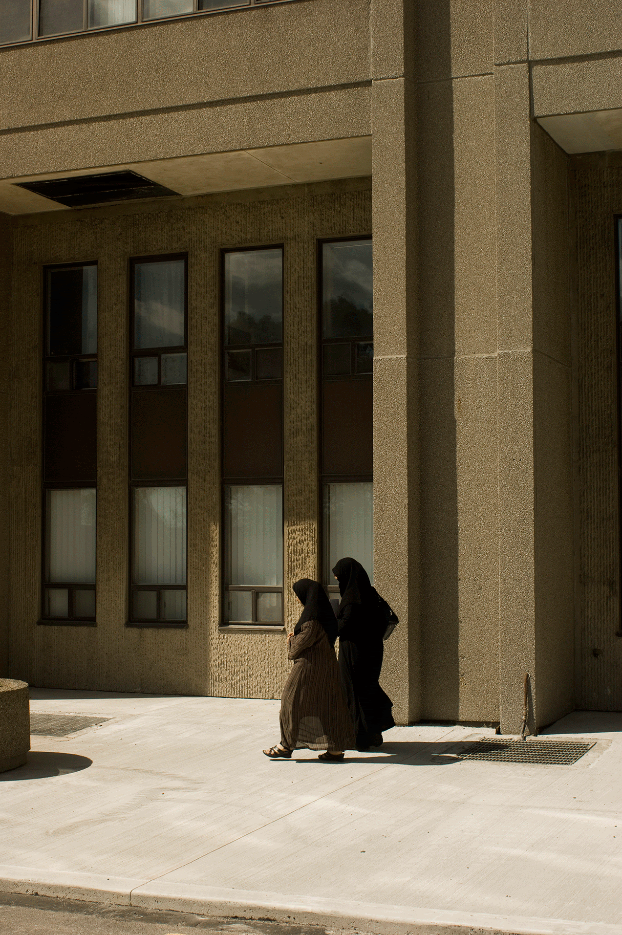
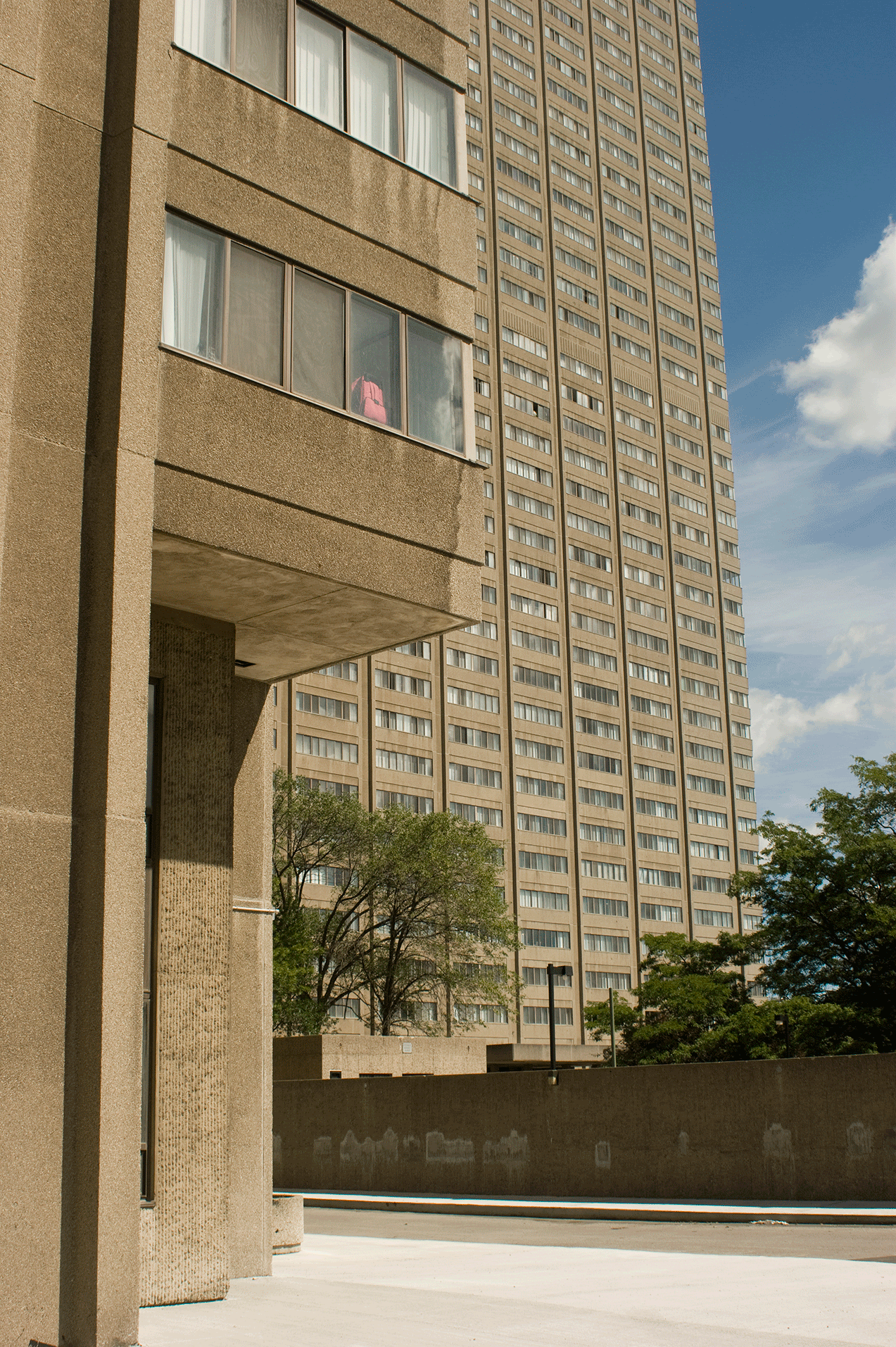
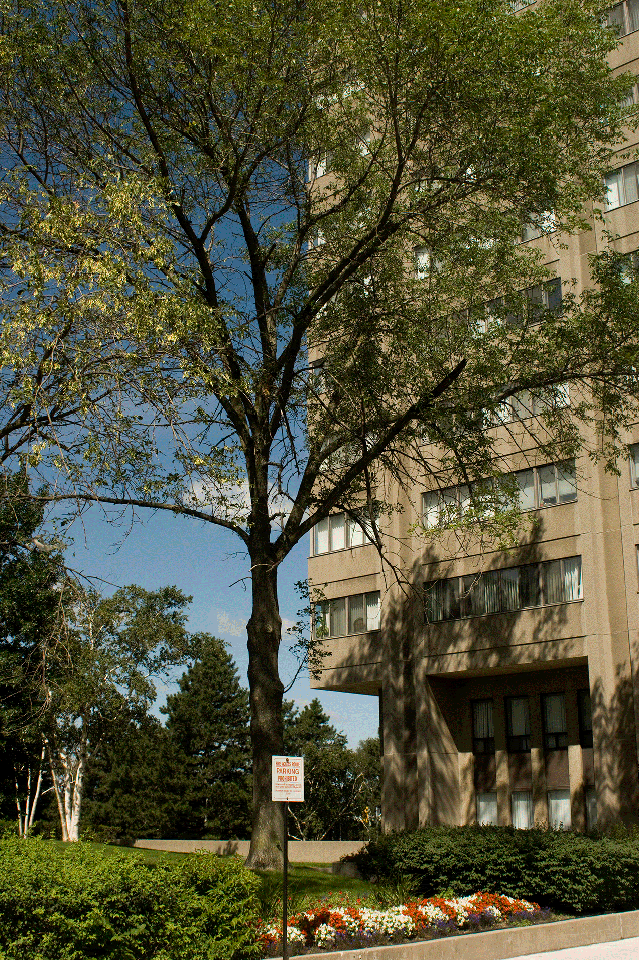
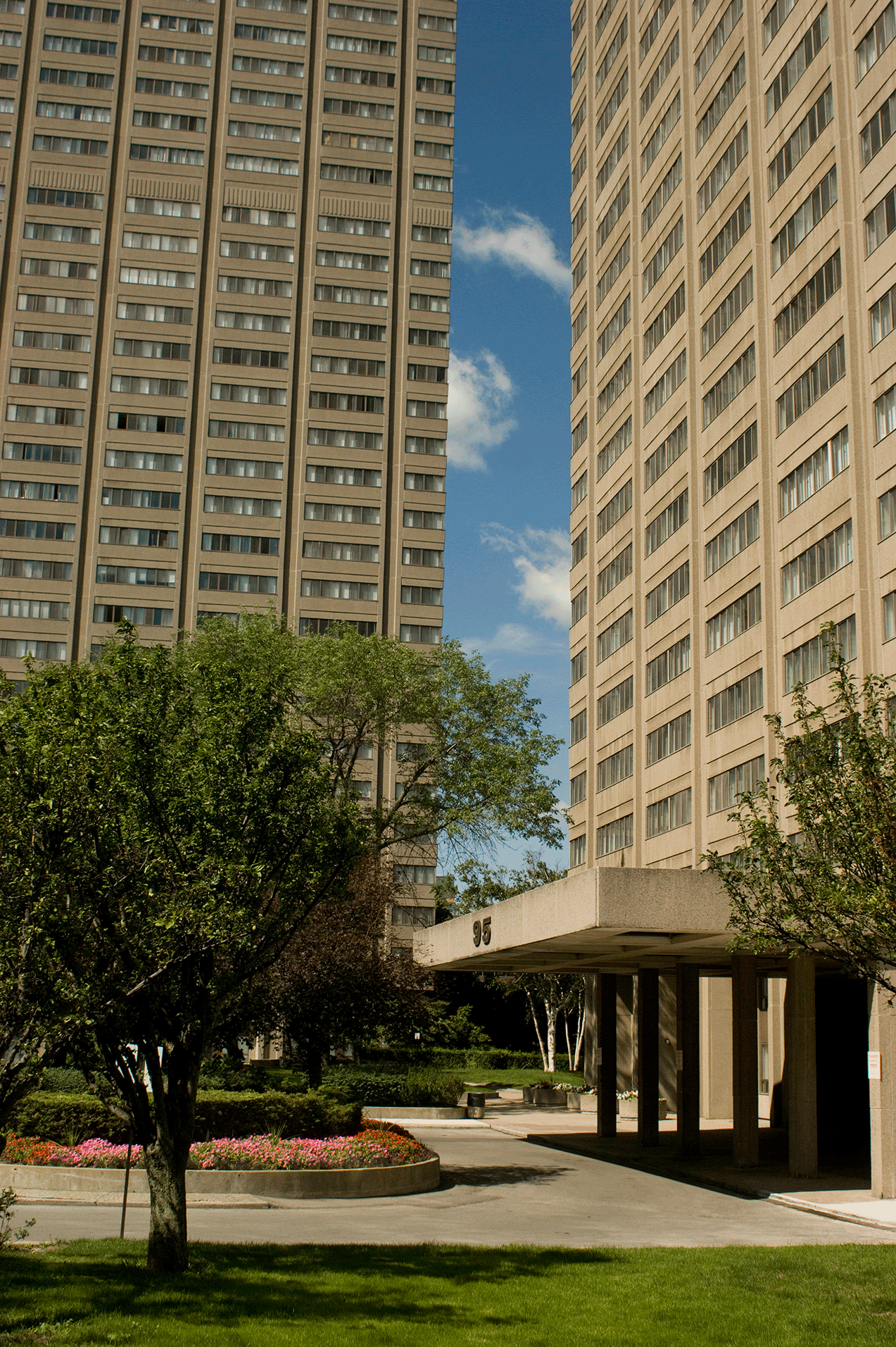
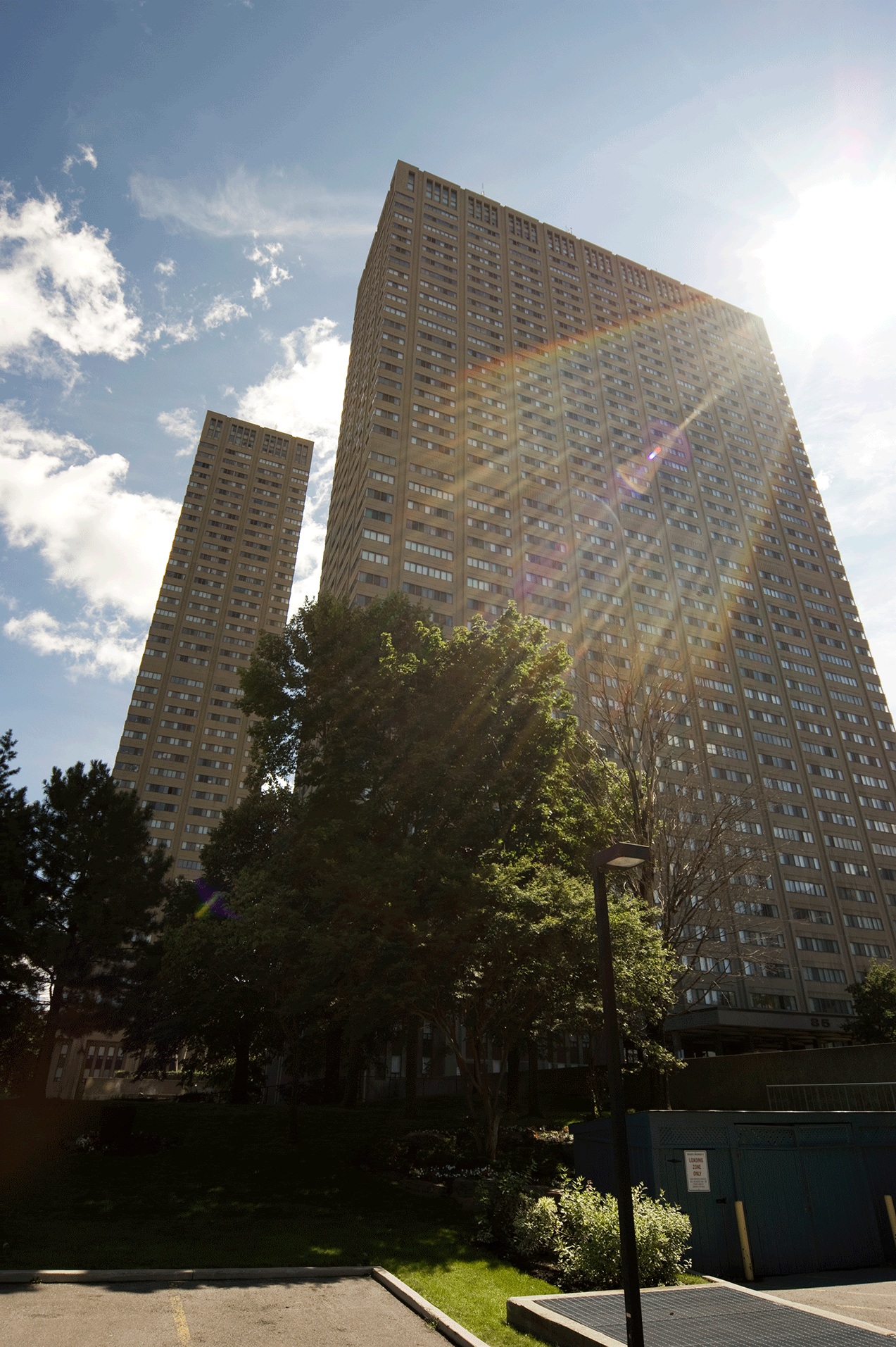
Leaside Towers, 1970
Architect: Alexander Benedek

852ed8e3.gif

14e0aed9.gif

a2fb4e86.gif

ee489d42.gif

46054ae8.gif

303b36fe.gif

bd741bad.gif

cca109c1.gif

fc8e84a5.gif

9a435ccf.gif
 
Leaside towers, IMHO a very nice complex! I am not sure about some of the recent changes though. Back in the 70's I had a friend or two that lived there.
His bedroom was actually the "double glazed sunroom". A very cool one I should say. I remember some of the seventies decor that really made me say "WOW"
One hallway had IIRC purple shag carpet up the wall half way or so. It was then bordered by a row of mirror tiles complete with gold marbling! Very dark hallways and neat glowing orange touch buttons in the elevators.
Across the valley to the east sits the high school I attended. One very windy day a few friends and myself watched the north tower sway in the wind. We put a marker line on the window we were looking out of to mark the edge of the tower. We could literally see it move, almost a quarter of an inch away from the line.
 
Given the choice, I wonder if Torontonians would prefer to live/work in "brutal" or antique structures.

RobartsLibrary.jpg
 
Given the choice, I wonder if Torontonians would prefer to live/work in "brutal" or antique structures.

I lived in a Gropius-designed dorm for a year. It was Bauhaus of course, not Brutal, but maybe in the same ballpark. While the building was featured in some architecture books, it was pretty soulless, and was referred to by some of its residents as a monastery without God. There were a couple of adjacent residences from the late 1800's / early 1900's which were generally considered more desirable.

I followed that by living in a truly brutal grad student apartment complex which, unlike the fair dinkum public housing across the street, had a cameo role as a really gritty project in the not-much-acclaimed Spencer for Hire. In spite of the monumentally ugly concrete exterior, the apartments were pretty well designed with a lot of light and space and great views. Painting the interior concrete walls a very stark white really helped.

When I think of how much I generally dislike brutal architecture, I also have to admit that the one time I lived in it I actually liked it. I wonder if the answer to the question is building-specific.
 
Great pics, deepend, of a very elegant building.

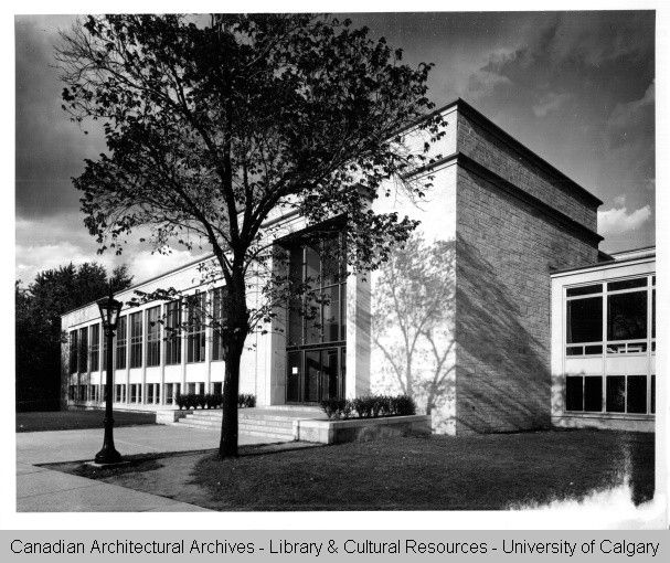
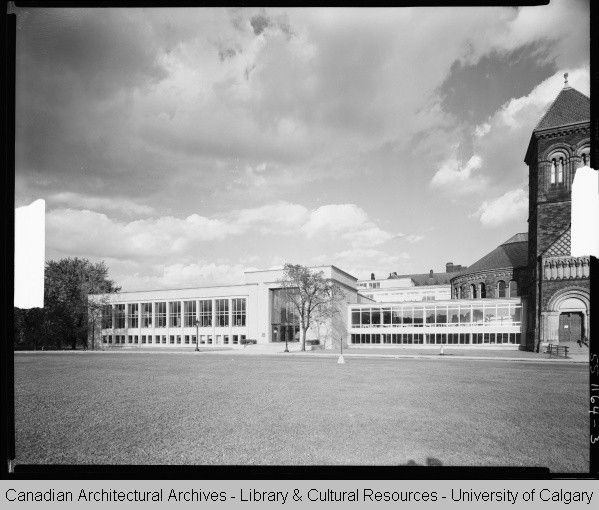
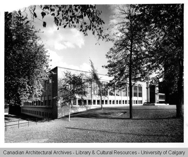
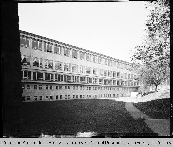
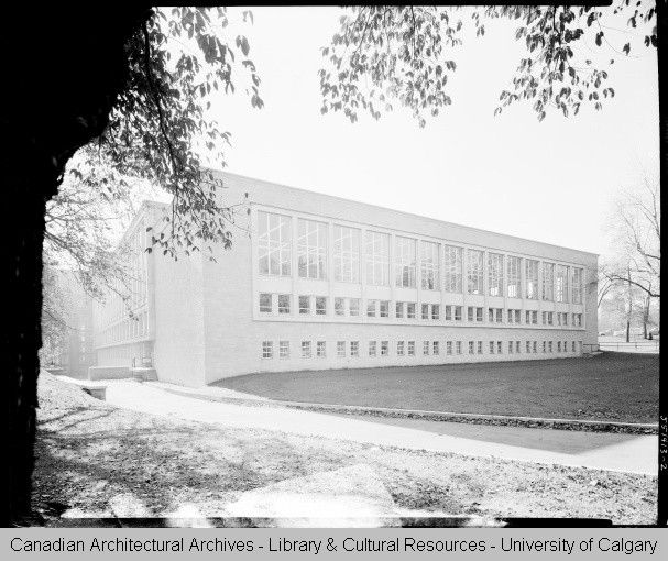
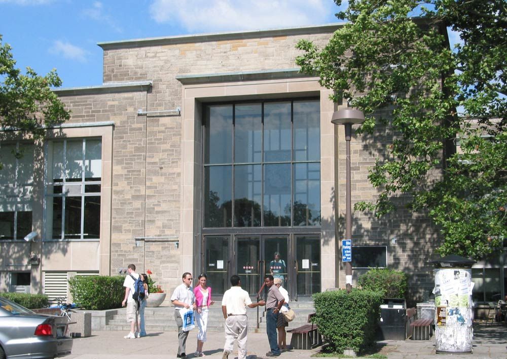
Hope you don't mind me adding a building from the 1950's, but I've always thought that the Sigmund Samuel Library at U of T (Mathers and Haldenby 1955) was a well-done, under-rated building:

sigmundsamuellibrary1955b.jpg


sigmundsamuellibrary1955.jpg


sigmundsamuellibrary1955a.jpg


sigmundsamuellibrary1955d.jpg


sigmundsamuellibrary1955c.jpg


SigmundSamuel.jpg
 
Great pics, deepend, of a very elegant building.

Hope you don't mind me adding a building from the 1950's, but I've always thought that the Sigmund Samuel Library at U of T (Mathers and Haldenby 1955) was a well-done, under-rated building:

thank you Charioteer! i love SigSam as well....
please add as many buildings to the thread as you like!
we all know the lines between styles, eras and decades is extremely malleable, and there are a lot of mid-late 50's buildings that could be included here.
 
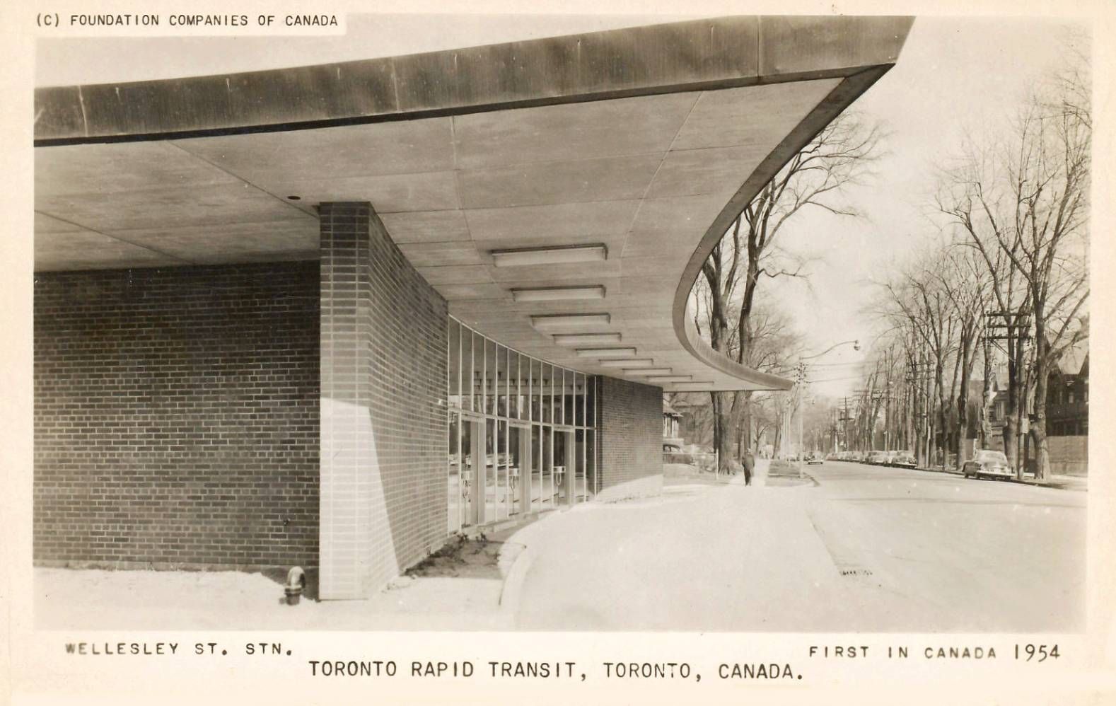
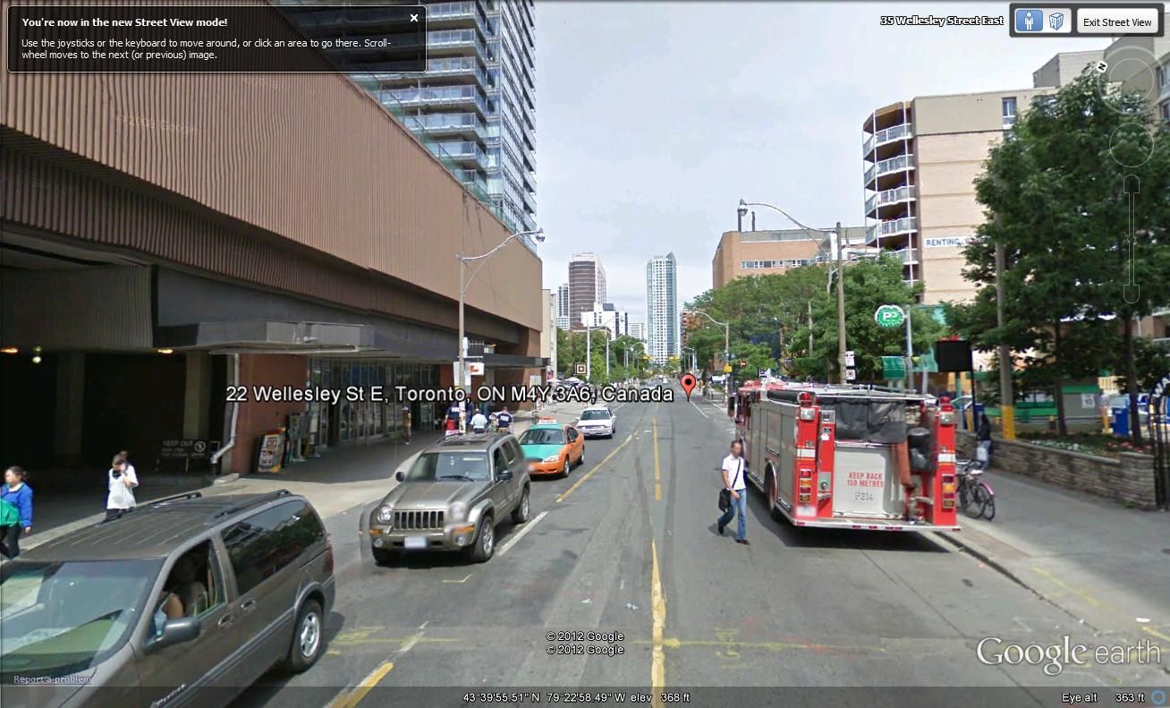
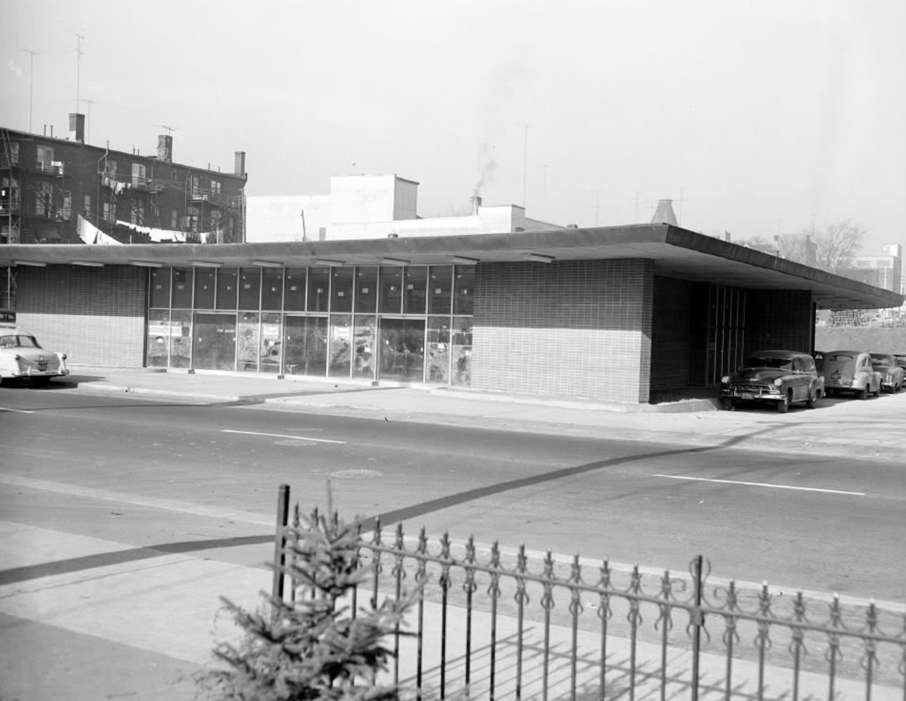
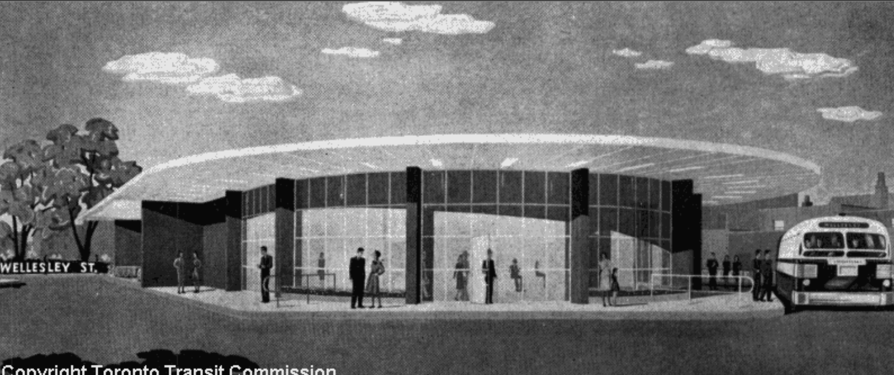
For a building that was added to the Inventory of Heritage Properties in 1984, the canopy is in extremely sad condition:

wow, i wonder what led to the imposition of that wall of horrible brown sheet metal across the top of the building. second story parking? surely there was another way....

39c7e660.png

7f505867.png
 
As to the Reference Library: Moriyama's original plan was for a cube of mirrored glass. The brick and the setbacks were forced on him by politicians and the community.

the original 1973 plan with word bubbles--from The Grid, 01.28.12

0ea64c97.jpg
 

Back
Top