Toronto 87 Peter | 156.05m | 49s | Menkes | Core Architects

Would blue or green spandrel make that much of a difference?

Sure there's a lot of grey. I just find the forum gets too easily sidetracked on colour and forget about design. It's not always grey but, it is not just this city that favour one colour either.
 
I know you're asking somewhat rhetorically, but yes, any colour other than gray, (assuming they're not just some washed out excuse for colour), would be better. As long as the choices are made with some design intelligence, we'd still be a step ahead. The bigger step is of course to build with better materials, no one would disagree with that, but I don't fault anyone who complains about gray all on its own: we've had more than enough of it.

42
 
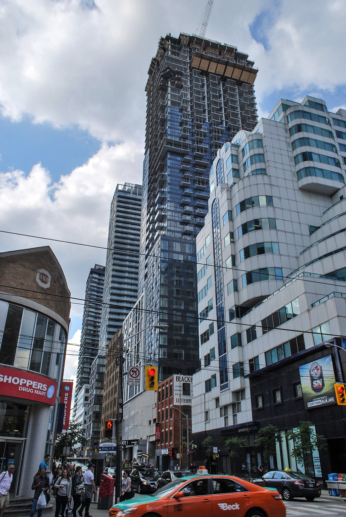
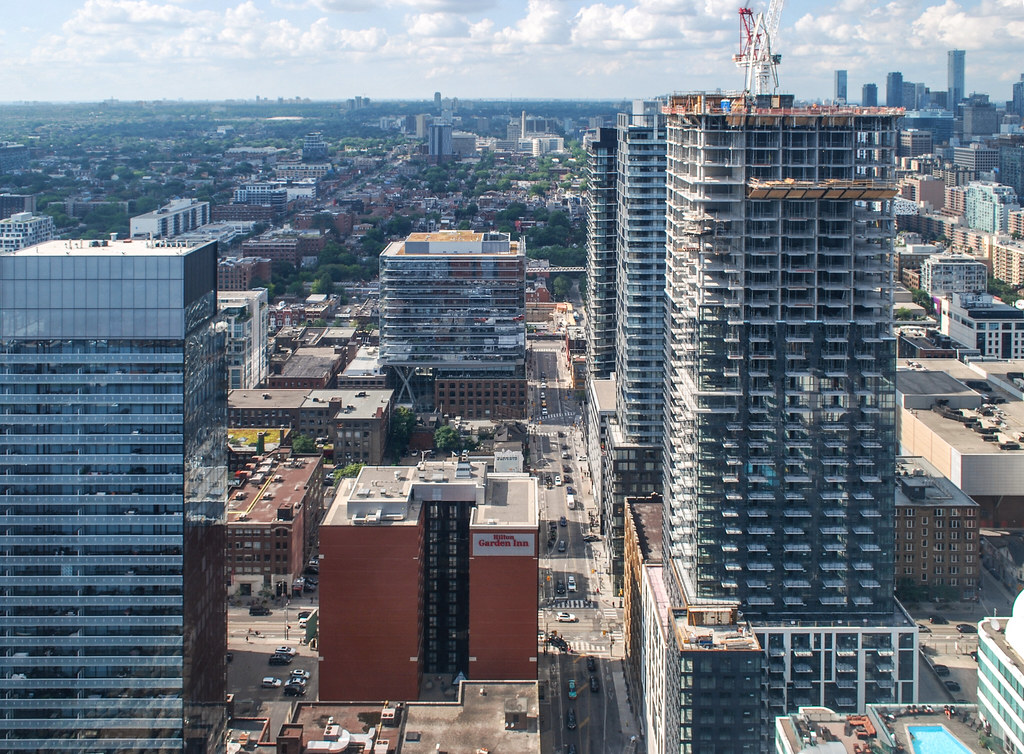
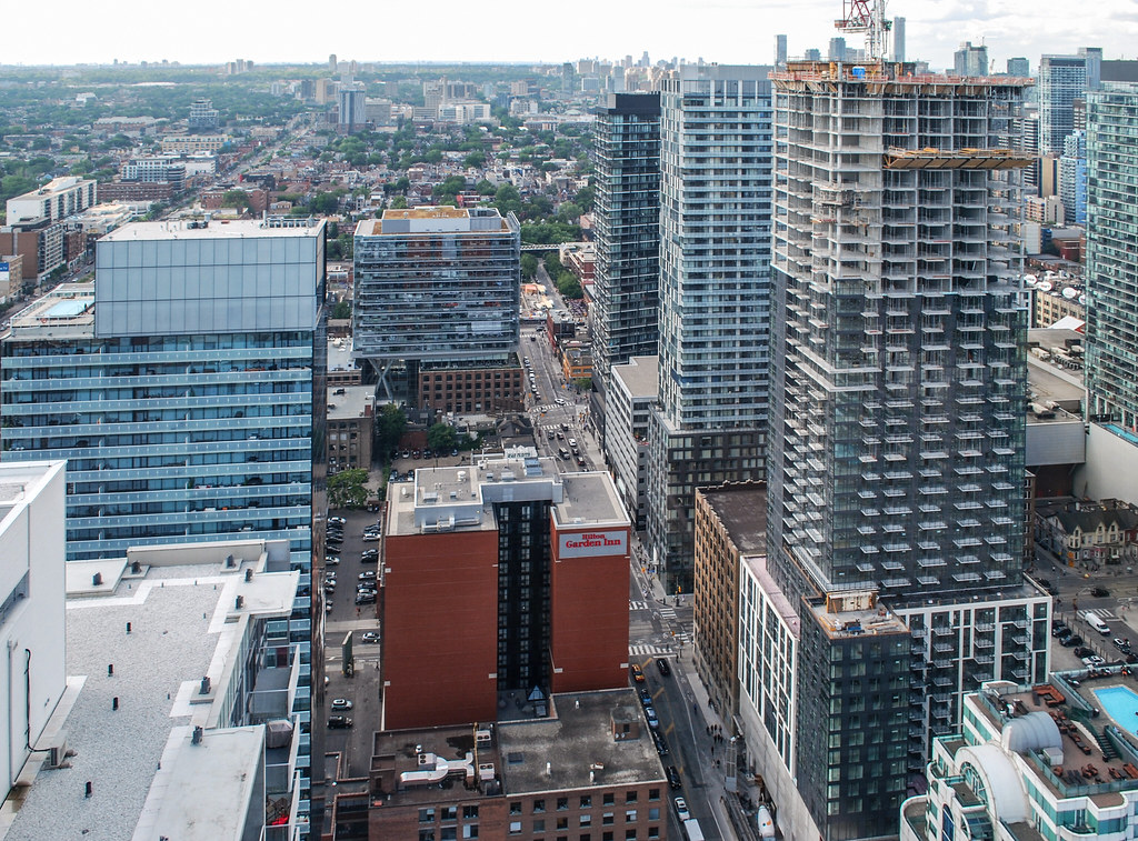
Monday afternoon:
DSC_0200.jpg
 

Attachments

  • DSC_0200.jpg
    DSC_0200.jpg
    1.3 MB · Views: 507
It's not only the prevaling grayness, but also a sameness of look and heights in this area that disappoints. For an entertainment district, could we not have some sparkle ? While there's nothing damnably wrong with the individual projects here, the overall effect is assembly- line predictable. The cityscape is anaesthetized similarly in the bland development just south of the tracks. Perhaps something as been learned however ; on the flip side, at the eastern waterfront something quite marvellous and engaging is unfolding.
 
i don't know about that, it seems to be one of the better looking buildings that stands out in that district

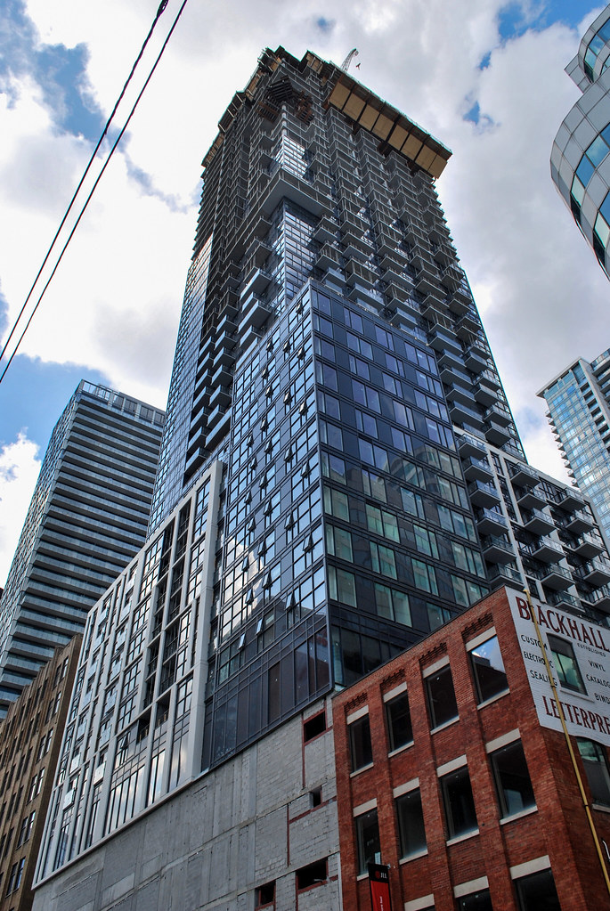
Thats becuase of its rich dark glazed windows mixed in with the white trimmed beams etc. That adds alot of contrast to this struture making it pop out than the others.
 
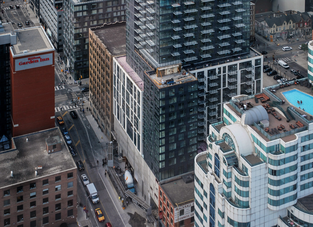
I won't defend the tower or its repetition of the grey cube theme that all too often afflicts Toronto - and in this case, it is a rather beefy cube. The podium is a bit better, creating a solid streetwall with two volumes and a sharp light/dark contrast (with some form of public art coming to add some pizzaaz to the pedestrian experience).

It is true that the table-top height restriction has created a sense of emergent uniformity more suited to a planned economy than an entertainment district, but to suggest uniformity of design is disingenuous. The Peter/Richmond intersection is one of the city's most interesting in my view, with QRC and its inventive adaptive reuse, Tableau and its striking black cladding and engaging curves (to to mention neon green art piece), the orange city shelter, and plans for an interesting podium on the southwest corner. Plus there is Picasso, arguably Toronto's most playful tower. Even the relatively banal towers in the Festival cluster are fairly distinct - though there is a grey cladding theme that begins to emerge with Bond and Pinnacle. Hopefully PJ will be a good addition. Nonetheless, a few of the recent proposals have been terrible (i.e. 40 Widmer), and the ED is always threatened by grey banality - but it isn't all bad.
 
Last edited:
There's very like architectural foresight that went into this. It just exists. The placement of the balconies and the bulbous massing says it all. The greyness or the table top skyline are too common distractions on UT. This would be a mediocre tower at 200 metres clad in blue or gold or charcoal or rose or bronze ...

We're not building an Entertainment District here either. We are replacing one (a mediocre one that peaked 10 plus years ago) with an affordable, mid range, high density (perhaps too high) residential district within walking distance of a major employment district.
 
Last edited:
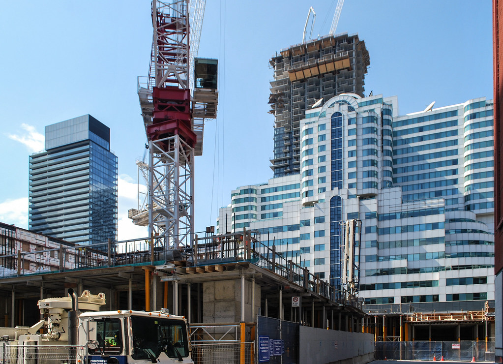
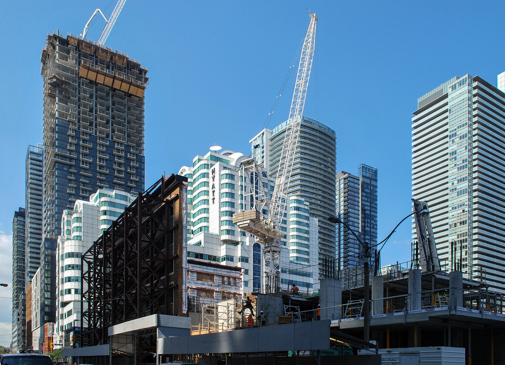
Thanks for the amazing pics! I love that new urban canyon.

And btw, what are they going to do with that blank podium wall facing the street?
 
Damn, that Peter St street wall! So good!

Also, the Hyatt is the best looking building down here. Put a designation on it.
 

Back
Top