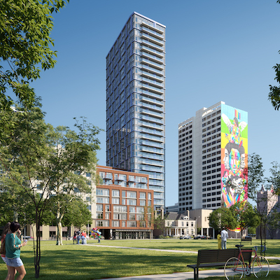
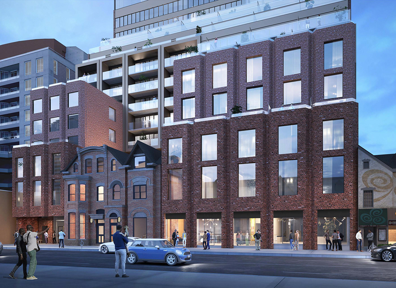
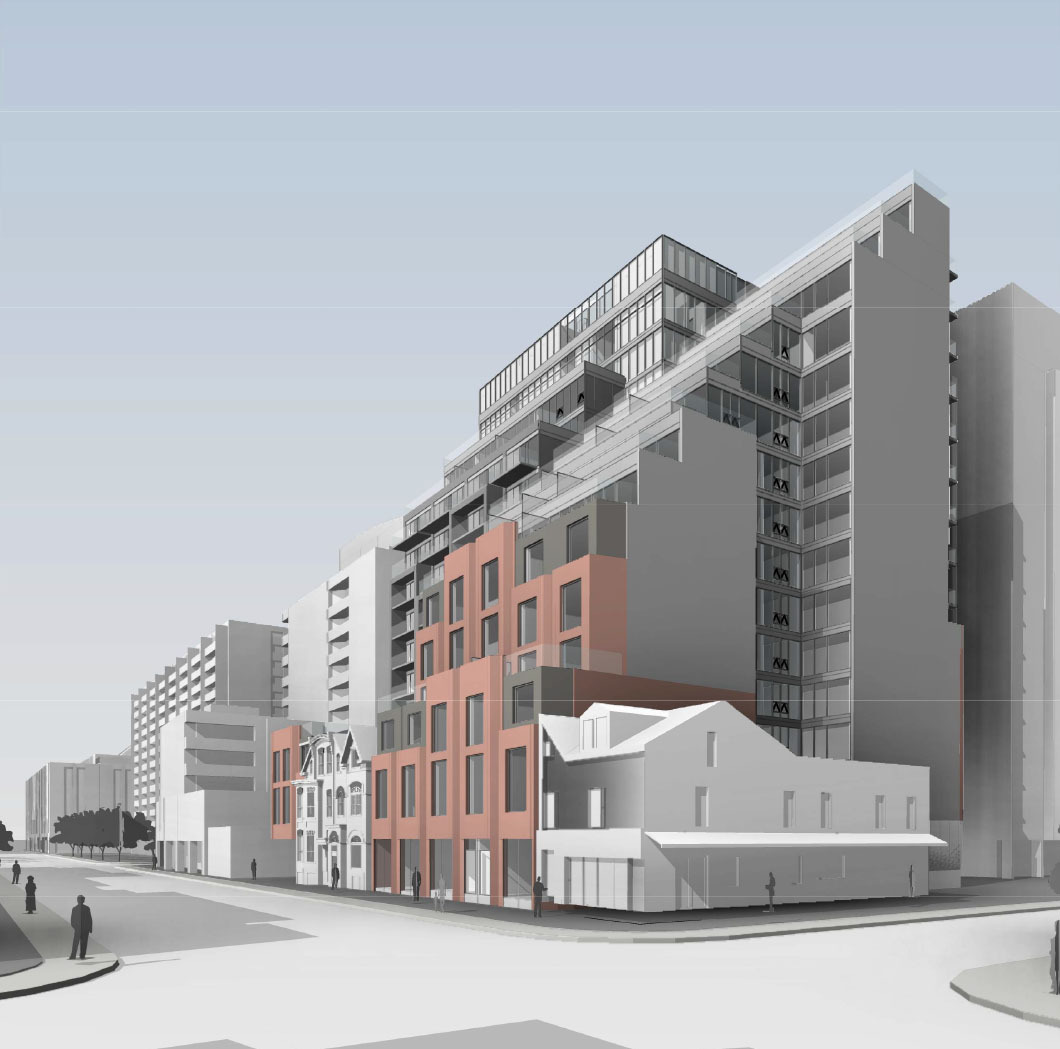
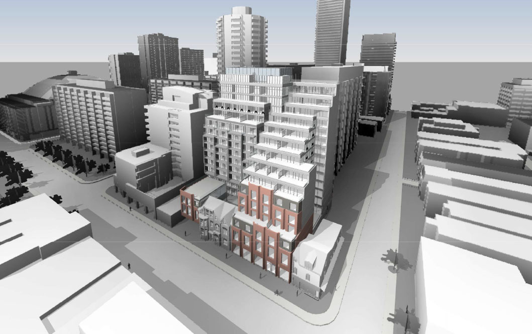
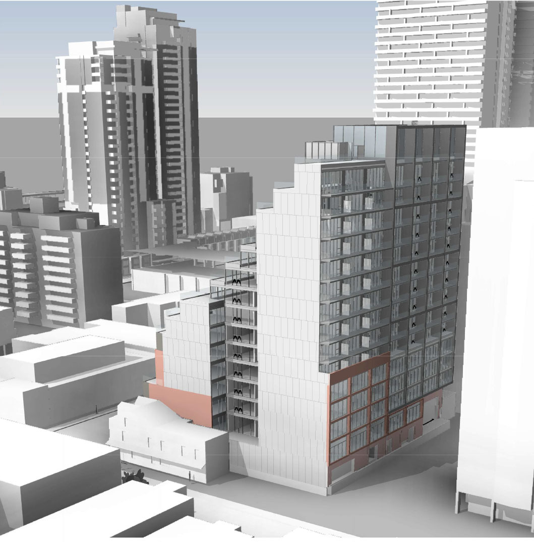
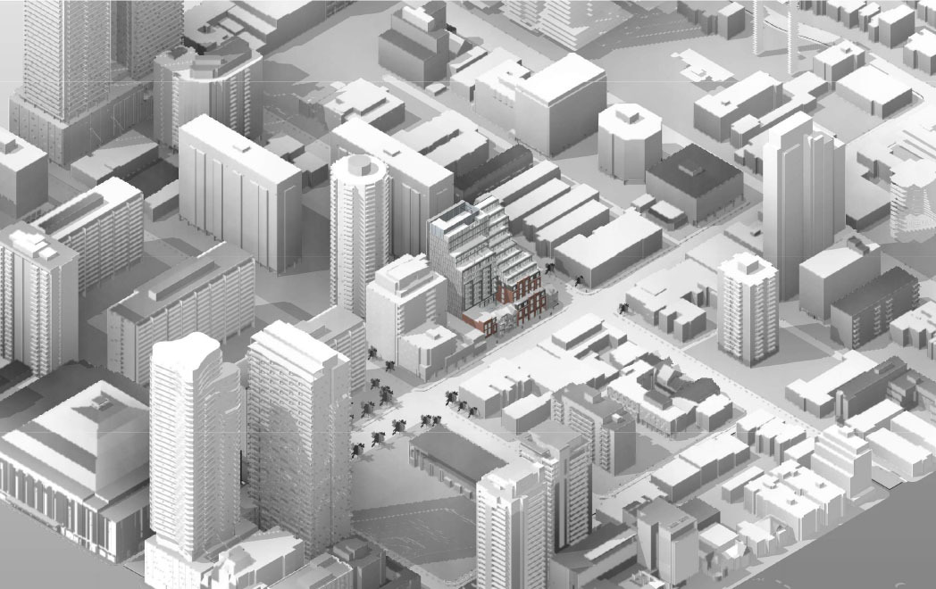
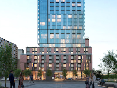
While the lower reaches are not exactly beautiful, that doesn't tend to be the part of Campus One that people hate particularly. In the meantime, as it says in our front page article, Diamond Schmitt have indicated that they only consider the current image to represent a massing model, that they have not applied a design to it yet. Campus One's early massing model looked nothing like what we ended up with - it looked great - go back to the early pages of that thread before the City said no to the height and Knightstone applied the screws on the exterior.We’re talking here about the composition of the facades? The strategy of staggering rectangles of brick and glazing is not purely about budget. It’s a design strategy. Which nobody seems to like.
View attachment 261084
42
