Times Group doesn't make ugly looking buildings IMO. They may be bland but all of their buildings look reasonably good. I'm giving them the benefit of the doubt here. That Loft building looks great.
With that said....I can understand how some people don't like it.
i'm starting to really like this builder. they have decent quality of standard finish....definitely surpasses Conservatory Group/Monarch that's for sure (IMO).
going to definitely keep an eye on this builder and their future projects.
(wow, it's almost 5am and i'm still up using UT....hmm..the timestamp on my post is 1hour behind)
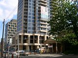
It will look great in the skyline, but the beige is still shitty up close. Thankfully, it looks much better than I had envisioned when it first started to go up. There are still numerous damaged precast pieces that I hope the builder replaces.
Times Group doesn't make ugly looking buildings IMO. They may be bland but all of their buildings look reasonably good. I'm giving them the benefit of the doubt here. That Loft building looks great.
With that said....I can understand how some people don't like it.
Really? I don't see any wood or anything like wood at all. Everything seems to look like precast.
I love how people drool for Verve and other buildings with precast, but this tower which uses interesting shapes as well gets a poor grade. I think it's a very snappy, tasteful colour and the shapes used at the base are interesting. It has the stance of a spaceship. Precast is hardly offensive when it's smooth like that.
Did anyone drool over Verve?! I think the general consensus was that it was a welcome change to an otherwise older neighbourhood rife with bland highrises from the 60's & 70's.
So far, my main problem is that the precast and the cladding/windows clash. Light beige contrasted with gray doesn't do it for me. The massing of the building is fine and overall design mostly uninspired but it's a refreshing change from what stands nearby. Like Verve, this is another building that so far appears to be just "OK", but mostly a missed opportunity in a somewhat dull neighbourhood. Hopefully James Cooper Mansion will bring some highrise excitement to this area.
By fall, we'll see how it all turns out in the end.
I think they should've just pulled a Kowloon and built another tower on the grounds of that park. It's not really greenspace, anyway - walking on it feels like being in a gigantic ashtray.