Toronto 266 Royal York | 127m | 37s | Sevoy Developments | Arcadis

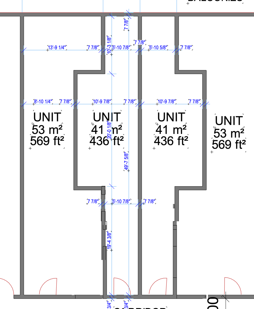
So, this is in my ongoing list of worst layouts I have seen. I had to check for myself so I scaled the plans up and measured it (they may not be 100% bang on I'm just scaling these from the pdf) . I have to say I have zero clue what they are even thinking for the proposed layouts here. (19'-4" x 5'-11 entrance hallway?)
Screen Shot 2022-01-28 at 4.59.21 PM.png
 
Somewhere, Brad Lamb is smiling:
I think you mean taking notes 😂, even the terrible layouts at Sterling Automotive weren't quite as ballsy as this IMO. The only one I could think of that was potentially as bad was the Units of Sadness in the corner of the project at 10 St Mary, but it's always a race to the bottom. ¯\_(ツ)_/¯
 
I don't understand* why we have laws about like angular plane and stuff like that to defer to nearby homes or step back from the street etc. but we don't have laws (or at least sufficient ones it seems) about appropriate unit size/proportions/layouts/amount of windows and light/etc.

* I mean I do understand, but it's depressing.
 
Last edited:
Lamb loves his bowling alley units but they are typically larger than that and at least have halfway functional layouts.
 
I don't understand* why we have laws about like angular plane and stuff like that to defer to nearby homes or step back from the street etc. but we don't have laws (or at least sufficient ones it seems) about appropriate unit size/proportions/layouts/amount of windows and light/etc.

Building code and municipal (Toronto) bylaws have plenty to say about natural light requirements, both minimum (per bedroom) and maximum (building as a whole).
 
Building code and municipal (Toronto) bylaws have plenty to say about natural light requirements, both minimum (per bedroom) and maximum (building as a whole).
Good to know we've got that part! (Though these super narrow and deep layouts still seem unfortunate to me from that access to windowlight perspective.) I imagine writing up laws around unit layout and proportions and stuff could be difficult to define and difficult to apply to all circumstances, but maybe hopefully something possible.
 
To make it even better, the 1113sf unit at the bottom right appears to have only a single window in the rendering!

Burn it with fire. Who in the hell is the developer here?

Edit: Fieldgate.
Fieldgate have sent us a note. There may be some ownership relationship here, but they say this is not a Fieldgate project.

42
 
New renderings are updated in the database. The overall storey count changed from 37 storeys to 37 storeys & 23 storeys. Total building height changed from 121.00m to 127.00m & 84.00m. The total unit count was reduced from 826 units to 824 units. Finally, the total parking space count changed from 414 parking to 200 parking.

Rendering taken from the architectural plan via Rezoning submission:

PLN - Architectural Plans - SEP 8  2022-1.jpg


PLN - Architectural Plans - SEP 8  2022-13.jpg
 
Considerable improvement on the Royal York frontage in particular, lets look back at how goofy it looked before:

1667410699345.png


Also, of note, an in-situ park has been added. ~14000ft2

1667410768992.png


Not the most usable space, but at least it has some size and is on the southern flank of the site.
 
Last edited:
Those super skinny, notched units are ridiculous. I hope the City is able to lean heavily on this plan to get it thoroughly reworked.

Suite doors get missed on lots of plans (and that's the least of the issue with these layouts)!

42
The redesign this proposal comes along with 268 Royal York added to the north, so now we get two more typical towers instead on one chunky with the crazy-wide podium that produced this horrific floor plate…

1643385388801-png.377094


Phew. Here's the new podium floor plate, with units that appear to be far move livable:

PodFlrPlate.jpg


42
 

Back
Top