Hamilton 11 Robert Street | 19m | 6s | Yoke Group | Lintack Architects

Today. Not much change on the exterior. I think they've moved to working mostly on the inside. The exterior is moving along but more slowly than before:
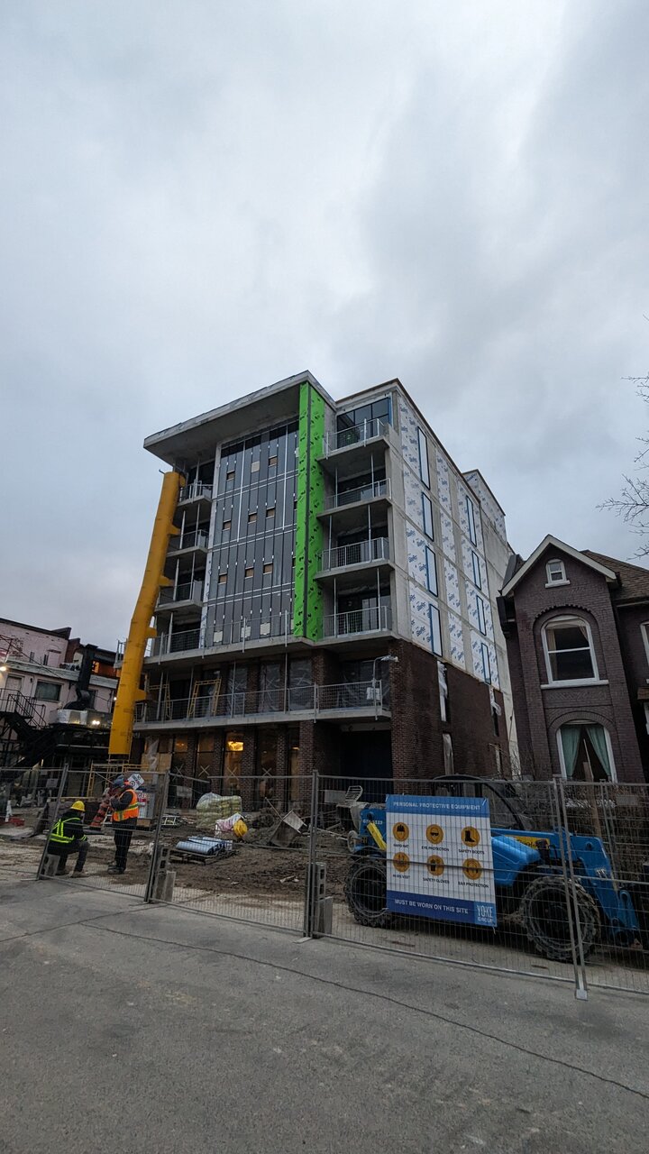
1000003411.jpg
 
I was wondering about the plans here, because I didn't recall there being a basement here. I guess this just wasn't shown to be part of the design originally. The DRP meeting about this project doesn't show a basement floor, but pictures from early days clearly show a basement level. I guess part of that basement at least is usable by the commercial space providing probably at least 4500sqft of commercial space which isn't half bad. Ground floor plan, and then basement dig:
1000004694.png

1000004693.jpg
 
I miss Granny’s, but this is a decent trade-off.

A few thousand more of these across the province and we could almost fix the missing middle!

IMG_5825.jpeg


IMG_5821.jpeg
 

Attachments

  • IMG_5820.jpeg
    IMG_5820.jpeg
    1.6 MB · Views: 49
I mean, this isn't missing middle, so..
While it's not technically missing middle. It is mid-rise apartments which have been noticeably absent from much of Ontario's recent history, voting instead for low-rise detached houses or high-rise skyscrapers mostly.

All to say, we do need a few more thousand of these. Along with multiplexes, low rise apartments (4-storeys in neighbourhoods).
 
This is medium-density housing, built on urban land where residential was previously missing (it was a tiny Caribbean market).

Sounds like missing middle development to me!
Yes it’s all of that, but missing middle it’s not - midrise is not missing middle:

IMG_1906.jpeg
 
While it's not technically missing middle. It is mid-rise apartments which have been noticeably absent from much of Ontario's recent history, voting instead for low-rise detached houses or high-rise skyscrapers mostly.

All to say, we do need a few more thousand of these. Along with multiplexes, low rise apartments (4-storeys in neighbourhoods).
.. designed better though. I don't want to see thousands more that look like THIS. This is just vranich design scaled down. Mid-rise infill yes sure, we need more of that for sure. But this.. It looks super out of place here because there is nothing ultra-modern around to tie into it.

I mean you got victorian on one side and spanish/mexican style on the other and the god damned armory across from it. Nothing new in this little area has probably been built in over a century. Modern designs plopped into highly traditional neighbourhoods tend to look VERY jarring.

In case it isn't obvious - I don't applaud boxes - the building next door shows victorians COULD have made boxes, they CHOSE not to cuz it's boring and bland.
And when I say boxes I don't just mean a rectangular building as that would encompass a lot - I mean blockitecture where literally everything on it is a 90 degree angle. Outside of core urban we're in a very lazy era of architectural building right now - ikea-esque.

I don't applaud these because I know design-wise, we can do much, MUCH better. This will age horribly as all modern structures along james street have. At least it has real brick on its base.
 
Last edited:

Back
Top