News   Jul 15, 2024
 447     0 
News   Jul 15, 2024
 560     1 
News   Jul 12, 2024
 2K     1 

The TTC Metropass, 2008 Edition

^ Except the font for "february/08". The month and year should be spelled out using the TTC font only (that would save the font guy the work of finding a new font every month).

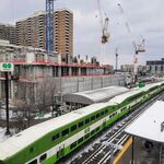
If TTC wants to find a new TTC-themed background photo every month for its Metropass, why not start a photo competition? Get riders to submit their best transit photography. The person whose photo is selected to be used on a Metropass gets a year of free Metropasses (including the one with his/her photo on it).
 
I've got it too. Looks good, except for the month font.

I wonder if the font changes each month as some sort of anti-piracy tool, otherwise I don't know any reason to do so.
 
Gill

n122602698_34858679_5370.jpg

It’s Gill Sans Ultra Bold (not quite Kayo, though some say they are indistinguishable).

Someday the TTC will learn that it isn’t issuing Passes-métro, hence month names are capitalized.
 
Someday the TTC will learn that it isn’t issuing Passes-métro, hence month names are capitalized.

Does it matter? Essentially, the TTC's taking the same approach now with Metropass fonts as it did in the 80s with Yonge line tile facings. (Sarcasm intended.)
 
here is an article from spacing montreal about their new monthly pass redesign.

http://spacingmontreal.ca/?p=558

if you don't understand french, you can translate it through http://babelfish.altavista.com/ or http://www.google.com/language_tools?hl=en

We should use photographs of stations on our passes, because it might just raise the transit riding public's interest in current station design. That might sound similar to the Spacing buttons, except these wouldn't be abstract textures.
 
Make TTCs Metropasses more collectible...

Everyone: I feel that making TTCs Metropasses more collectible is a key here-Junctionist mentions stations-and let me add vehicles-historic as well as current. Use photos like good pics of the 1953 Gloucester Red cars as well as more modern models like the H6;Both types of CLRVs and older PCC streetcars and buses of current and older models. Have a sentence about them on the back explaining what they are. Good Toronto pics would work good here also.

As for the font on front-I feel it should be simple-Helvetica type and read across the bottom "FEBRUARY 2008" - no nonsense. Gets the point right across. Since I collect railway/transit passes/tickets I notice more than most.
LI MIKE
 
the number is my MDP number, which sometimes can be used to receive a new pass if i lose it.

I wish I knew that. I lost mine on the 1st of November!

On the upside, I'm still paying 91.50 for mine due to TTC's bizarre anniversary based billing and will be until July.
 
The March Metropass has a photo of a train by the platform of Downsview station. It's a start, though I'd prefer some months' Metropass to have a photo focused on the actual design of the station.
 
I wish I knew that. I lost mine on the 1st of November!

On the upside, I'm still paying 91.50 for mine due to TTC's bizarre anniversary based billing and will be until July.

I knew about that - the people at the MDP office at Davisville were really good about replacing mine as well. I just called and explained what happened and they said come by, get a new one, and if the old one turns up, mail it to them.

This is the last $91.50 month for me.
 
The March Metropass has a photo of a train by the platform of Downsview station. It's a start, though I'd prefer some months' Metropass to have a photo focused on the actual design of the station.
since it hasn't been posted yet...

lastscanpi6.jpg
 

Back
Top