News   Nov 05, 2024
 256     0 
News   Nov 05, 2024
 432     0 
News   Nov 05, 2024
 507     0 

The Tenor (10 Dundas St E, Ent Prop Trust, 10s, Baldwin & Franklin)

  • Thread starter billy corgan19982
  • Start date
We need some updated nightime shots of the square now that the most current exterior ads have been backlit.


Not quite, but FS neon is on - and that rhymes
dsc00235ho0.jpg
 
Those "holiday" lights are hands down the ugliest, most embarrassing non-denominational-can't-possibly-offend-anyone piece of crap cowardly inspiration-less decorations I've ever seen any where.

I shudder every time I see them in person... And they look even more ridiculous during the day.

ok i feel better now
 
the FS neon sign looks great! passed by it and it's so vibrant!
 
Agreed, I think whoever was in charge at city hall for those lights should have their head examined. We all know the city can a does get it right like last year at city hall. http://www.youtube.com/watch?v=O5RuIz6WKSU&feature=relatedBut I think we should save our Christmas display critiques for another thread.

As for this building I don't really care about the interior, all it is really is just another mall. It's the exterior that concerns me. However after saying that it's the interior of Future Shop which so far detracts from the appearance from the square as we get to see all the staff eating their lunches and going to and from their lockers. Who's dumb ass interior planning was that? Future shop should have left that section open to at least have displays of products to entice people to go in. I think when I was in the square I witnessed a small food fight. Stores I think that would have used that space better would have been Chapters, using that as a Starbucks and CD section. Sam's had they not gone under. Or lol shoot me now, Miss behaving (sp?) like on Queen west with the dancers. I really hope that when City goes in the square they capture some less then impressive lunchroom acts that make Future Shop rethink the store layout.

Seriously, a lunchroom has the best view of the square? What a f#@king waste.
 
OT - The polar bears at Yonge + College is much easier on the eyes. Just what is wrong with using white LEDs alone?

Andrew3D:

On the bright side, if Future Shop ever decides to be cheap, they can always install additional signage (or sell it back to PenEquity, with the latter covering it in the puke grey corrugated steel). Yuck.

AoD
 
On the topic of Christmas lights... does anyone know why the city didn't bother lighting up University Avenue at all last year? It totally sucked.
 
Great Shots! I think the building and the area are coming together...year over year new tenants will move into the area, new signs will go up, new buildings will get built and life at Yonge & Dundas will get better.

P.S. I never noticed the lights on the balcony (Yonge St. side), I think they look good!
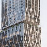
 
I think the Atrium on Bay does a better job being Metropolis, than TLS.

The Atrium has at least as much potential to be an advertising canvass as TLS in the future. Let's see what happens.

BTW: nice pics wyliepoon!
 
The southeast corner section of Future Shop [with it's employee lockers/lunchroom and that other section of empty space] is a major eye sore at night when it's all lit up. It's not very noticeable in the pics, but if anyone goes down there in person, you'll see exactly what I mean.
 

Back
Top