News   Nov 12, 2024
 432     0 
News   Nov 12, 2024
 452     0 
News   Nov 12, 2024
 518     0 

The Tenor (10 Dundas St E, Ent Prop Trust, 10s, Baldwin & Franklin)

  • Thread starter billy corgan19982
  • Start date
I really wonder if the building would have turned out better if they used a different colour on the cladding, lets say, a dark charcoal? I think a big part of the problem is that the grey is dreary and uninspiring.
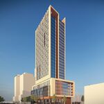
 
A dark charcoal grey would be bolder and wouldn't blend in with the background as easily. I think that's one of the main issues with the building, it seems to just bleed into the sky and not really have form or presence. The grey they chose is extremely mute.

Nor am I advocating splashing it with bright colours... Edmonton City Centre already proved how unsightly that could be with their redo several years back...
31062_G_03.jpg
 
I see little point in reviewing a giant billboard (the exterior of the building) since so little "building" will even even be visible from the DundasSquare POV (the east and north sides are another matter).

...unless he wants to join the constant laments about quality of signage.

It's the interior of the building (like the much-discussed Future Shop warehouse) that needs a critical eye... I'm beginning to wonder if most of the interior spaces will feel as "temporary" as FS. Not an attractive proposition or a recipe for long-term success.
 
The AMC theatre traffic will drive the sucess of this building...other factors which may bode well for the building....

The restaruants (interior lighting), outdoor patios and signage above which should improve the overall attractivness of the project. - Likely to be much more attractive from the square than the FS location interior.

This project is still a good year away from total completion and even then, I'm sure there will always be new add on's and takeaways.
 
This project is still a good year away from total completion and even then, I'm sure there will always be new add on's and takeaways.
Great, so TLS apologists will always have an excuse to say "don't knock it until it's finished you jerks!!!"
 
I'm not quite sure why everyone is reacting so harshly to the Hume article. He basically sums up the large number of pages in this thread dedicated to chiding TLS' exterior. It doesn't matter if the building is complete or not, its not hard to tell that there is little architectural merit to it at all. Hume (whom I don't normally agree with) succinctly sums up much of the (well deserved) criticism which we are indoctrinated with each day and puts it out there for the masses.
 
I'm not quite sure why everyone is reacting so harshly to the Hume article. He basically sums up the large number of pages in this thread dedicated to chiding TLS' exterior. It doesn't matter if the building is complete or not, its not hard to tell that there is little architectural merit to it at all. Hume (whom I don't normally agree with) succinctly sums up much of the (well deserved) criticism which we are indoctrinated with each day and puts it out there for the masses.


Whether there is architectural merit to TLS or not...Hume did reference some points of the project that can't be judged until completion.

i.e

The fact that it seems "dead" ( duh.. 1 tenant out of how many dozen have actually moved in....)

The fact the ducts are exposed ( duh... The exterior signage installation has not yet been completed)
 
I agree with Project End (and Hume).

TLS has to be the most disappointing downtown addition in recent memory. It's not even exciting as a retail experience. You enter through mail-order aluminum doors and the walls are lined with cheap ceramic kitchen tiles up to about half the wall height, after which drywall takes over.

Even the interior of the Dragon Centre has more drama than this.

The drywall won't be there forever...

..just until the "move in's" are complete.

And yes of course Dragon Centre interior will be more dramatic than this, it has more than one store available for customers. Look on the bright side, at least you get two functioning escalators at TLS.
 
I'm surprised no one's noticed, but the central pillar sign is three-quarters complete. It does do a lot to tie the building together (mostly by covering the ducts), but I'm a little disappointed they did end up going with a flat billboard and not a convex one. I think the spacing geeks are also going to be upset, because the plane of the central pillar sign doesn't line up with the ad to the immediate East of it. The step is actually kind of awkward.
 
My memory isn't as good as it once was, but didn't Hume express a fairly optimistic view of how TLS would help in transforming the intersection? Make it a shining example of urbanity? The way I see it is that the article simply expresses his disappointment with the project for not really living up to this expectation. I'm with Hume. I had high hopes for the building, but it's a disappointment. It's unfortunate that they are not covering up the entire building with ads, because there's more cheap siding on the building than in a trailer park.
 
The more I think of it, I think TLS is a big ass version of that billboard truck that drives around for Rockwell Clothing on Bond Street (the ghetto hip-hop clothing store). The van is atrocious, polluting, and shouldn't be on the road, and it's covered up by the tackiest advertising ever. Man I hate that truck.
 

Back
Top