I don't think he likes it....
 We don't deserve this horrorchitecture
TheStar.com - News - We don't deserve this horrorchitecture
January 14, 2008
Christopher Hume
Under any circumstances, the new Toronto Life Square would be a disappointment, but given its particular history, it's doubly so.
In case you hadn't noticed, the "square" is the nasty dark grey bunker that now occupies the northeast corner of Yonge and Dundas Sts. It looms over one of the city's most important intersections with all the charm of a high-security prison. Big, bulky, busy and boring to the last rivet, it is a building untouched by architecture, or any other civic concern for that matter.
If this weren't injury enough, the insult lies in the fact that the complex was built on prime real estate expropriated by the city back in the late 1990s for the purpose of revitalizing the neighbourhood. But even before this galactic coal-carrier is finally finished later this year, it's clear it will add little to the area, except its sheer bulk.
And as for the contents of this lumpen excuse for a building, they will include Future Shop, Shoppers Drug Mart, AMC Theatres, as well as the inevitable Tim Hortons.
How exciting is that?
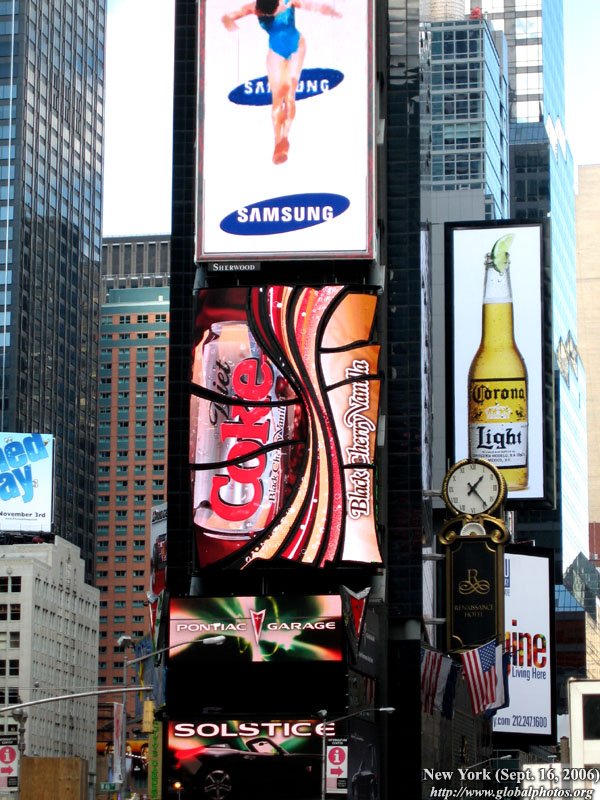
What makes it all so laughable is that Toronto Life Square likes to pass itself off as this city's answer to Times Square in New York. That might lead one to expect noisy crowds, commercial kitsch and vertigo-inducing video ads, all of which can be fun in small doses once or twice a decade. Instead, we get a building so dead and inert, one feels uncomfortable walking past it.
Since the project was launched all those years ago, a lot has happened in the area. Yonge-Dundas Square opened in 2003 and has become a genuine civic space. Always under intense pressure to pay its way, the square has even started to make money.
Recently, Citytv announced it will take over the former Olympic Torch building on the east side of the square, a move that will generate activity.
"Citytv could be adventurous in its use of the square," notes its co-designer, architect James Brown. "They could appropriate it so the square would become a studio."
As for Toronto Life Square, the best hope is that much of the unrelieved grey of its surfaces will eventually be hidden beneath the advertising that will provide whatever identity it has. Indeed, the building might best be understood as an armature for video screens, billboards and the like.
There's no shame in background buildings – that's what most urban structures are – but they need to be well designed, decently appointed and, above all, part of the larger whole. At Yonge and Dundas, they also need to define the square, which is, after all, an open space surrounded by buildings.
Unfortunately, Toronto Life Square (whose original name, Metropolis, made a lot more sense), looms over the square ominously, too big for the corner and barely contained within its site.
The industrial references – exterior fans and exposed air ducts – seem singularly inappropriate in this context. If the designers were going for a Pompidou Centre-like mechanical aesthetic, which could have been fun, they failed. Perhaps because of the grey exterior, which some might see as urban camouflage, and the easy awkwardness of its utilitarianism, the building takes on a strangely military quality. It could be a post-apocalyptic battlefield headquarters, or something built for the permanent warfare envisioned by Orwell in 1984.
But smothered in advertising, corporate logos and the clutter of commercial branding, the building will be largely invisible. Just as well, too; its appearance is a painful reminder of how low architectural standards are in Toronto. The developer, PenEquity, has committed not just an offence against good taste, but a crime against urbanity.


