


VoiceofReality
Active Member
Here's another one from the website...

|
|
|
Here's another one from the website...
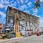
Are those railings on the patio over future shop permanent? They look terrible, mind you, so does the whole building so maybe thats the look they are going for...
")