News   Nov 08, 2024
 911     0 
News   Nov 08, 2024
 1.2K     4 
News   Nov 08, 2024
 4.6K     0 

TCHC: 501 Adelaide E / 288 King E (14s, aA)

LOL, I sometimes wonder. I was kind of raised in the old school, by immigrants, that even to take unemployment was an emotionally difficult thing to accept.

My brother, who moved to Alberta a few years ago, and hates it with a passion, tells me those are pretty much the values of that province. Maybe you should check out Calgary or Edmonton, where most people have those old school values. Out there you have to pull yourself up by your own boot straps and everybody looks out for number one. It's very much like American values but if you're ruthless and determined, a person can still make a killing out there. My brother's making lots of money, he just hates every second of his life, but he's kind of an urban lefty, so he's kind of a fish out of water. Someone with your old school values would take to it like a fish to water.
 
As I promised earlier in the thread, I took a sizing of a unit in this building. I didn't have a lot of time so I scaled from the architectural drawing. These figures are rough, but shouldn't be too far out of whack.

My "favourite" unit on the top floor (all 2-storey lofts) is approx 1341 sq/ft and features a 172 sq/ft terrace overlooking the lake. The other 9 lofts on that floor are similar size.. I think most of them are a tad smaller, but perhaps a couple are larger.

All the other floors are single storey units. I didn't have time to scale them yet, but there's 3 very large 4 bedroom units on each floor (one of them has 3 bathrooms). There are a handful of 1 bedroom units on each floor and there are either 12 or 16 bachelor units in total (I forget which floor they end on). The majority of the suites are 2 or 3 bedroom. The hallways have tiled floors.. slate perhaps? Not sure what it is, but they are nice with the elevator area also has tiled walls.

Since there's underground parking, the only thing it's missing from a luxury condo is an in-suite washer/dryer.
 
3757094454_41928e1de3_b.jpg


3757095826_12059b523a_b.jpg
 
Those windows are becoming a little too popular. They look quite similar to what's on 550 Wellington, for example.
 
Those windows are becoming a little too popular. They look quite similar to what's on 550 Wellington, for example.


TCHC design has come along way ... more like mid-range market condos than low rent apartments.
 
Last edited:
I noticed while walking by, that they have a rental sign up. Now is your time to get a "million dollar residence" for a decent monthly rental. It's probably around 1000 dollars for a 1 bedroom.
 
the arrangement in the spandrel panels is quite clever ... I like that detail ~
 
solaris, have to agree with you.
I also like the colour they use in the spandrel, although I hope the mullion colour doesn't fade in this environment.
 
Condo Critic: King St. E. has it all - let's not ruin it now

this thread was out on page 4 ... so i guess it's time for an update.


http://www.yourhome.ca/homes/reales...ic-king-st-e-has-it-all-let-s-not-ruin-it-now

August 15, 2009 Christopher Hume


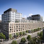
288 KING ST. E.: You know that something good has happened when the Toronto Community Housing Corp. builds residential towers as beautiful as this one. Located on the north side of King, a block or two west of Parliament St., it runs north all the way to Richmond St. where there is a second entrance. The new building also extends the domestic stretch of King east of Sherbourne, where until now it ended.

Though the architects have made no attempt to copy their 19th-century predecessors, they understand how a building should behave on the street. What this means is that the new structure comes out to the property line and that the bulk of the building is broken down into several main elements; at the bottom, a two-storey glass looks out to the sidewalk on both facades. Presumably, they will eventually house retail uses. Above, a three-floor glass box occupies the frontage, surrounded by the rest of the 11-storey tower.

The materials are contemporary, but there's an attention to detail that keeps the project from feeling generic and anonymous. This may be social housing, but it doesn't fit the image that term implies. Instead, it looks as though someone cares, as if the builders wanted to do something worthy not just of the inhabitants but the city.

One can complain that this addition represents another nail in the coffin of King East, at the same time, the building itself shows of early 21st-century residential architecture at its best.

GRADE: A

WHAT DO YOU THINK?
 
I do agree that this project was well designed

But is it with worth an A ?? I don't think so, it may be an 'A' in terms of public housing project, but not in terms of building architecture compared to the rest of the City
 
About the worst thing a landlord can do is to outfit an apartment too cheap. Not only is the cheap stuff less durable but tenants automatically take better care of something that nice. There are some really nice affordable finishes created through the condo boom.

I really doubt about this statement "tenants automatically take better care of something that nice" I can definitely vouch that is not correct. Tenants don't care about taking care of stuff if they are renting. Unless you have really clean tenants, many are dirty. Give them nice stuff and they'll just ruin it. How? they don't clean the stove and oven, leave food particles around without cleaning up, ruin hardwood floors with scratches, don't vacuum etc. Basically a pig sty. If it's not their place, some wouldn't care less.
 
I do agree that this project was well designed

But is it with worth an A ?? I don't think so, it may be an 'A' in terms of public housing project, but not in terms of building architecture compared to the rest of the City

The point is that there shouldn't be this segmentation between what is "public housing" and what is "the rest of the city".

Critics are supposed to judge things within context-- and within the context of the city, this is an A.
 
The point is that there shouldn't be this segmentation between what is "public housing" and what is "the rest of the city".

Critics are supposed to judge things within context-- and within the context of the city, this is an A.

I think within context of the city. This should be rated C+? There are many better architectures around. My favorite being Absolute tower. Public housing wise, I like the one that looks like the borg cube.
 
The point is that there shouldn't be this segmentation between what is "public housing" and what is "the rest of the city".

Critics are supposed to judge things within context-- and within the context of the city, this is an A.

I agree somewhat with AKS ~ if I were the judge this project with other buildings in the City ... I'll likely grade this project B as there are some good design elements, but architecturally it is nothing particularly worth getting excited over ~
 

Back
Top