News   Nov 04, 2024
 52     0 
News   Nov 04, 2024
 475     4 
News   Nov 04, 2024
 614     0 

Problematic Park Design - Why Some Parks Don't Work

Ok, here's a very crude take on how I might treat the space. Its nothing I'm stuck on, but I think its better than what's proposed:
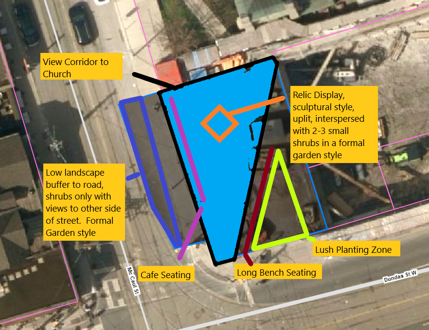
Relic Park 2.png


The idea is to emphasize your strengths, and minimize your weaknesses.

So play to the church, the people watching pub and potential patio to the west and the AGO to the south-west. Try to hide Dundas and the Condo.

Place seating oriented to allow views of the strengths. Don't clutter the relics which I'm treating as sculpture here with big robust vegetation, they are the star of the show within the space.

Add limited, low shrubs, if needed, amongst the relics, if trying to break up the hard surfaces.

Keep vegetation low to the west so as to keep a connection to the people watching across the way and to tie in to the landscape style in front of the church.

The principle planter, if desired, can go lush and green, it can be a large enough soil volume to do a single Sugar Maple, with one Beech tree to each side. Around that, you can go Christmas Fern for a carpet of green that will hold til. about Christmas.

The drinking fountain/waterbottle fill station (not shown) should go to the interior of the park, so as not to obstruct views or create clutter.

The trees can be uplit.

I quite like the indigenous pottery piece proposed here, but I can't make it fit in my revised design and think it belongs in another space where it can be better showcased. I'm not sold on the piece representing the Iron Workers.

To me that would be a large scale sculpture made of I-Beams that gives you a bit of awe thinking about people working at great heights on such things. It would need far more room and a more apt setting.

I think narrowing McCaul south of Dundas in a similar manner, to create new public space adjacent to AGO, OCAD and Grange Park could create a wonderful art-themed public space/park-like street.

*****

Funny note here.

The LA on this project is Janet Rosenberg.

Its not a secret that I'm not fond of most of her park designs, as I think she leans into a very formalistic style that treats a park as one might an art gallery landscape in an affluent mansion back yard, and that it usually just doesn't translate well for public appeal and the way people tend to use parks in the real world.

Oddly, I think her proposal here is among her more populist and accessible efforts and this might the one time I wish she'd gone the other way. LOL

I mean, you're opposite the AGO and OCAD, and next to a formal 19thC church; is there a better spot for an artistic take on an English Garden? (which is the way I think her work leans)

I really appreciate Janet, despite what some may think, she has a real eye for quality materials / finishes; and when her work is correctly situated (such as a botanical garden) I think it can be wonderful.

I just think she lacks the 'common touch' and practical understanding of ordinary people's relationship to heavily used urban spaces. Ah well.
 
Last edited:
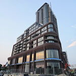
Ok, let's move on to the second 'Relic' Park, this is the one on St. Patrick Street, that is part of the Artist's Alley space.

While still small at 1000m2 it is roughly 4x the size of the space on Dundas, so there is a bit more play here:

1698330426873.png


1698330458749.png


1698330489903.png


1698330548855.png


1698330599603.png


1698330637121.png


Indigenous Sculpture:

1698330747763.png


1698330789322.png


Comments:

Better organized than than the smaller space with the sculptures at the centre of the space and seating oriented to view same.

Some potential issues w/tree species selection. I like all of these, all are native; but all are sun lovers, which this site does not have in abundance. White Birch and White Pine are not known for their tolerance of highly urbanized conditions either.

I don't have an hours of sunlight chart for this space, but the Landscape Architects should, and should double-check there is sufficiency. The Aspen are also sun lovers, but more urban tolerant and a reasonable choice here.

Also questionable from an urban tolerance point of view, but I might go for adding Beech here, as they are shade tolerant.

Site plan does not show any drinking fountain - every park should have one!

Otherwise, I'm not super excited about the space. But I think it looks functional'ish and could add value.

I have a bit of a problem with the 'Relic' concept in general, seems a bit like a 'poor man's Guild Park'

I really wish we didn't conflate the indigenous element and the relic idea, I see them as entirely unrelated, in such small spaces I'd prefer a more cohesive focus.

Something I don't see here is any references in the design to the architecture of Artist's Alley or to the Grange.

I think a bit more earth/warm brick here would be nice, maybe as the walking surface; we over use gray in this town. The adjacent portion of Artist's Alley here is also grey (the brick building is at the north-east.

****

In the end, I don't feel compelled to try to reinvent this space; just get the trees right, add a drinking fountain and a bit more warmth. I also hope they intend to uplight the columns.
 
Last edited:
This is odd. It's entirely a passive-use park -- ie a place where you sit and relax -- and yet most of the park's area has nowhere to sit. Once 50 people have filled all the chairs and benches, how is anyone else supposed to use the space? What are they supposed to do?
 
This is odd. It's entirely a passive-use park -- ie a place where you sit and relax -- and yet most of the park's area has nowhere to sit. Once 50 people have filled all the chairs and benches, how is anyone else supposed to use the space? What are they supposed to do?

A fair question.

A reason I specifically get annoyed by very small parks.

Here, I assume (don't know, haven't spoken w/the staff involved) the intent is, as you say, passive, a place to rest, to view, as one might in an art gallery, to eat lunch outdoors?

Here's the challenge w/overly small spaces as parks, I just had a look at one of the City's more loved playgrounds.....in Kew Gardens, including the wading pool and adjacent path, the space is 3400m2 or about 3x the size of this park.

Out of curiosity, I decided, ok, not every space will be that large, I removed the adjacent path, the wading pool and washrooms and went strictly w/the play equipment only. Its ~1400m2, still larger than this entire space.

Needless to say a sports field would consume vastly more land; a playground is one of the more compact 'active uses'.

Suppose you just wanted an off-leash area for pet owners.........Markham's guidelines would require 5000m2 or almost 5x the available space.

Toronto admittedly accepts much less, but the one at Allen Gardens is still larger than this entire park by greater than 50%

There's just not a lot you can do really well in such tight spaces.

When we think of 'small' parks in Toronto that work, we might reference Village of Yorkville Park or Berczy.

The former is ~ 3x the size here, the latter is even larger, almost 4x the size.

We really must say no to parks that are so small.

There is some virtue in little spaces for people to sit, take a sip of water, under the shade of one tree; but they are just 'public spaces', not a park.

****

On the seating question, you got me curious, admittedly this is very cursory, I just used street view to get a crude assessment.

How many seated park users in Yorkville and Berczy:

I got ~ 55-60 for Yorkville and about the Same at Berczy using just the most recent Streetviews for reach.
 
Last edited:
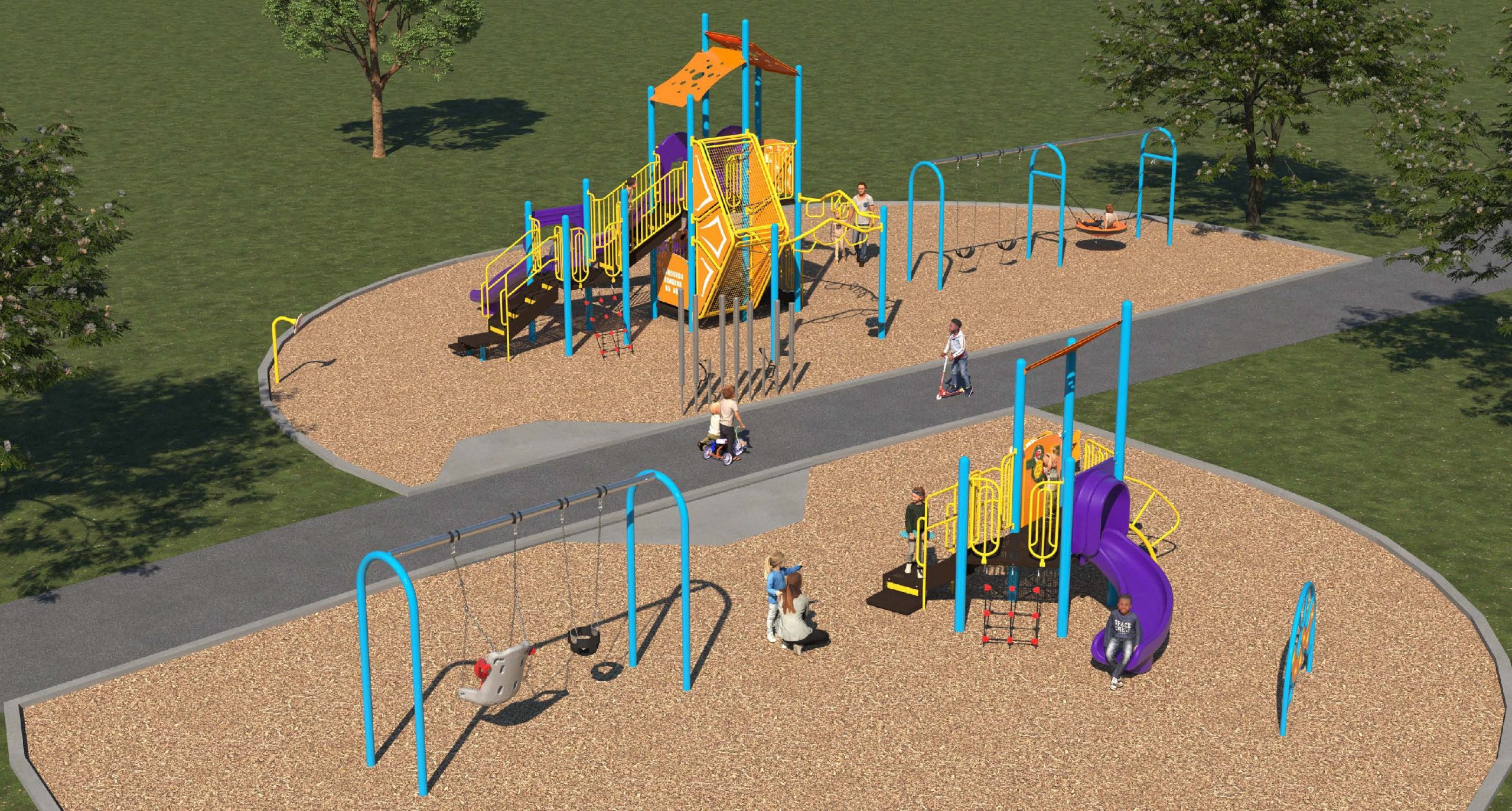
Benner Park, located very close to Glencairn Station's Viewmount Entrance, is being renovated to have a new accessible playground:


9967-benner-park-playground-improvements-final-design-scaled.jpg


This park is a short walk from Marlee Village (and my home).

Is the existing design problematic or do you see issues w/what's proposed?

If neither, it may be better suited to the Parks - New and Revitalized thread.
 
It's missing benches, picnic tables (shaded or unshaded), water fountains, and splash pads.

While not shown in the render, it does appear seating is in the program: (from the project page)

1698394093913.png


There is definitely not a splash pad or drinking fountain. In fairness to the designers, this work is being funded specifically out of the City-wide playground fund, not as a wholesale park re-do.

If water service were already available at the playground, they absolutely should have tapped it, a fountain isn't expensive; but if they would have had to bring water service in from the street or some distance away, that would have added substantially to the cost, and I can understand that being out of scope.

Though, I strongly support their being at least one drinking fountain in every City Park.

Last I checked there are only a bit over 700, spread over something like 1,700 parks. So fewer than 700 parks actually have a fountain.
 
Last edited:
Ok, I've been asked to comment on Relic Park.

As it doesn't exist yet, of course, I have to work with the rendered images and site photos etc.

I will move these selectively into this post, and will then comment:

I will do this for each proposed space discretely.

So we're looking first at the tiny park proposed at Dundas/McCaul:

View attachment 515399
Lets start by saying this is a tiny space, framed by the Church to the north, McCaul to the west, Dundas to the south, and a rather unfortunate under construction building to the east.

261m2 is just over 2x the size of my apartment.........and I'm not living in a 30M penthouse. I point that out just say trying to fit much in here is brutal.

View attachment 515400


View attachment 515401

So right off the bat, I want to note the use of the plural in reference to trees

If you planted an optimal specimen Silver Maple here; just one, how big would the crown (canopy/branch reach) be?

The answer is 25ft from the centre/trunk of the tree or 50ft across. Which would be.....2,500ft2; or just shy of the size of this entire park.

That doesn't mean you couldn't get more than 1 tree in, but just keep that in mind when your considering the space allocation here.

* To be clear I don't know what species are proposed, so crown area could vary quite a bit.

Renders:

View attachment 515404

So, based on what I'm seeing here, we appear to be looking north from Dundas. McCaul is out of frame to your left, the new building to your right.

****

Here's the layout scheme:

View attachment 515405

View attachment 515406

I'm going to start by noting there's no way I'm wrong that the render shows 5 trees, but the above shows 4; inconsistency is an issue.

Seating total in the schematic above is::

7 round seats
1 long bench seating 4-5 (my estimate)

4 'cafe' tables with 9 individual chairs.

***

A picture of the site as is, current streetview: (Sept '23)

View attachment 515408

***

View attachment 515407

****

I think we need look back at the renders of the adjacent project to get a better understanding of the space:

View attachment 515410

So this park will be up against high ground floor glazing.

Immediate thoughts:

Why a water ball filling station w/no drinking fountain? They are available as an integrated single piece, the fountain part is not an expensive add-on. No cup/bottle, no water for you! Not sure how how inclusive that is.....

Second thought: Why are we not integrating the sidewalks seamlessly into the landscape? Given how small the landscape is that would seem a no-brainer. We have to retain a pedestrian clearly, but we can use augmented paving materials
and consider the space in relation to the design. Depending on sidewalk width it may be possible to 'borrow' some space at the edges.

Third thought, I assume the mirror wall is meant to make the space feel larger; but I'm not sold.

Fourth thought: Why are we generally obscuring the only attractive building adjacent to this space with the mirror wall and vegetation, instead of celebrating it?
Why wouldn't we hide the monstrosity to the east if we could?

Fifth Thought: The functional program isn't too busy, but the 'vision' is ........... you've got 3 real competing ideas here.

1) Lush/Green
2) Display of bits of older achitecture
3) Indigenous program.

All have a place, but that's so much to ask of so little room, I think your probably short shifting it all.

****

Ok, I'm going to stop here for this post and look at the rest of the spaces tomorrow.

I'm also going to try to see if I can't figure out something better to do here. But man, a sliver of left over space next to this beast.........not the way to plan a park system.

There's a new survey out on the new Relic Parks, and there have been some design tweaks since the last one. I will do one post for each space.

For this one above, there are some additional seats w/backrests, apparently some new plantings, though I don't see this reflected in the rendered site plan, and they've added a warmer tone to paving moving away from endless grey.

Otherwise pretty similar.

As the survey covers both parks, I will include the link in both posts:


I rate this as modestly improved, but still way over programmed and sub optimal.
 
Ok, let's move on to the second 'Relic' Park, this is the one on St. Patrick Street, that is part of the Artist's Alley space.

While still small at 1000m2 it is roughly 4x the size of the space on Dundas, so there is a bit more play here:

View attachment 515677

View attachment 515678

View attachment 515679

View attachment 515683

View attachment 515684

View attachment 515685

Indigenous Sculpture:

View attachment 515686

View attachment 515687

Comments:

Better organized than than the smaller space with the sculptures at the centre of the space and seating oriented to view same.

Some potential issues w/tree species selection. I like all of these, all are native; but all are sun lovers, which this site does not have in abundance. White Birch and White Pine are not known for their tolerance of highly urbanized conditions either.

I don't have an hours of sunlight chart for this space, but the Landscape Architects should, and should double-check there is sufficiency. The Aspen are also sun lovers, but more urban tolerant and a reasonable choice here.

Also questionable from an urban tolerance point of view, but I might go for adding Beech here, as they are shade tolerant.

Site plan does not show any drinking fountain - every park should have one!

Otherwise, I'm not super excited about the space. But I think it looks functional'ish and could add value.

I have a bit of a problem with the 'Relic' concept in general, seems a bit like a 'poor man's Guild Park'

I really wish we didn't conflate the indigenous element and the relic idea, I see them as entirely unrelated, in such small spaces I'd prefer a more cohesive focus.

Something I don't see here is any references in the design to the architecture of Artist's Alley or to the Grange.

I think a bit more earth/warm brick here would be nice, maybe as the walking surface; we over use gray in this town. The adjacent portion of Artist's Alley here is also grey (the brick building is at the north-east.

****

In the end, I don't feel compelled to try to reinvent this space; just get the trees right, add a drinking fountain and a bit more warmth. I also hope they intend to uplight the columns.

This one changed a bit more than the one above, so I'll post the new renders:

1708453034339.png


Notable here is the shift to red/pink toned interlock for much of the space from the previous grey. Also the addition of more seating w/back rests.

Additionally, more trees were added in the central space; and the species mix was adjusted a bit. Meaningfully better.

1708453121376.png


1708453157442.png


1708453193120.png


Survey:

 
While I'm happy to take bad designs and their designers to the proverbial woodshed, I have to say, my hope (though I'm not naive) is that enough planners and designers read this thread that I have less eviscerating to do.

The point after all is not to complain or even critique for its own sake, but to share w/others why some ideas work better than others, and why some don't really work at all, ever. That, in service of encouraging good design, the first time.

That said, I believe I still have 2 parks to look at for @Johnny Au; though one (Eglinton) is deferred pending construction there.

So the one I have to get to is Walter Saunders.

Anyone else have requests, which can either be parks you think need improvement or could be examples you want to show off of great design?

One request I'll roll over from last year is the Memorial Gardens Park at the East York Civic Centre.
 
While I'm happy to take bad designs and their designers to the proverbial woodshed, I have to say, my hope (though I'm not naive) is that enough planners and designers read this thread that I have less eviscerating to do.

The point after all is not to complain or even critique for its own sake, but to share w/others why some ideas work better than others, and why some don't really work at all, ever. That, in service of encouraging good design, the first time.

That said, I believe I still have 2 parks to look at for @Johnny Au; though one (Eglinton) is deferred pending construction there.

So the one I have to get to is Walter Saunders.

Anyone else have requests, which can either be parks you think need improvement or could be examples you want to show off of great design?
Now that it's finally fully open, wouldn't mind seeing your thoughts on Dr Lillian McGregor Park, if possible! So far I find it a nice space to walk through, but not anywhere I'd go to spend any actual amount of time, but not sure if that's just me.
 

Back
Top