News   Nov 29, 2024
 755     0 
News   Nov 29, 2024
 307     0 
News   Nov 29, 2024
 624     1 

Ontario Flag needs replacing

I'm sure this doesn't line up w/flag making convention, nor it is particularly artistic, graphics were never my thing.

But if we were to replace the flag of Ontario, I might be partial to something like this:

1594685830270.png


The Blue at the bottom for the great lakes, our provincial flower (Trillium) prominently on each side, our provincial tree (White Pine) centred in the middle and a nod to our country w/ 3 small red Maple Leaves across the bottom.
 
Now might be the ideal moment to get the Ontario flag changed. In light of all the mass protests for Black Lives Matter taking on the legacy of Western colonialism, what better time than now to frame it as an outdated symbol honouring a European power that brutally subjugated First Nations peoples, among many other ethnic injustices?
The Union flag, be it at the Canadian border via the underground railway or on one of HM warships intercepting a slave transport would have been a welcome site to many. Escaped slaves served under that flag, in part I imagine to ensure the US didn't come northward. Yes, there was an empire that did a lot of nasty stuff under that flag, that's what conquering new territory is all about. But if I was an indigenous or black person I'd rather be living in a country colonized by the British than by the Spanish or Belgium, for example. Anyway, I support changing the Ontario flag to better represent who we are now. Even in England they don't use the Union flag to donote the country, that's the George Cross.
 
Last edited:
The Union flag, be it at the Canadian border via the underground railway or on one of HM warships intercepting a slave transport would have been a welcome site to many. Escaped slaves served under that flag, in part I imagine to ensure the US didn't come northward. Yes, there was an empire that did a lot of nasty stuff under that flag, that's what conquering new territory is all about. But if I was an indigenous or black person I'd rather be living in a country colonized by the British than by the Spanish or Belgium, for example. Anyway, I support changing the Ontario flag to better represent who we are now. Even in England they don't use the Union flag to donate the country, that's the George Cross.

On an aside, in the past decade all the counties of England (and some in Scotland) have adopted flags, and the designs are routinely outstanding.
 
I'm sure this doesn't line up w/flag making convention, nor it is particularly artistic, graphics were never my thing.

But if we were to replace the flag of Ontario, I might be partial to something like this:

View attachment 257190

The Blue at the bottom for the great lakes, our provincial flower (Trillium) prominently on each side, our provincial tree (White Pine) centred in the middle and a nod to our country w/ 3 small red Maple Leaves across the bottom.

Probably a bit too busy with so many elements, though perhaps in stylized form it could work. Maybe I'll try to whip something up.
 
I am sure that we would manage to find one worse if attempts were made to change it.
It would be extremely difficult to be worse than this flag:

1280px-Flag_of_the_State_of_Georgia_%282001%E2%80%932003%29.svg.png

Flag of the American state of Georgia (2001-2003)

It says "Georgia" four times, the seal is repeated four times, and has 89 stars in total.

It would be extremely difficult to manufacture that flag without any error in detail (though the flag only uses four colours), let alone having a first-grader draw that flag from his/her memory no matter how talented.

No wonder why the North American Vexillological Association considers that flag as the absolute worst by far.

Nowadays, Georgia uses a different flag (2003-present):

1280px-Flag_of_Georgia_%28U.S._state%29.svg.png

Much less complicated but still practically undrawable by an average first-grader from his/her memory (especially the seal)
 
Last edited:
It would be extremely difficult to be worse than this flag:

1280px-Flag_of_the_State_of_Georgia_%282001%E2%80%932003%29.svg.png

Flag of the American state of Georgia (2001-2003)

It says "Georgia" four times, the seal is repeated four times, and has 89 stars in total.

It would be extremely difficult to manufacture that flag without any error in detail (though the flag only uses four colours), let alone having a first-grader draw that flag from his/her memory no matter how talented.

No wonder why the North American Vexillological Association considers that flag as the absolute worst by far.

Nowadays, Georgia uses a different flag (2003-present):

1280px-Flag_of_Georgia_%28U.S._state%29.svg.png

Much less complicated but still practically undrawable by an average first-grader from his/her memory (especially the seal)

The vast majority of US states suffer from horrendous flag design. They should be embarrassed.
 
The vast majority of US states suffer from horrendous flag design. They should be embarrassed.
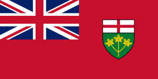
As a British-born Canadian I always like seeing the Union flag (if it ain’t on a ship, it’s not a jack) in its various versions. But it is difficult to tell them apart. Here’s Ontario‘s...

320px-Flag_of_Ontario.svg.png


And here’s Bermuda and the the Falkland Islands. I’d have trouble differentiating these after a short glance.

320px-Flag_of_Bermuda.svg.png


320px-Civil_Ensign_of_the_Falkland_Islands.svg.png
 
As a British-born Canadian I always like seeing the Union flag (if it ain’t on a ship, it’s not a jack) in its various versions. But it is difficult to tell them apart. Here’s Ontario‘s...
I'm a Canadian and British citizen. And while I appreciate some aspects of our shared history and current relationship, I don't see any need for Canadian jurisdictions to continue to use the union flag. It doesn't speak to who we are anymore, and actually, never really did.
 
Last edited:

Back
Top