News   Jul 15, 2024
 290     0 
News   Jul 15, 2024
 463     0 
News   Jul 15, 2024
 550     0 

Museum Station

Isn't the TTC's drift away from understanding the merits of their own perfectly fine, clean, understated design for the subway system as a whole - it could have been updated from time to time while maintaining the essence of the look - to a reliance on others to generate ideas and decide where to apply them within their system, a reflection of the malaise that manifests itself in other areas of what they do?
 
Ummm, really?
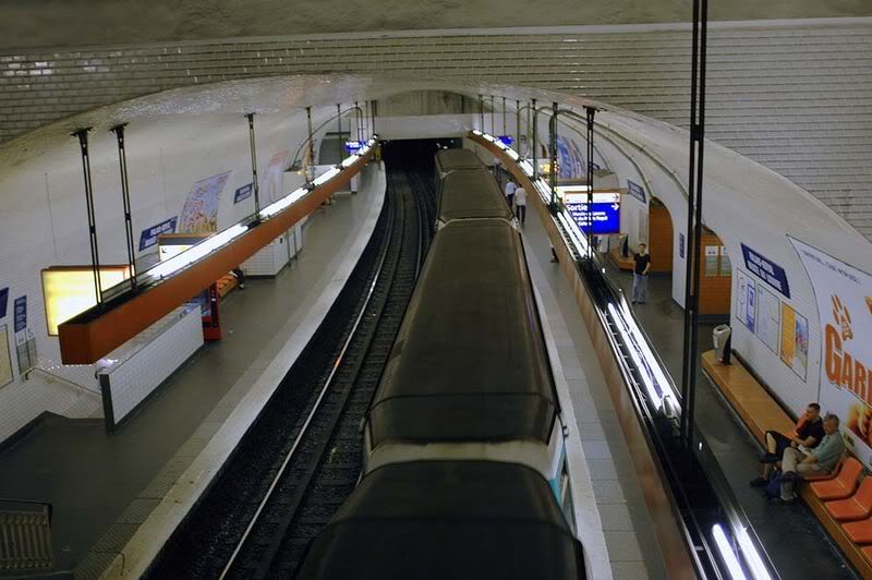
LouvreMetroStation.JPG

Wow it got renovated then... Last I was there (1996?) it had orangeish tiling... That's pretty trippy.

Well, there's apparently a couple of Louvre stations: this is the one I remember...
800px-PalaisRoyalMuseeDuLouvre2004.jpg
 
Yes but it's a bit too late for this type of lamentation. For 53 years the subway adheres to a certain look. To makeover every station would seriously bleed finances and the results might not necessarily look attractive anyway (THINK: Dundas's mustard-seed tiling).

For future lines I'm totally onboard for creative looks to stations, but after the University reno I think the TTC should quit while their ahead.
 
How many more of these station makeovers have the rogue benefactors planned? I imagine they'll get bored and move on to some other scheme soon enough, leaving the transit system with another baffling level of layering. I can't see them hanging around long enough to wave their magic wands and sprinkle fairy dust over Chester, or Dundas West, or Coxwell, or Ossington ...

Then who will the TTC turn to, and for what?

The whole thing reminds me of how, here and there, the city has devolved parts of the public realm - street furniture, paving, planters etc. - to gentrifying BIAs in different neighbourhoods, with differing amounts of money to spend, and different ideas about what constitutes good design. Perhaps, in the long run, BIA-free neighbourhoods will actually benefit from their close escape from this process?
 
Though, come to think of it, I suppose the Eglinton to York Mills extension a few years earlier was the first to abandon that uniform look - perhaps vitrolite wasn't being made any more, perhaps they couldn't get matching tile, perhaps they didn't realize the unifying quality of their original plan?

Technically, the only Vitrolite stations were on the 1954 Yonge line and Osgoode + St Andrew on the 1963 University Line. Glazed concrete block/tile is what defined Museum and what defines Bloor-Danforth.

As for Eg to York Mills, I tend to attribute it to the era when square transit engineers started growing out their sideburns and donning leisure-suity garb. (And perhaps the absolute first to abandon the uniform look were the 1968 B-D termini of Islington and Warden, with their fussy little bits of contrasting perpendicular tile...)
 
yes, they've abandoned complete adherence to one motif in successive expansions of the subway, but there always retained some consistent element. The Lawrence-Finch extensions were pretty much identical, Spadina had its consistent (though not anymore) signage, and Sheppard had its consistent concrete wall/purple stripey thing. The thing that bugs me with Museum, as has been iterated before, is that it throws it all out the window and you have one very orphan station in terms of design. Even the "renovated" 80s Yonge stations can be collectively categorized and unified under the "era of crap and acid" look. I've said it before and I'll say it again, it is a great and awesome thing that we're investing in the stations, but I care more for renovating it at ground and street level to make it more visible and integrated with the neighbourhood. Below ground, KISS should be the main guiding principle with public art integrated, but not taking over, the station.
 
I really liked how they at least tried to provide a uniform look from eg to york mills and to this day there is something really classic about those stations.

My biggest problem with these multiple station renos are that the ttc is in charge. If we were in europe or asia where some sort of design mattered I wouldn't be stressed at all but judging from their earlier renos ( dundas, college) and now museum, and so on.. ugh....

Just wait to see how terrible Museum station will look 10 years down the road when all the columns are scratched and destroyed and everything is covered in 10 years of grime and dirt.
 
Starchitects might be in charge of the university station reno's but I haven't seen or heard anything about Pape and the Danforth stations being done by anyone with any credentials
 
Isn't the TTC's drift away from understanding the merits of their own perfectly fine, clean, understated design for the subway system as a whole - it could have been updated from time to time while maintaining the essence of the look - to a reliance on others to generate ideas and decide where to apply them within their system, a reflection of the malaise that manifests itself in other areas of what they do?

No. ;)
 
There's no denying that stations on the BD line are losing their luster due to grime, wear, and even vandalism. I think that restoring the tiles is a worthy endeavor. That doesn't have to mean that the status quo must be maintained. The platform floors are very basic and not even purposely. The stations could be enhanced by extending the dual colours of the tiles to the floor. The lighting is also generic, and could be enhanced with some new minimalist aluminum designs. Small details can go a long way. Though besides the tiles, what's upstairs deserves some attention:


That's some nice modernism.
 
That's some nice modernism.

I'd take the modernist look of the BD line over any of these neo-tacky proposals. It looks ordered, refined and identifable that one's on a Toronto subway. Making every station look dissimilar only makes us look scatterbrained and uncouf.
 
Actually, there is a purpose to the station floors. That particular type of flooring was chosen because it doesn't show dirt and is highly durable and low maintenance.

I meant that it the floor appears to be more of a utilitarian choice rather than something specifically chosen for the design of the station. Low maintenance is best, though there are probably more variations that can be done with low maintenance materials these days.
 

Back
Top