You are using an out of date browser. It may not display this or other websites correctly.
You should upgrade or use an alternative browser.
You should upgrade or use an alternative browser.
Metrolinx: Bombardier Flexity Freedom & Alstom Citadis Spirit LRVs
- Thread starter Monarch Butterfly
- Start date
afransen
Senior Member
I think we should aim for rapid transit to be fully grade separated. More often than not, though, it should be elevated rather than tunneled.Yes, because when I think of a line that goes to the airport, I think of a line that has to stop at every intersection and make a ton of extra stops. Seriously name me one rapid transit line in a major city around the world, where the airport link is at grade. I'm waiting.
vic
Senior Member
TossYourJacket
Senior Member
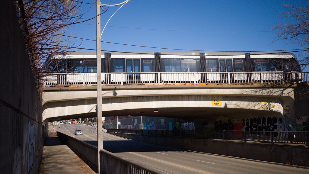
While I think there's some serious questions with the Ontario Line plan, hopefully it manages to finally get some momentum behind elevated transit lines. Also just, since I was a kid, I always thought elevated transit lines looked cool as hell, so I'm all for them where it makes sense.I think we should aim for rapid transit to be fully grade separated. More often than not, though, it should be elevated rather than tunneled.
Allandale25
Senior Member

STREETCARS TODAY | # **Sneaking Into Town ** | Facebook
# **Sneaking Into Town ** New cars for Toronto's Eglinton Crosstown line are coming in from Bombardier. The first true light rail line there will open in 2022, running 19 km (12 mi). Ex-TTC...
 www.facebook.com
lead82
Senior Member
I can't believe they picked the grey livery. It would have been so nice to have them red like the rest of the streetcars/buses. The grey is drab but will blend nicely with the greyness that is Toronto public spaces.
Monarch Butterfly
Superstar
I can't believe they picked the grey livery. It would have been so nice to have them red like the rest of the streetcars/buses. The grey is drab but will blend nicely with the greyness that is Toronto public spaces.
Maybe an accountant figured that "grey" is a less expensive colour?
lead82
Senior Member
Probably true but I though I read somewhere it was to align with the subway train colours - ie our T1/Rockets tin can look. The Flexities would look way nicer in a nice colour or with the green colour Metrolinx was advertising on all their banners and web pages.
Monarch Butterfly
Superstar
Probably true but I though I read somewhere it was to align with the subway train colours - ie our T1/Rockets tin can look. The Flexities would look way nicer in a nice colour or with the green colour Metrolinx was advertising on all their banners and web pages.
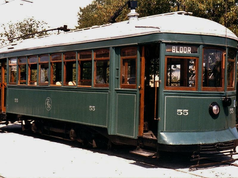
Would have accepted Toronto Civic Railway's green livery.

From link.
EastYorkTTCFan
Senior Member
More likely a hired consultant told them it would be a good colour choice.Maybe an accountant figured that "grey" is a less expensive colour?
robmausser
Senior Member
I can't believe they picked the grey livery. It would have been so nice to have them red like the rest of the streetcars/buses. The grey is drab but will blend nicely with the greyness that is Toronto public spaces.
Grey was chosen opposed to red because of the public perception that the Crosstown LRT is just a glorified streetcar.
Metrolinx wanted to do everything it could to stop this public perception. Having them look like the Streetcars definitely would not help.
The grey was to try and make them look as much like the metal subway cars, although I agree they look drab.
Metrolinx does not have a good track record with picking colours for its vehicles...
Coolstar
Senior Member
Actually, the UP Express livery is pretty good IMO. Same goes for the new livery on the GO train coaches.Grey was chosen opposed to red because of the public perception that the Crosstown LRT is just a glorified streetcar.
Metrolinx wanted to do everything it could to stop this public perception. Having them look like the Streetcars definitely would not help.
The grey was to try and make them look as much like the metal subway cars, although I agree they look drab.
Metrolinx does not have a good track record with picking colours for its vehicles...
View attachment 290707
Monarch Butterfly
Superstar
cplchanb
Senior Member
If it was green TTC will cry foul so I guess grey will have no excuses for infighting.Actually, the UP Express livery is pretty good IMO. Same goes for the new livery on the GO train coaches.
afransen
Senior Member
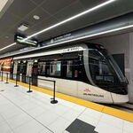
Just realizing that is the actual livery. I assumed the livery hadn't been put on yet. Wow, boring. Transit vehicles should stand out a bit more.


