alklay
Senior Member
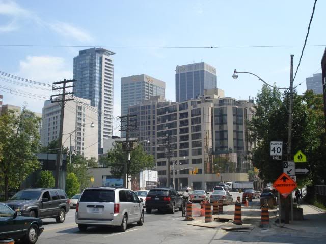
A Rabba with some hydro poles and skinny and dead trees to really complete the picture.
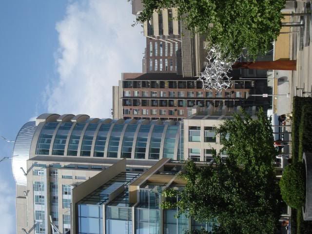
^I single this view out because it has this minimalistic look that fmpov is much better looking than the round "silo with cap" facing Yonge St. I actually think the round end needs to be covered first by another building!
(Okay, I know, a parkette is scheduled for the little patch in front. I think a flatiron redbrick Clewesian-styled building would be ideal here.)
Up close, this building is tolerable. Anyone else agree?
^Oh but the good ones...are so good there. .
