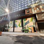
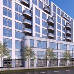
The Olympic Village looks nothing like the logo.
The Olympic Village, the venues, and even all the park and path connections are supposed to resemble blood, veins and muscles. The main Olympic Stadium is supposed to be clad in a skin that looks like the fibres of human muscles. Parks and green space are shaped like muscle fibres. The Olympic Village buildings and pathways to the venues are to be shaped like veins. People walking along the pathways are supposed to represent blood - carrying life-giving oxygen along the veins (pathways, some buildings) to the muscles (parks, some buildings like the Main Stadium).
The logo is too jagged to fit in with the master-plan for the architecuture and urban design of the Olympic site. I would say that the logo should have been closer to this "cardiovascular" theme.


