News   Nov 14, 2024
 809     0 
News   Nov 14, 2024
 1.2K     0 
News   Nov 14, 2024
 503     0 

High Park Lofts on Roncesvalles (Stinson, 7s, Stanford Downey)

A Harry Creation on Roncevalles

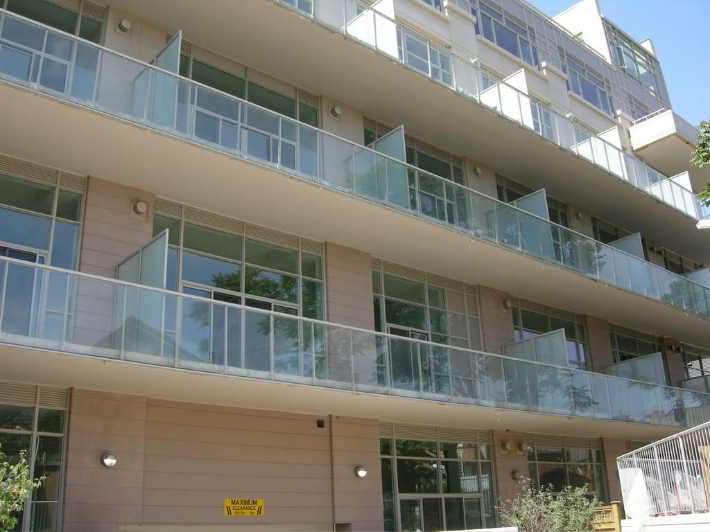
Walked by the other day and must say i'm disappointed. Parts of it look decent (the long glass balconies.) But really, red brick should have been used; no excuses harry! This junction of Dundas/Ronce/Bloor is depressing (and very autocentric.) Anything that makes the area more attractive--some red brick I think--would be welcome. On a related note, just realized what a horrible idea Roncevilles Lofts is from an investment perspective: gorgeous building, terrible location--beside a fuel depot?!

Overall, I'd rather see faux brownstone walkups (like the real ones in the nabe) than pink precast. I just can't see hip little boutiques and Polish deli's moving into Harry's creation.
 
Hip little boutiques and Polish delis will probably be making their real estate decisions on grounds other than the colour of the cladding.
 
On a related note, just realized what a horrible idea Roncevilles Lofts is from an investment perspective: gorgeous building, terrible location--beside a fuel depot?!

I don't think that fuel depot will be there for ever, I also think any purchase in the area will pay off huge. The area is about to go upscale very fast you can feel it.
 
Can someone snap pictures? I'd like to see the finished thing! :)

(I've seen the update on Page One, but more recent and in summer weather would be nice if possible.)
 
Just lovin' my new digital camera...

Doesn't look like anyone has moved in yet. The sales office is still open.

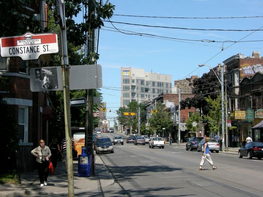
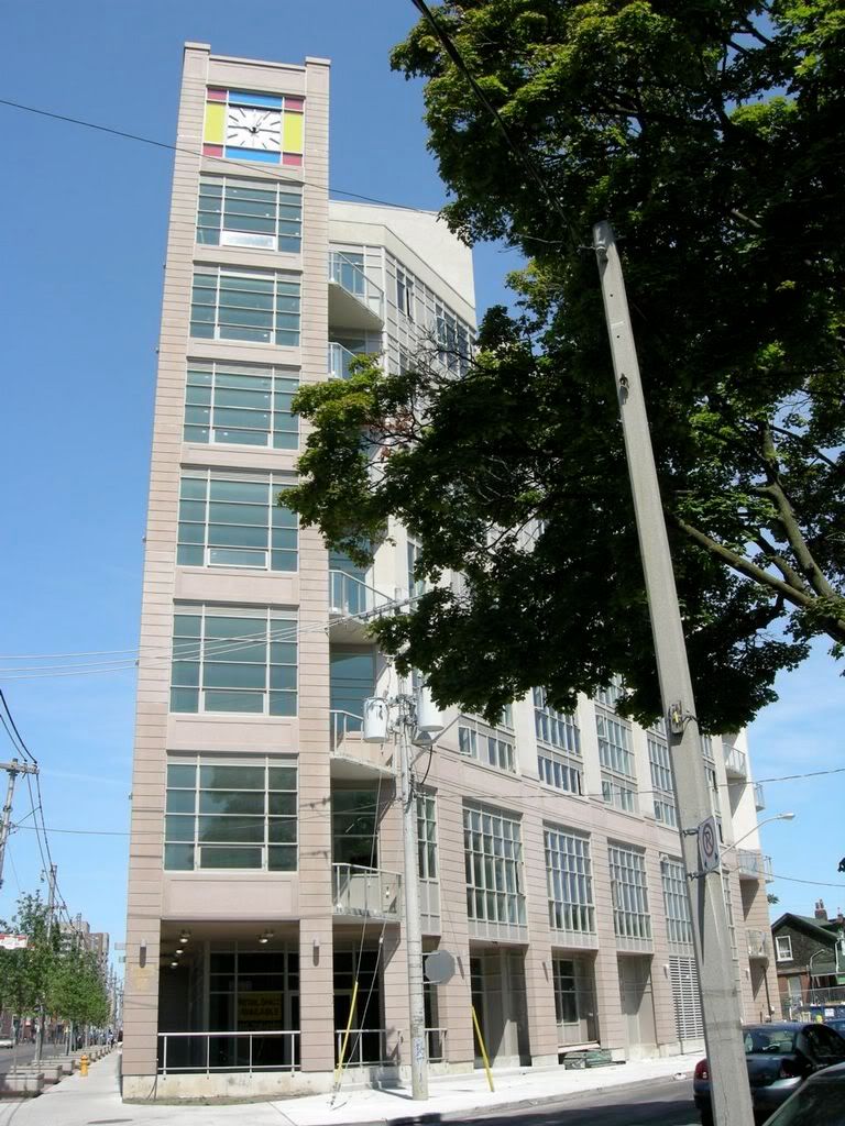
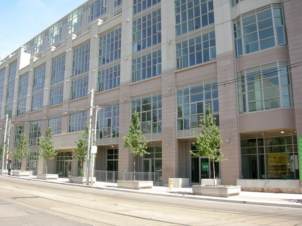
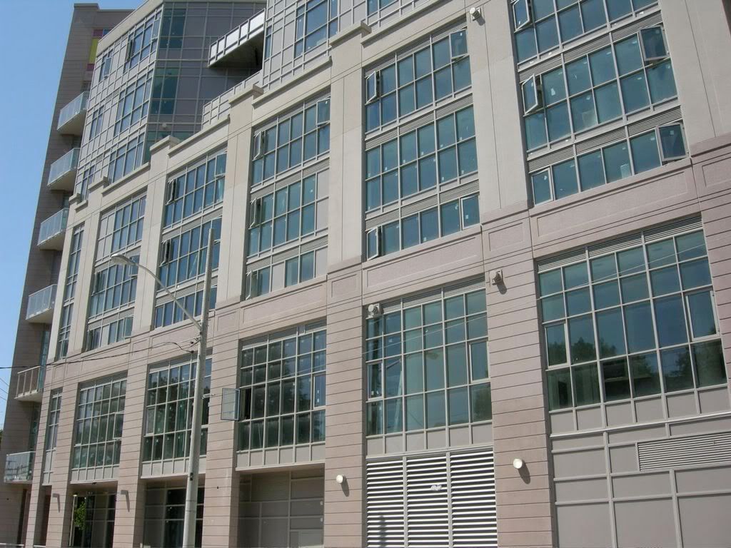
This building really stands out in this incredibly run-down neighbourhood (east of Roncesvalles and north of Howard Park, that is).

hp1.jpg


hp2.jpg


hp3.jpg


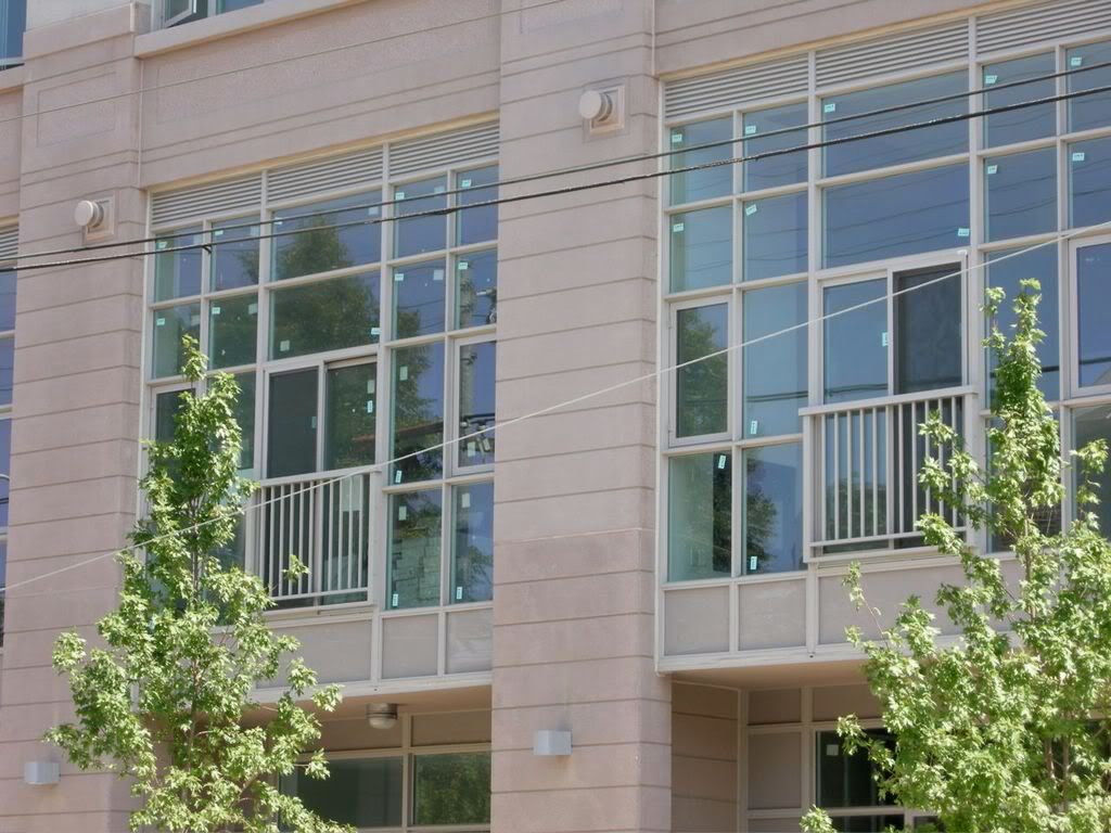
hp4.jpg


hp5.jpg


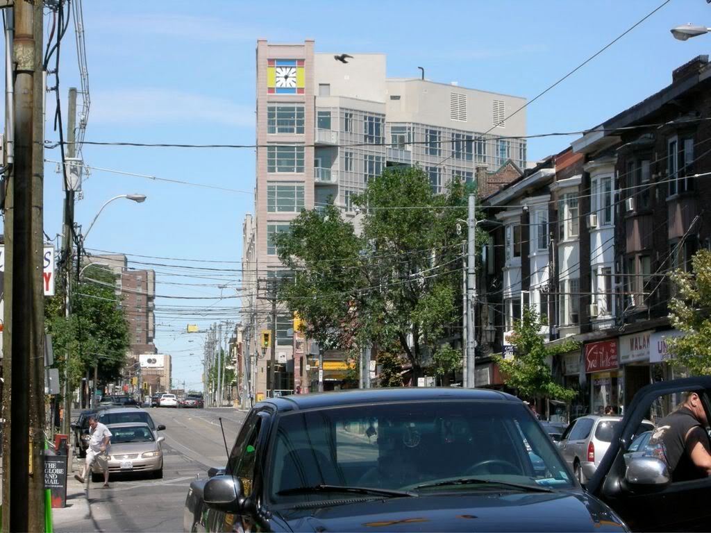
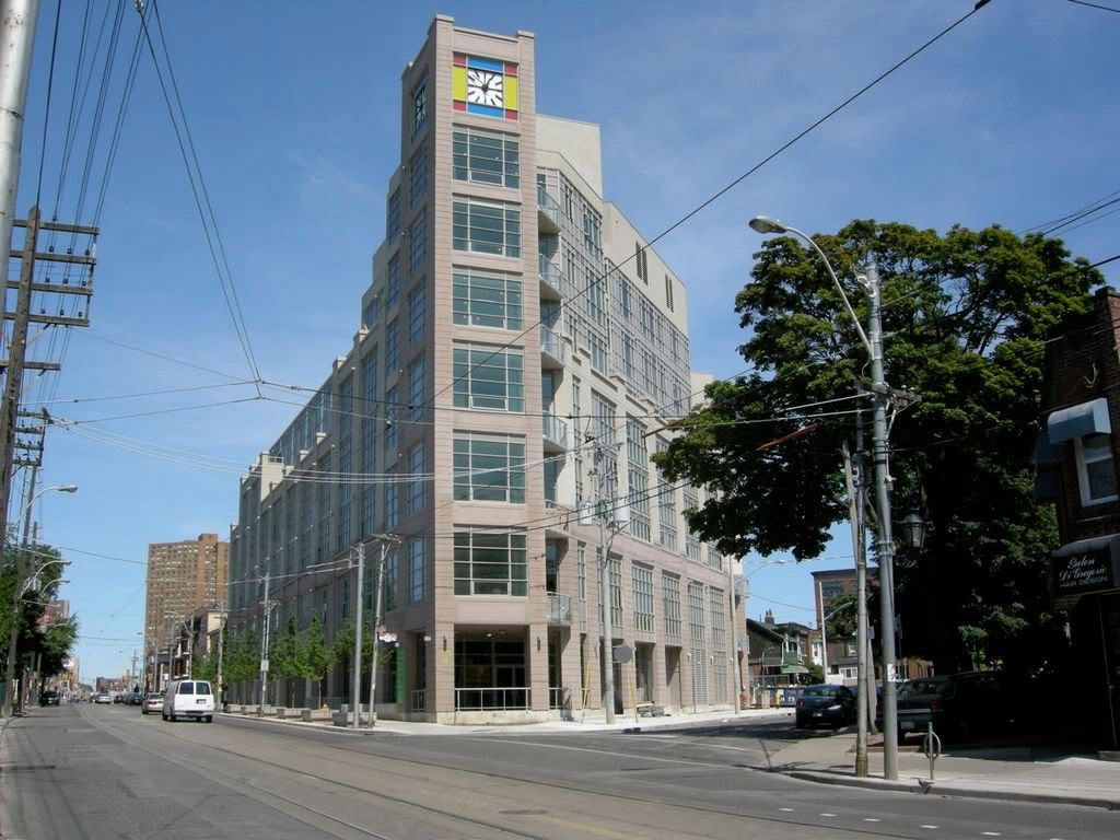
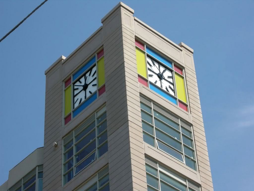
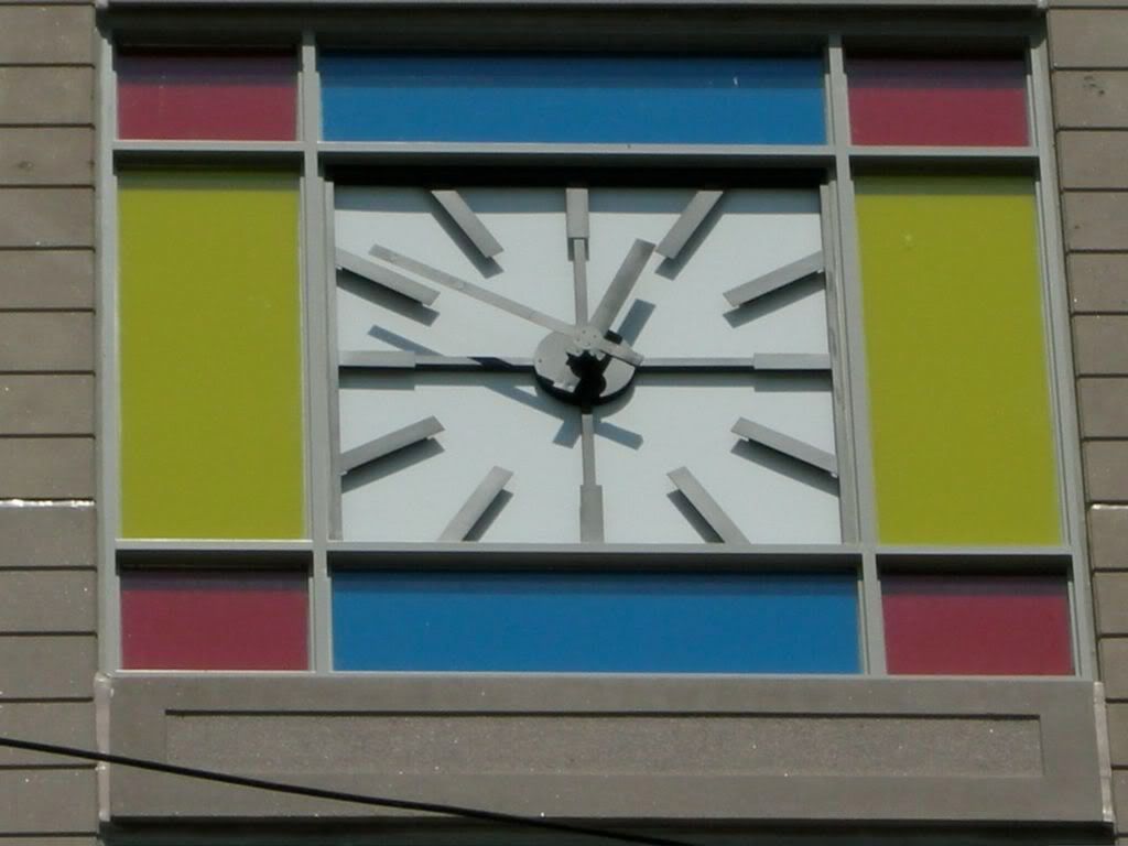
I kinda like the bizarre colour additions.

hp6.jpg


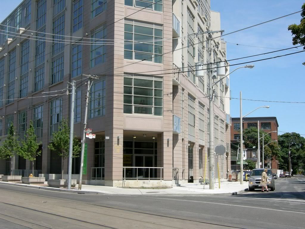
Masses of ugly dangling wires all over this city look like crap.

hp7.jpg


hp8.jpg


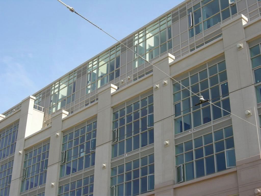
hp9.jpg


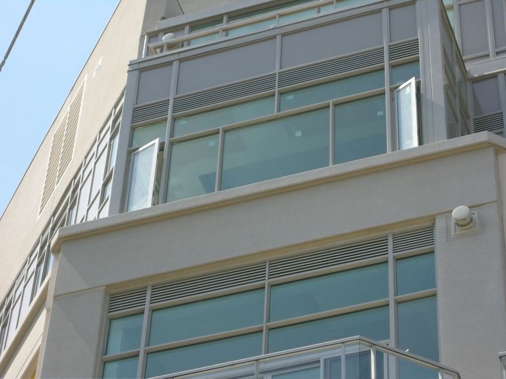
Looks like nice sunroofs on the top floor.

hp10.jpg


Wouldn't want to be sitting on the balcony when those transformers blow...

hp11.jpg


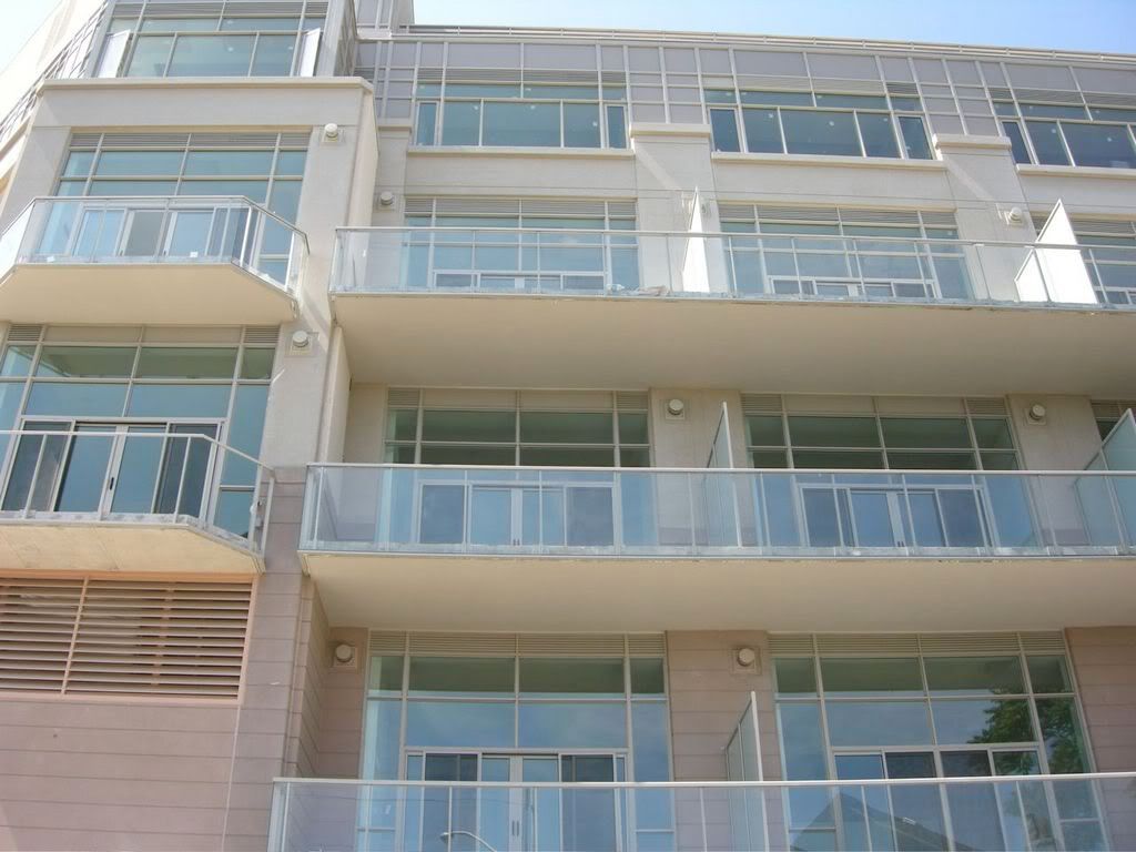
Moving around to the backside...

hp12.jpg


hp13.jpg


hp14.jpg


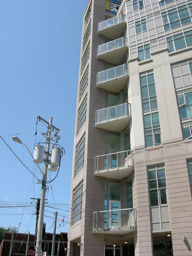
Very deep balconies for these folks.

hp15.jpg
 
for a "flatiron" building Harry blew that corner's potential badly: meet the street with retail not a raised porch!

Overall, I find it adds zippo to the neighbourhood. But then I'm a fan of red brick and Aa-style finishes.

Still, reminds me that harry should clear out of Toronto now that he's officially bankrupt and set up business in Hamilton (oh no please don't destroy that present hidden gem and future paradise!) or London Ontario.

Finally, from my perch in the sky it kills my view of those gorgeous LV condo towers--like please Harry maybe some of us are kool enough that we like to Zip around feeling the Vibe;)
 
Wow... great update. I couldn't have asked for better.

The renderings (before they changed the design) were so dramatic and really made it seem more exciting, but I really am happy with the final product.

I really like this development... very cute, and I bet the units are very cozy. Now I'm just curious to see the interior atrium!!!

Interesting that the building isn't occupied yet (with residents)...!
 
or a "flatiron" building Harry blew that corner's potential badly: meet the street with retail not a raised porch!

Actually, I find the "tower" effect worked out well.

Overall, the building still has that "new kid on the block" feel to it, and has not quite been integrated into the street. I suppose that once people start to move in, and with on-going improvements to Roncy, this building will fit in quite well.

I like the clock. If I have any issue, it's with the mechanical box up top. It's just too weighty, and gives the building a top-heavy look when viewed from the east.
 
Casaguy, I'm not certain this building stands out, as I think it's just another eyesore scarring a nice (up-and-coming) Victorian neighbourhood.

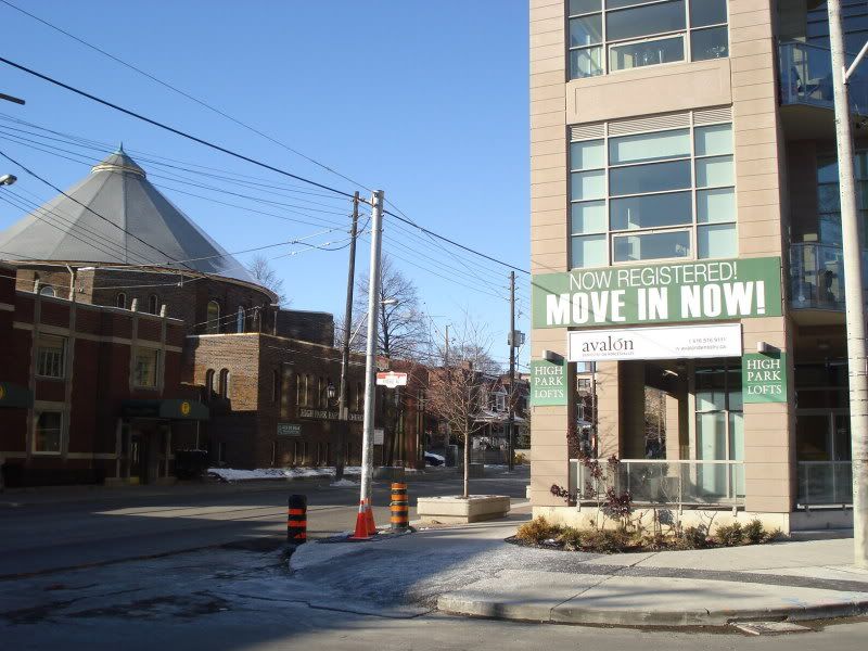
Today, I noticed they've finally registered the building, as proclaimed on the banner ad:

DSC00039-1.jpg


Is Harry Stinson still behind this building? (aka, profits go to his company?)

edit: note the brand new sidewalk is already ripped up Toronto-style! Grrr....
 
Last edited:
The project has been registered for a while now. Stinson is not involved in the project, the receiver is selling the remaining units.
 
This building could have just been so much better. Parts of it have been done alright, but I am more or less pretty disappointed in it. Also, I had the chance to see some of the units from the inside and it is like walking into a suburban home.

Rather, than getting that urban loft feeling, or modern condo for that matter, you have run-of-the-mill banisters, stairs and mill work finishes. I know that purchasers choose their finishes, but when the options are selected straight from Birch Creek Housing development in Aurora, it makes you wonder how much effort was truly put into this project?

All in all, I give it a C. (Christopher Hume ain't the only one who can assign grades...!) :)

p5
 

Back
Top