adma
Superstar
The dilemma with the Yonge Parkade is that it was not an" integrated work of architecture". It didn't really integrate with the Eaton store further north, (and certainly not with the Galleria interior) nor with the existing buildings to the south or across the street. It seemed like a separate building, and certainly a second-rate suburban building at that. The facade was an attempt by Zeidler to "decorate the shed" (so to speak) by masking the garage with a repetitive series of metal frames that were intended to support third-party Yonge Street signage (a la Sam's and A&A's) that would animate the frontage. This signage never arrived (and in fact Dundas Square is the descendant of this concept). Exit stairs were designed to create some interest (like at McMaster), but were too weak a gesture to create any sense of rhythm. Having almost no retail at the base, a large amount of blank exit doors and a set-back (mandated by Metro Roads), the entire block became a black hole that sucked the life out of both sides of the street.
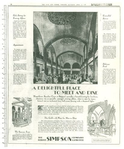
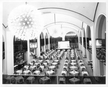
Like in so many cases in the city, the issue is not one of historic preservation vs. modern architecture, but of good vs. banal design. In the case of the Yonge Parkade, we did not get (to put it generously) Zeidler's best. As an aside, adma, I do agree with you about the loss of the Yonge/Dundas glass house element, one that was both playful and urbane. That "floating" Italian restaurant that once existed within the space was also quite lovely.
1980:
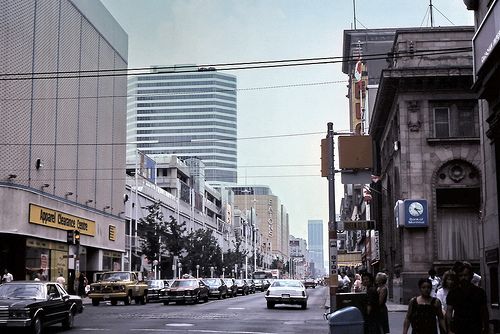
Yet, funny thing is--even as an urban "black hole" without the intended signage, I just can't call what I see in that photo "unintegrated" in and of itself, even if it's a little too discrete relative to its neighbours. Even the piggybacked garage registers more as a coherent part of the overall architectural statement than as an eyesore function awkwardly camoflauged--look: 60s/70s-style avant-garde megastructural futurism dug that stuff. With that in mind, it doesn't look particularly second-rate or suburban to me, and IIRC it's the porcelain-panelled Eaton store which tended to get more of the "second-rate suburban" pans back in the day. In fact, in these here "Save Ontario Place" days, I can see the taste ledger once again tipping on behalf of the former high-tech Eaton Centre elevation in lieu of the present pallid false-fronts, which one who's overfamiliarized with many a present-day power centre or suburban-mall-makeover might argue have ironically more so-called second-rate suburbanity to them.
At worst, it's a heroic failure like Frank Gehry's roughly contemporary Santa Monica Place.
