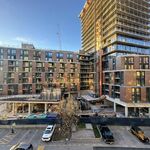
I would disagree with this. If there is a positive about the Hudson, it's the fact that it is not a true eye soar, and kind of "disappears" in to the background. That is unless, you are driving East, and have the sun glaring into your eyes from the reflection in the windows. In terms of the brick - it is fake, it's just cement molding which looks like brick.
Another thing that I think detracts from the building are the 2 midrises to the North and East of the main tower which is a nice structure, but now looks more like a community center more than a condo IMHO.
If you think all there is to warehouses is broken windows and chipped paint, then I'm afraid there is not much point in arguing with you on this point.
There is always a randomness to warehouses, the result of building on and hacking off over decades. They are also designed for practicality, as opposed to just "looking cool" which I find always results in better architecture. That's what's so great about them. There is nothing pretentious about them.
Clearly, Corktown WANTS to look like warehouses and that's really the main problem - they reek of all the typical warehouse clichés but lack all the fundamentals. Not only is there no variation in the building themselves - but there is hardly any variation between the 3 buildings! I'm sorry, but if your going to be cheap about your development, then stay away from styles of architecture which take quite a bit more money to pull off. mark my words, this project risks looking like subsidized housing when all is said and done.


