


B
bengaijin
Guest
Re: Innovative Design Competition - Visual Transformation!
I was at the presentation last night as well, and have to say I was thoroughly underwhelmed.
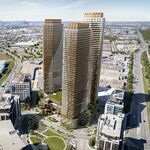
I am completely baffled by the gung-ho support that Foster's proposal seems to generating on this site. While I thought they had a couple of good ideas - the restructuring of queen's quay traffic patterns and (more importantly) the treatment of the north/south 'gateways' leading from the city core to the water's edge - their major gesture, the teardrop/sail icons, seemed to me to be overwrought and impractical, a line of white elephants along the lake.
I hesitate to offer any of the other proposals as "better" however. Like Foster's, most of the other proposals had a good idea or two, but none of them really added up to a coherent or valid vision. I feel that the core objective of this design exercise was lost in these proposals: providing a coherent connective tissue that unites the disparate elements of the central waterfront. Most of these proposals (PORT's and Foster's especially) were focused on scattering MORE objects across the waterfront, putting the goal of unification and pedestrian flow a distant second.
On this criteria, I have to say that the Du Toit/Hillier (was that their name?) proposal did the best job. And yes, I know the floating maple leaf and the chinatown gate and all that were silly and bordered on insulting - by no means am I defending those aspects of the project. But they, unlike anyone else, created a strategy that interlocked a smooth and continuous waterfront line (the bridges) with the serrated zigzag created by the slips, quays and piers. This complex, twin condition is at the heart of the central waterfront problem, and it went largely unaddressed.
I'm glad that so many people are enthusiastic about a new waterfront, but are any of these designs really the right choice?
I was at the presentation last night as well, and have to say I was thoroughly underwhelmed.
I am completely baffled by the gung-ho support that Foster's proposal seems to generating on this site. While I thought they had a couple of good ideas - the restructuring of queen's quay traffic patterns and (more importantly) the treatment of the north/south 'gateways' leading from the city core to the water's edge - their major gesture, the teardrop/sail icons, seemed to me to be overwrought and impractical, a line of white elephants along the lake.
I hesitate to offer any of the other proposals as "better" however. Like Foster's, most of the other proposals had a good idea or two, but none of them really added up to a coherent or valid vision. I feel that the core objective of this design exercise was lost in these proposals: providing a coherent connective tissue that unites the disparate elements of the central waterfront. Most of these proposals (PORT's and Foster's especially) were focused on scattering MORE objects across the waterfront, putting the goal of unification and pedestrian flow a distant second.
On this criteria, I have to say that the Du Toit/Hillier (was that their name?) proposal did the best job. And yes, I know the floating maple leaf and the chinatown gate and all that were silly and bordered on insulting - by no means am I defending those aspects of the project. But they, unlike anyone else, created a strategy that interlocked a smooth and continuous waterfront line (the bridges) with the serrated zigzag created by the slips, quays and piers. This complex, twin condition is at the heart of the central waterfront problem, and it went largely unaddressed.
I'm glad that so many people are enthusiastic about a new waterfront, but are any of these designs really the right choice?
