News   Nov 18, 2024
 1.3K     1 
News   Nov 18, 2024
 599     0 
News   Nov 18, 2024
 1.6K     1 

Blue Jays

Before details emerged of how the trade actually transpired, I always theorized Billy Beane went on a three day bender and traded Donaldson in a drunken stupor.

But as tends to be the case with the Bay Area's less fortunate baseball franchise, they just couldn't (wouldn't) front the cash that Donaldson would ultimately demand.
 
makes me glad I'm a flex ticket holder and got my tickets for the post-season 2 weeks ago
 
makes me glad I'm a flex ticket holder and got my tickets for the post-season 2 weeks ago
Tried to buy single game tickets right at 10 am this morning and there was a 45 minute wait on ticketmaster. Apparently 70,000 people queued to get their hands on tickets.

I've always been on the fence with the Flex Pack but seriously regret not purchasing one this year. How do you like being a Flex Pack holder?
 
The Jays magic number to clinch a playoff berth is 1. All we need is for the Twins and Angels to lose.

EDIT:

The Jays are in the playoffs!
 
Last edited:
Do you think the Jays bullpen is strong enough for us to win the World Series? That's one aspect of the team that is inconsistent and could cost us games in the playoffs. Osuna and Sanchez have been iffy lately. I've been more impressed with Cecil than those two. Our bats and fielding are almost always reliable, but our relief pitching is something that I think needs some improving in the playoffs. Hopefully my fears will be unjustified.

On another note; if we do win the World Series, it would be great to have another CN Tower fireworks show (perhaps on that same night, after the game, or on the day of the parade). I don't mean to get ahead of ourselves, but that was a thought that crossed my mind recently. It would be a nice way to cap off what I hope will be a championship season.

Lastly, do you think the Jays will come in 1st in the AL? What do you think the playoff matchups will be? I would like to see the Jays face the Yankees in the Division Series, knock them out, and hopefully face Kansas City in the ALCS. It would be nice to avenge our loss to them 30 years ago in the '85 ALCS (in which we blew a 3-1 series lead).

Isn't it weird to be discussing the Jays with so much anticipation, excitement and expectation? We've probably got the best chance to win it all this year. It's especially odd because no one saw this coming. Our success and threatening reputation has really came out of the blue.
 
Last edited:
This is an interesting discussion re the Jays logo (which I've hated since its unveiling):

http://www.blogto.com/sports_play/2011/11/what_do_you_think_of_the_new_toronto_blue_jays_logo/

I hope to see it improved in the future. There are so many errors in it right now that I'm sort of saddened to know it will be on, at the very least, this year's AL East pennant. It would be a neat idea to hold a competition, or simply, invite artists on Urban Toronto to assess the mistakes and inaccuracies in the current logo and have them sketch their own visions (respecting the theme of the logo; just modifying and refining it to make it better). Even non Jays fans would surely be up to the challenge to show off their abilities and creative approach. Would that be possible to set up? It would be interesting to see the various ideas people have and perhaps something great can be fleshed out and forwarded to team management for their future marketing consideration for the club.

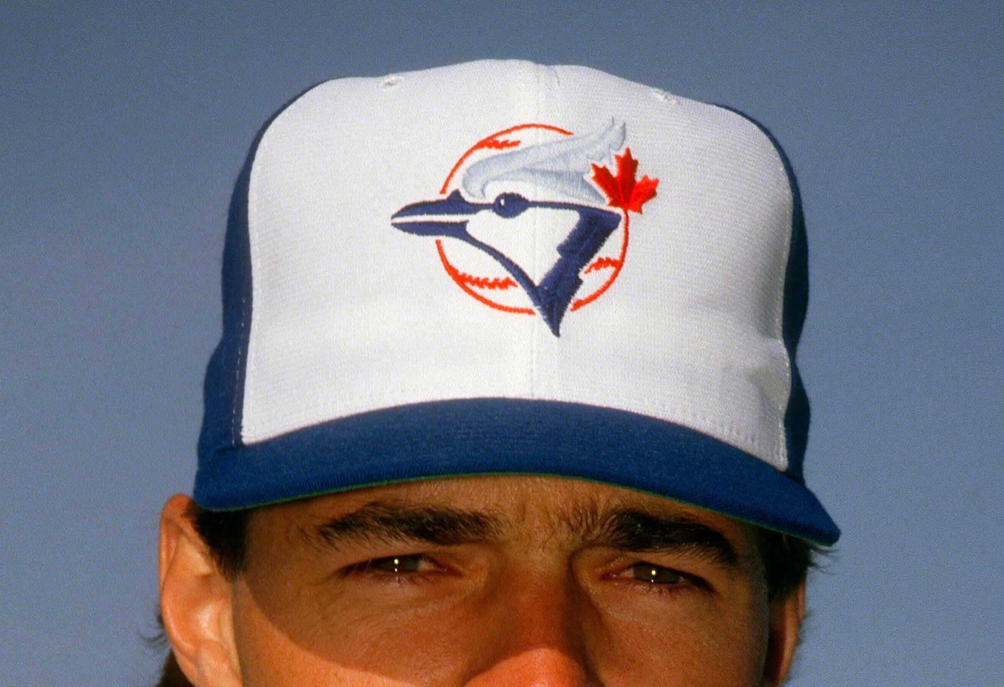
On that note, it would be nice to see the Jays wear their white panel caps and helmets for every home game. I did, however, notice another error while watching Jose Bautista's interview during tonight's rainout. He was wear the white panel cap, but I immediately saw that the stitching on the white panel is blue, which conflicts with the clean white aesthetic. It ought to be white, like it was on our original home caps. See comparison below:

img-389891-m.jpg


bluejays.jpg
 
Last edited:
It's still the best logo they have had since the original.

Here is a look back at some of the Jays horrible logos.

1118jays1.jpg
 
This is an interesting discussion re the Jays logo (which I've hated since its unveiling):

http://www.blogto.com/sports_play/2011/11/what_do_you_think_of_the_new_toronto_blue_jays_logo/

I hope to see it improved in the future. There are so many errors in it right now that I'm sort of saddened to know it will be on, at the very least, this year's AL East pennant. It would be a neat idea to hold a competition, or simply, invite artists on Urban Toronto to assess the mistakes and inaccuracies in the current logo and have them sketch their own visions (respecting the theme of the logo; just modifying and refining it to make it better). Even non Jays fans would surely be up to the challenge to show off their abilities and creative approach. Would that be possible to set up? It would be interesting to see the various ideas people have and perhaps something great can be fleshed out and forwarded to team management for their future marketing consideration for the club.

On that note, it would be nice to see the Jays wear their white panel caps and helmets for every home game. I did, however, notice another error while watching Jose Bautista's interview during tonight's rainout. He was wear the white panel cap, but I immediately saw that the stitching on the white panel is blue, which conflicts with the clean white aesthetic. It ought to be white, like it was on our original home caps. See comparison below:

img-389891-m.jpg

The logo change back in 2011 was perhaps the first step in rejuvenating what was a long dormant fan base. The logo changes post 1996 were never resounding wins with the majority of Jays fans because quite simply, the original logo was iconic in its representation of the pinnacle of the team's success during the late 80's and early 90's. The cartoonish, hokey junk they came up with was simply disgraceful in my opinion and as a fan, it made representing the Jays more of an embarrassment than anything, especially when compared to more traditional logos like the Red Sox and Yankees.

That said, my only real nitpick with the current logo is how they just plastered the over sized maple leaf onto the Jay, as opposed to incorporating it into the design of the baseball of the original logo. They use a variation of this as their alternate:

oc3tlmem3ptof3z503ih1hcfv.png


Ideally, the maple leaf should've been incorporated into the red outline of the baseball to stay true to the original logo and the baseball should be seen on the hats and jerseys as was the case in the past. Regardless, the current logo is still a HUGE upgrade over the cartoony trash they peddled in 2004.
 
No doubt that the current logo is an improvement over the previous ones (sans the original), but it still needs a lot of work, and that article I posted demonstrates what is wrong with it. Definitely, the worst aspect is how the maple leaf is so huge and isn't an extension of the baseball. The maple leaf should be much smaller and not compete for attention with the blue jay head. Another problem with the logo that isn't mentioned in that article is that the baseball outline is too spaced apart from the jay head. It looks too fragmented.

Apparently baseballs aren't allowed to be on caps and jerseys anymore, hence the ball-less logo. That's a pretty farcical rule. As if players would be distracted by that. That being said, the maple leaf only makes sense in the context of the baseball logo. Since our caps and jerseys don't have a ball on them, the blue jay head should stand alone without a leaf thrown in there as an after thought. It's not even necessary to be there. Everyone knows we're a Canadian city. I think it just accentuates our inferiority complex towards the United States. We're the Toronto Blue Jays, not the Canadian Blue Jays.
 
Why change something that's perfectly fine the way it is?
 
Because it isn't perfect. Don't you see the problems with it that are discussed in that article I linked to? Why not take those points to heart and further improve the logo. It is on the right track, resorting back to the original logo, but there are some aspects that need further tweaking. Given that this is a board that largely revolves around architecture and design, most of us have a keener eye for detail than the majority of people and could probably come up with something that is better than what currently identifies the team. At the very least an interesting discussion can be had. I'm surprised that any artist could design something so sloppy. I don't even have an art background and I immediately noticed several problems with the logo when I first saw it.

Another problem with the current logo is the shade of blue on top of the blue jay head. It should be almost baby blue. More like what is on our original caps.
 
Last edited:

Back
Top