News   Nov 15, 2024
 389     0 
News   Nov 15, 2024
 820     0 
News   Nov 15, 2024
 408     0 

Bay Adelaide Centre West Tower (Brookfield, 50s, WZMH)

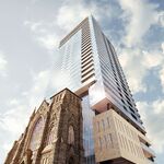
#3 is such a clunky and poor rendering... somehow seems like the perspective is wonky or angles were drawn by a child.


careful, #3 was done by a forumer with some great talents when it comes to renderings. I think he just did a quick design based off some confusing blueprints.
 
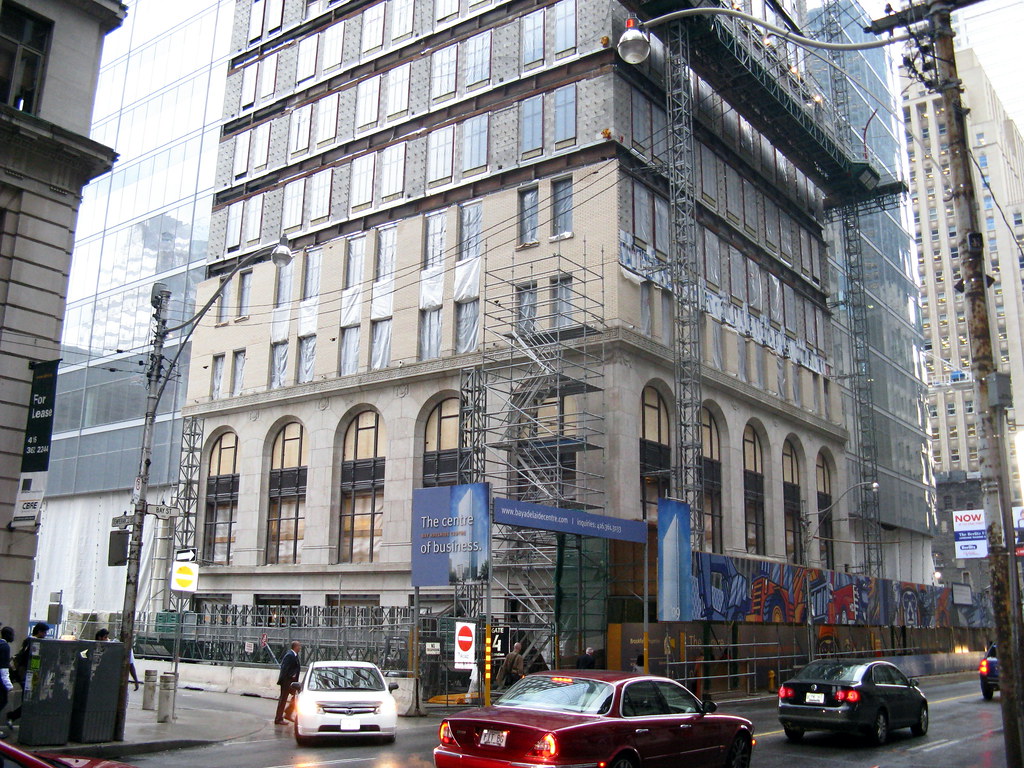
2845008106_a6b1d7aa47_b.jpg

I believe the original building had some blue brick between the windows, are they keeping that or doing something different?
 
No, it was its neighbour to the south which had the blue brick, and that's *not* coming back...
 
The 'rendering' of version 3 is actually a drawing by Anthony Sun (as the caption suggests) from the submitted elevations, for the SSP drawing section. Since artists have to scale their work down quite small, this is fairly typical in appearance. Tony has contributed lots of other terrific drawings to SSP.

http://skyscraperpage.com/diagrams/?memberID=31
 
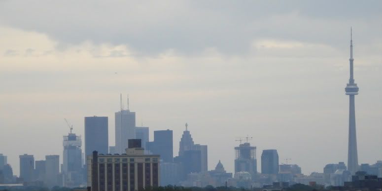
From that angle Telus and Success1 line up perfectly. But i'd have to think that would be Success1, Telus isn't tall enough yet to be visible.
 

Back
Top