News   Jun 20, 2024
 416     1 
News   Jun 20, 2024
 1.5K     6 
News   Jun 20, 2024
 610     0 

Bay Adelaide Centre West Tower (Brookfield, 50s, WZMH)

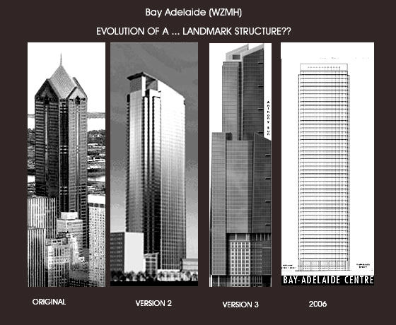
I still would have preferred the original design as well. It was supposed to be 200 feet taller than this last design. The one that they're currently building is very elegant as well though.
 
Nah I don't think the first design would have been all that great ... you could probably account for the extra height due to the spire.

Now what about the third design ... that could have been one interesting building!

As has been mentioned though, what we got seems to have turned out to be way less stumpy then the initial renderings indicated ... I like it.
 
11 September 2008 photo update

From Rebecca just east of Ossington this afternoon: shacks on Givens (which I like) meets office tower on Bay (which I hate.)

DSC00092-1.jpg
 
yep, no doubt it will look better when finished! nice photoshop work.

Urban Dreamer - you always keep me guessing. Ive just read your comment praising the Murano condo towers and now you call BA crap? To my untrained eye, these projects look very similar... glass boxes with notched corners. Maybe I am missing something? In my opinion both are bland and boring.
 
Solaris...great pics from the TD Centre..that first one is amazing. We're in the home stretch now as they start finishing off the roof...so keep those updates coming :)
 
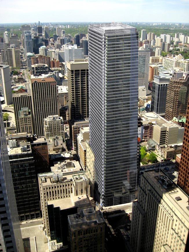
Third proposal is the best one... current design is too generic


na, as Ive said many times before on this thread, #1 is clearly the classiest design. And I would suggest one of the reasons this design was abandoned was because it was far more expensive to build than any of the later ones. Give me a granite clad building any day! #2 is not bad, but didnt we get a shorter version of that with the Maritime Life building at Yonge and Queen? #3 is such a clunky and poor rendering... somehow seems like the perspective is wonky or angles were drawn by a child. #4, what we actually got was by far the most boring.
 
na, as Ive said many times before on this thread, #1 is clearly the classiest design. And I would suggest one of the reasons this design was abandoned was because it was far more expensive to build than any of the later ones. Give me a granite clad building any day! #2 is not bad, but didnt we get a shorter version of that with the Maritime Life building at Yonge and Queen? #3 is such a clunky and poor rendering... somehow seems like the perspective is wonky or angles were drawn by a child. #4, what we actually got was by far the most boring.

Agreed, I too prefer the first design as this 80s novelty, the way we look at 80s clothing in amusement. Cities throughout North America have these landmark PoMo towers with funny pyramids and/or domes and we don't! Shame...:D
 
Scotia Plaza gives us just the right amount of PoMo... I'm happy enough with it.

Plus, more PoMo in our skyline would make us look like an American city. I prefer that we keep our own distinct flair.
 
Scotia Plaza gives us just the right amount of PoMo... I'm happy enough with it.

Plus, more PoMo in our skyline would make us look like an American city. I prefer that we keep our own distinct flair.

Or an Asian city, or a European one? American cities aren't the only ones with PoMo in their skyline.
 

Back
Top