http://www.theglobeandmail.com/servlet/story/LAC.20090124.ROCHON24/TPStory/National
CITYSPACE: HELLO INSULATING MURALS: GOODBYE BORING GREEN MONOLITH
Hey dude, check out the flower-power tower
The U of Waterloo has wrapped its new School of Pharmacy in medicinal herbs. The result isn't flawless, but it sure is groovy
LISA ROCHON
January 24, 2009
KITCHENER, ONT. -- You can see it on the ski slopes - the dazzling grids of colour splashed all over this season's snowboarder jackets, and the lusciously oversized flowers on the latest skis. Even the psychedelic video projection in the Museum of Modern Art's atrium (big, bright, wild shapes flowing over the walls and the bodies of New Yorkers) is a much-needed love-in. And Barack Obama has been inaugurated as 44th president of the United States - of things old and true.
It's flower power all over again. And the love is touching architecture.
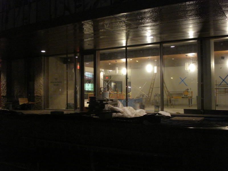
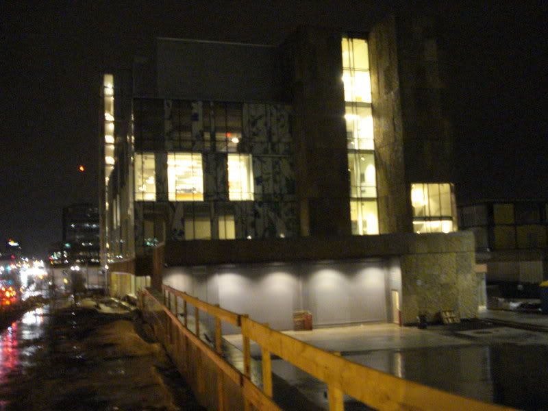
Just when we had grown weary of green-tinted glass infecting our cities like the winter flu, a building comes along that replaces the deadening curtain wall with a contemporary tapestry alive with lushly painted flowers and medicinal herbs. University of Waterloo's School of Pharmacy by Hariri Pontarini Architects is irreverent, gutsy and imperfect. Most compelling is the way a seven-storey building can communicate, even in the winter-weary downtown of Kitchener, Ont., that maybe, yes, strawberry fields are forever.
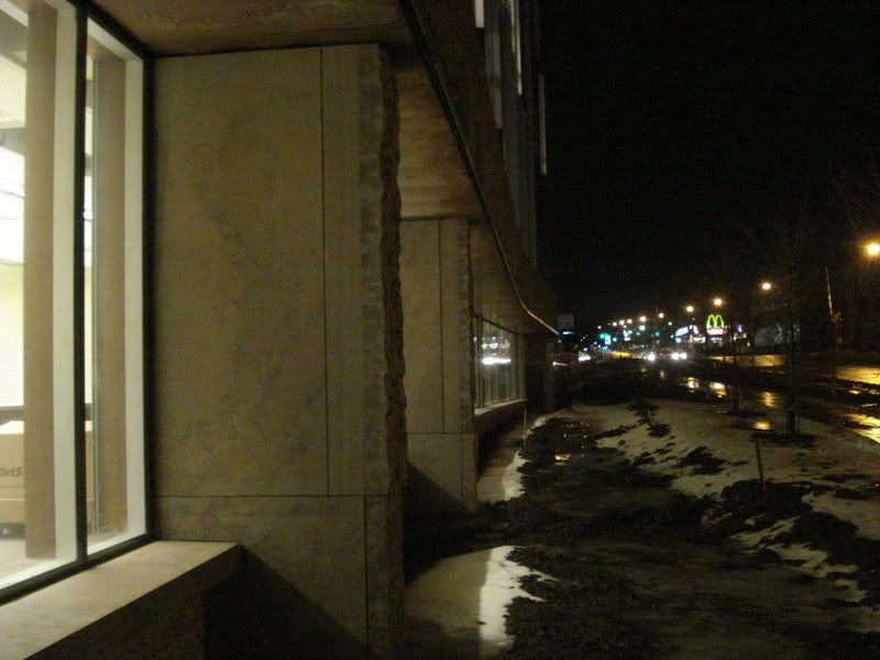
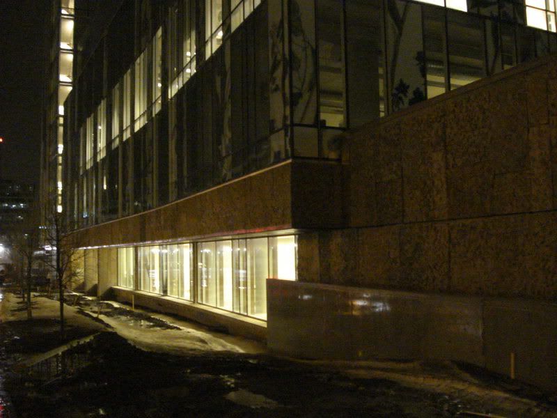
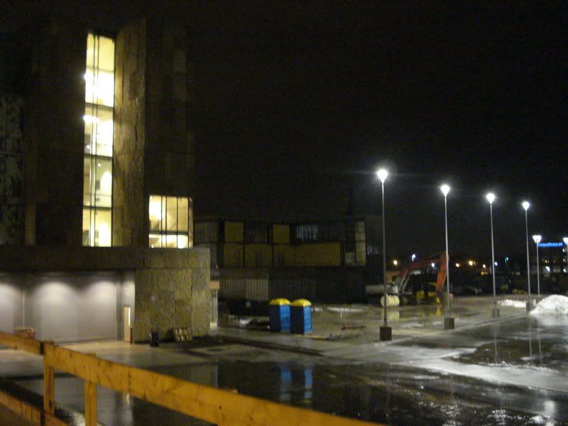
The building is part of the university's health-sciences campus, a potent mix of academic research and family medicine, designed to trigger the revitalization of an early-20th-century warehouse district. The city of Kitchener has donated $30-million to the building, as well as the land: an eight-acre (about 31/4-hectare) site at the corner of King and Victoria streets. A centre for family medicine - with offices and 27 examining rooms, also designed by HP Architects - is under construction next door to the $53-million pharmacy school. The two buildings will be connected by an atrium. Public space, designed by Claude Cormier, will feature a grassy courtyard with honey-locust trees, and a streetscape lined by that hearty hybrid, the accolade elm.
But it's the colour images embedded in the building that dominate its form. Photographic murals have been inserted beneath a series of glass spandrels that wrap the building's exterior. In those photos, verdant leaves grow everywhere; there are violet and red blossoms, too, and philandering bees. Surrounded by the sober, taupe palette of the neighbourhood's historic brick warehouses, the pharmacy building's lush gardenscape, dancing beneath glass, suggests that - convention be damned - there are delightful alternatives to lifeless cladding systems.
Necessity is the mother of invention. Necessity can also force a bohemian willingness to try something new. The building was originally meant to be clad in limestone and glass, but cost overruns forced the architects to rethink the aesthetic. Reluctant to approve a generic metal or stucco cladding, partner-in-charge Siamak Hariri thought back to a theme he had often discussed with Jake Thiessen, director of the School of Pharmacy and the downtown health-sciences campus: Roughly 60 per cent of pharmaceutical drugs originate, not in a factory, but as natural plants.
Hariri contacted Sky Glabush, an artist and art professor at the University of Western Ontario (who is also Hariri's brother-in-law), to ask whether he could produce a small watercolour of medicinal herbs and plants. Glabush typically paints slightly disturbed landscapes of dystopia, but he agreed to help.
Here, it's important to linger on how a creative hunch gets translated into a captivating reality. Introducing a new building material is a risky business that can devour a firm's time, energy and money. But evidence of the painterly hand - Glabush's brushstrokes in watercolour and gouache - compelled the architects to pursue what the artist had begun. Certainly, that impulse has guided those whose work has resonated powerfully before: At Notre Dame du Haut chapel in Ronchamp, France, Le Corbusier understood the magnetic pull of the painterly hand by eschewing stained glass, opting instead for windows hand-painted with a crude, child-like wonder.
Hariri called on Udo Schliemann, a Toronto graphic designer with Gottschalk + Ash, to select certain aspects of Glabush's diminutive watercolour painting to magnify big enough to match the building's three-metre-high spandrels.
The next question: What material to use for the mural itself? With project architect Michael Boxer co-ordinating the creative initiative, the firm was put in touch with both the American and Canadian offices of DuPont, and the company agreed to provide what's called a film interlayer - effectively, a large, thin photo. It was the first time an interlayer had been integrated into a building's curtain wall rather than be simply a stand-alone artwork. Each panel was ultimately cut from a larger photographic sheet and numbered by local curtain-wall contractors Merit Glass. The pattern was carefully calibrated to offset costly heat gain on the west and south elevations.
From a distance and up close, the colourful mosaic beckons to the most world-weary urbanite. Measured that way, the building is a triumph.
Still, the building is also hobbled by its own generation gap. The difficult discourse splits along the lines of the bohemian groove of the curtain wall and the extensive, establishment use of stone and copper on the lower floors. And the metal fins disguising mechanical vents at the top of the building belong to still another, cooler aesthetic.
As a result, those boho flowers look great - but feel out of place. They're like disillusioned graduate Ben Braddock smoking weed in the middle of his parents' swanky cocktail party.
Hariri Pontarini Architects occupies a place of privilege within Canada as much for the firm's exquisite handling of stone and wood as for setting down urban buildings with grace and purpose, no matter a site's constraints. Their clients include York University's Schulich School of Business; and, most recently, the University of Toronto's department of economics, with its slipped planes of old and new architecture running along and behind St. George Street.
There's no denying the firm's allegiance to old-world, European elegance. To that end, underneath a copper soffit gracing the pharmacy building's front entrance, there are oversized glass doors in thick frames of walnut. Inside, built-in seating and window fins (vertical, hyper-articulated mullions) are expressed in rich tones of walnut. Within the main lobby, stairs are cut from moody Eramosa stone, and offset from a glass balustrade with large, steel grommets.
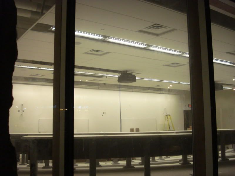
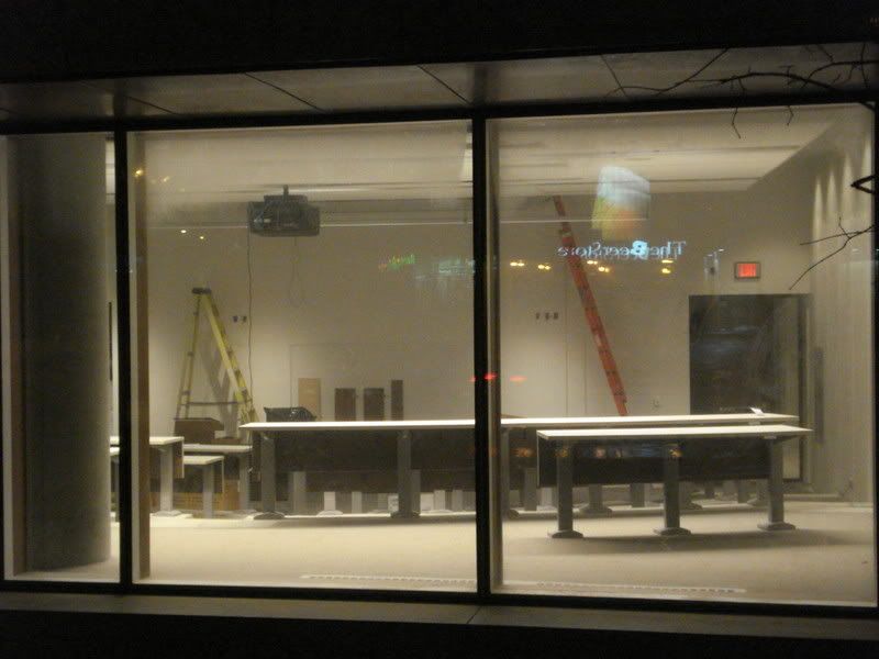
Pharmacy-school director Thiessen was on the architecture-selection committee for U of T's Leslie L. Dan Pharmacy building, before he left Toronto for Waterloo. Unlike the sealed confines of that building (by Foster + Partners), the Kitchener work features operable windows and open research labs that are located above ground and easily illuminated by natural light.
Many pains have been taken by Hariri Pontarini (in association with Robbie Young + Wright Architects) to relieve the Cartesian grid. "We're experimenting with softness all over the building," says Hariri. "We're deliberately patterning on the outside for softness - and for a bit of joy, hopefully - trying to take some of the hardness off." The curve of King Street is mirrored by the curve of the pharmacy building, to the north; and, to the south, by the rhythm of alternately protruding window bays.
The elegance of the construction, led by Ball Construction Inc. of Kitchener, is impressive throughout. Even in a place typically reserved for the roughest detailing, in the fire-escape stairwell Hariri Pontarini has provided a stainless-steel balustrade with harp-like insets, and capped it with a curved, walnut railing.
And the exterior stone is a compelling story. Much of the new pharmacy building - students only just began occupying its labs and lecture halls earlier this month - features the top layer of Eramosa stone found in an Owen Sound, Ont., quarry. Such "overburden" is usually considered too rough and pebbly for use, and is tossed away. But for this project, it was offered - for cheap. Hariri liked how it referenced the heaviness of the Earth, while the painterly windows spoke of the riches growing from the Earth. In theory, it works. But the tripartite canvas of stone, boho garden and metal cladding feels forced into a slightly disjointed, choppy narrative.
Was it wrong to allow a building to broadcast some earthly charms? Not a bit. The flower-power template is beguiling enough that it'll likely be edited, worked over, even imitated by other architects in future years. That's what happens when architecture takes a chance on itself, and decides to buck the establishment.
lrochon@globeandmail.com