|
|
|


You are using an out of date browser. It may not display this or other websites correctly.
You should upgrade or use an alternative browser.
You should upgrade or use an alternative browser.
TTC: Other Items (catch all)
- Thread starter drum118
- Start date


WillTo
Senior Member

Streety McCarface
Senior Member
I wonder how long the 504 split will last. When they tried it on Queen it was an abysmal failure and no doubt this will be too.
In theory it is a good idea to split the route on either side of Downtown but in practice it is not. When people need to remember is that vehicles need places to layover and when you have vehicles laying over on non-rev trackage (I saw non-rev in the sense that it is not a dedicated route i.e Parliament V.S. King) you will have headway issues.
I give it 3 months before the 514 is either reinstated or the split is dropped.
Why couldn't they just have named each section of the route 504: Broadview—King and 514: King—Cherry (or Roncessvales—King)? I don't mind the split, it actually seems fairly logical, but all the terminals are different, and it's very hard to tell where one streetcar is going. At least with the different names, you can think to yourself: "Oh there's a 514, it's going to go down cherry", but now you see a 504A and you think "Wait, is it going to Cherry or Broadview?" Especially if you don't use the line daily. We didn't call the 514 the 504S, even though that's basically what it was, because it didn't terminate at any 504 stations.
yrt+viva=1system
Senior Member
I got a noticed last week about the Vaughan Municipal Elections and what caught my eye was the use of Vaughan Metropolitan Centre and Hwy 407 as advanced polling stations. It's a great idea as people don't need to go out of their way to make it for an advanced polling station.
Richard White
Senior Member

AlvinofDiaspar
Moderator
Never mind system level design consistency - they still can't get the typographic design right.
AoD
Streety McCarface
Senior Member
I mean, is the "to" really that necessary? We don't want passengers waiting on platforms to read long displays about their train, increasing dwell times (this shouldn't be a problem here, but it can be in NYC). Leaving the "to" as lowercase removes our attention from it, making evident to the reader the important information: Line 1 — Finch.Never mind system level design consistency - they still can't get the typographic design right.
AoD
It's extremely subtle, but there's probably a reason for it.
Monarch Butterfly
Superstar
Obviously lowest bidder. Only two colours, black and amber.
Would have preferred a yellow ball with the 1 in it, but that would have cost a few more pennies.
Steve X
Senior Member
They just have to meet TTC's requirements for this bid.Obviously lowest bidder. Only two colours, black and amber.
Would have preferred a yellow ball with the 1 in it, but that would have cost a few more pennies.
AlvinofDiaspar
Moderator
Obviously lowest bidder. Only two colours, black and amber.
Would have preferred a yellow ball with the 1 in it, but that would have cost a few more pennies.
I have no problem with monochrome displays - the colour is right for maximum visibility. The issue is the illegibility of the font used.
I mean, is the "to" really that necessary? We don't want passengers waiting on platforms to read long displays about their train, increasing dwell times (this shouldn't be a problem here, but it can be in NYC). Leaving the "to" as lowercase removes our attention from it, making evident to the reader the important information: Line 1 — Finch.
It's extremely subtle, but there's probably a reason for it.
Except that the characters in "Line" and "Finch" are also lowercase after the first character. That has no bearing on important information - but to distract from it.
AoD
M II A II R II K
Senior Member
There’s a separate 29E express service in addition to the 929. I guess it’s the same service.
Steve X
Senior Member
Some buses fell through the crack and didn't receive the 929 sign programming.There’s a separate 29E express service in addition to the 929. I guess it’s the same service.
cplchanb
Senior Member
I mean, is the "to" really that necessary? We don't want passengers waiting on platforms to read long displays about their train, increasing dwell times (this shouldn't be a problem here, but it can be in NYC). Leaving the "to" as lowercase removes our attention from it, making evident to the reader the important information: Line 1 — Finch.
It's extremely subtle, but there's probably a reason for it.
i dont understand why ttc doesnt like capped letters. their font size is so small that you can hardly see it properly and theyre underutilising the physical screen size.
EastYorkTTCFan
Senior Member
The Screens on the subway trains aren't that big, to begin with. The font size is just fine on them for the distance that most riders will be from it, if you have difficulty reading it then see an eye doctor immediately because you probably need glasses, or have some other serious vision problems.i dont understand why ttc doesnt like capped letters. their font size is so small that you can hardly see it properly and theyre underutilising the physical screen size.
M II A II R II K
Senior Member
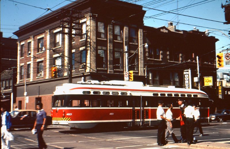
Didn’t know some late PCCs featured the next streetcar’s colour scheme.