News   Jan 28, 2025
 71     0 
News   Jan 28, 2025
 295     0 
News   Jan 28, 2025
 277     0 

TTC Cartography, Signage, and Wayfinding

Because in smaller font applications it fails readability tests miserably. It's iconic for large font applications like subway walls, but for any kind of smaller application, not good.
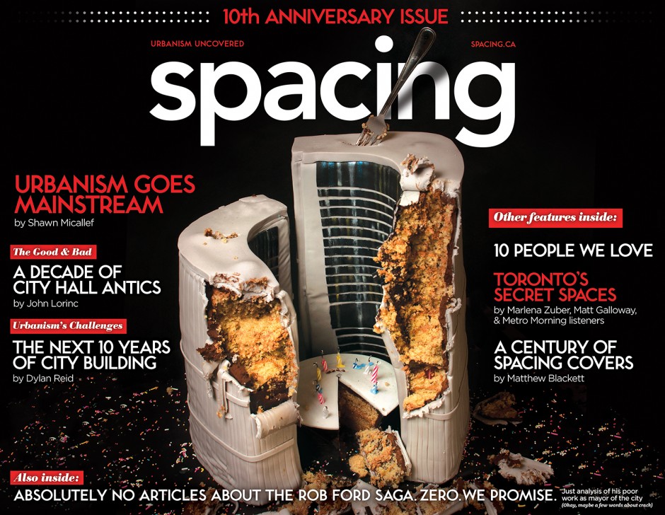
You think? I find it looks good on the 512 stops and should be used on all of them. It's more legible than no sign which is what we have most places now!

And I like it in even smaller applications.

SPACING-30-cover-940x728.jpg
 
You think? I find it looks good on the 512 stops and should be used on all of them. It's more legible than no sign which is what we have most places now!

And I like it in even smaller applications.

SPACING-30-cover-940x728.jpg

Hate to say it, but honestly I think that looks pretty awful. Looking at it on my iPhone (about as small of an application you can get), it's pretty hard to read. Also, there's the fact that Bloor-Yonge has no lower case typeface, so everything needs to be in caps. Again, fine for station walls, but I don't want signage to look like it's yelling at me.

For smaller-scale applications, like station signage, Clearview is the clear (no pun intended) favourite.

I remember when you and I tackled redesigning the standard subway map to fit the 20"x28" poster space currently used for ads, one of the questions I was wondering was if there is a standard used for typeface legibility. Or rather how small can a font be to be accepted as visible to the public. Definitely tried my hardest to keep the current font size, but couldn't do it - considering the inclusion of every Transit City surface stop basically required a downscaling. So yeah I wouldn't doubt that there is a standard for font readability/legibility.
 
I remember when you and I tackled redesigning the standard subway map to fit the 20"x28" poster space currently used for ads, one of the questions I was wondering was if there is a standard used for typeface legibility. Or rather how small can a font be to be accepted as visible to the public. Definitely tried my hardest to keep the current font size, but couldn't do it - considering the inclusion of every Transit City surface stop basically required a downscaling. So yeah I wouldn't doubt that there is a standard for font readability/legibility.

I'm sure there's a ratio of font size to reading distance, but I don't know off hand what that is. That's also the advantage of going with a don't like Clearview instead of Bloor-Yonge: if the viewing distance is the same for both, the former is still readable, even if the font is actually smaller. As you mentioned, smaller but still readable font size on a map definitely has its advantages.
 
Hate to say it, but honestly I think that looks pretty awful. Looking at it on my iPhone (about as small of an application you can get), it's pretty hard to read. Also, there's the fact that Bloor-Yonge has no lower case typeface, so everything needs to be in caps. Again, fine for station walls, but I don't want signage to look like it's yelling at me.

The missing lower case is a problem that could be solved. The mix of Subway font and lower case in that spacing cover seems fine to me. (I don't of course mean the "spacing" logo itself, which is a truly awful hodgepodge of characters.)

So many arguments in favour of Subway font. For one, given that it's actually chiselled into the walls, we're always going to have it. So we should build on that and use it more, to bring some consistency to the system.
 
I remember when you and I tackled redesigning the standard subway map to fit the 20"x28" poster space currently used for ads, one of the questions I was wondering was if there is a standard used for typeface legibility. Or rather how small can a font be to be accepted as visible to the public. Definitely tried my hardest to keep the current font size, but couldn't do it - considering the inclusion of every Transit City surface stop basically required a downscaling. So yeah I wouldn't doubt that there is a standard for font readability/legibility.

Most designers will keep body copy at a minimum of 10-12pt for legibility. Footnotes, legal, etc. can go as small as 6-8pt. This is if the document is going to be read at the typical distance you read a book, for maps and such you would probably want to go larger as people will be standing further away. This isn't law, but a decent guideline.
 
The missing lower case is a problem that could be solved. The mix of Subway font and lower case in that spacing cover seems fine to me. (I don't of course mean the "spacing" logo itself, which is a truly awful hodgepodge of characters.)

So many arguments in favour of Subway font. For one, given that it's actually chiselled into the walls, we're always going to have it. So we should build on that and use it more, to bring some consistency to the system.

We definitely should continue to use it, but not for anything other than station walls and maybe stylized headers in web and print. The picture you posted is all headlines, it sort of works there. But even if you made a lower-case set it would not be appropriately legible for body text or finer print and it absolutely should not be used on wayfinding signage.
 
It's been over a year since the launch of the 'numbered' line system. During this period I've observed some minor but important improvements in signage and wayfinding. For instance, I noticed that those platform silver poster-sized ad frames that were always victims of graffiti/scratchiti have been replaced by sharper, black coloured frames with a large TTC logo. Little things like this are positive steps.
 
Just wondering if anyone knows when these new signs at Wellesley went up? Noticed a whole bunch of stations beginning to see batches of these new ad frames being installed but none (except for Wellesley) with the signage installed in the thin strips next to the main poster.

uttuFcL.jpg


WDD7u1c.jpg


nknAXG1.jpg


FsI7p35.jpg


yqkKjo2.jpg


LCoCVOk.jpg


qOlsFt0.jpg
 
^I'm not sure of the exact time as to when they when up, but they've been there for at least 3 weeks (that's when I first spotted them).
 
I saw them about 2 weeks ago, VERY nice, very helpful. (Similar to signage I have seen elsewhere on subways.) I assume they are going to add throughout the System, I certainly hope so.
 
Just wondering if anyone knows when these new signs at Wellesley went up? Noticed a whole bunch of stations beginning to see batches of these new ad frames being installed but none (except for Wellesley) with the signage installed in the thin strips next to the main poster.
Ah - I've been wondering what the point of those narrow frames was!
 
Ah - I've been wondering what the point of those narrow frames was!

Me too!! They started installing those narrow frames 2 years ago and never made use of them. I even took to twitter and asked TTCHelps what they were for and they thought they were mirrors (based on my picture) but it was the same reflective plastic that was installed of every ad.
 
For line one, I wish it wasn’t a straight line. It can be confusing because you never really know if you’re going northbound or southbound it you’re a tourist. It is, however, great for determining if you’re on the right platform if you know your destination station.
 

Back
Top