News   Jul 15, 2024
 739     3 
News   Jul 15, 2024
 894     1 
News   Jul 15, 2024
 630     0 

Transit Fantasy Maps

Having maps that ignore each other is pointless. It would be like having a road map of Ontario that only shows 400-series highways and ignores roads that are below 80KM/H maximum. That's just silly and doesn't help with navigation. There can be separate maps (especially if it is difficult to show details on one map) but the maps should at least reference each other. I think gweed's map strikes a great balance in that regard.
 
Last edited:
For Eglinton, the LRT has stops as little as 350 m apart (Pharmacy to Victoria Park). I'm not sure the reason for the discrepency between wikipedia and the EA. In theory if you have 12 stops from Laird to Kennedy that's every ~660 meters.

Yeah, some are close and some are far, but we're talking average stop spacing right? Average stop spacing for surface Eglinton should be much higher than 450m. Where'd you get 450m?

660m sounds right.

Edit: quick check. On Google Maps, Laird to Kennedy station (a bit east of Kennedy rd) is 8.4 km. East of Laird you've got 12 stops. 8.4/12 = 700m.
 
Last edited:
You need to measure from Don Mills to east of Kennedy. Laird to Don Mills is wider stop-spacing than even in the underground portion.

Well.. Laird to Don Mills still counts as part of the surface section right?

Anyways even when discounting that, Don Mills to Kennedy: 6.2km / 10 stops = 620 meters. Still more than double Spadina stop spacing, and probably triple St Clair's.

No matter how you slice it, Eglinton's surface section is has much longer stop spacing than Spadina or St Clair, something anyone can verify on Google maps.
 
For Eglinton, the LRT has stops as little as 350 m apart (Pharmacy to Victoria Park).
I'm getting closer to 450 metres. And then the next stop to the west (Bermondsey) is about 900 metres away. And then a kilometre to Wynford. This hardly seems like close spacing. There's a couple of stops I wonder about (Lebovic, Ferrand). But only a couple ...
 
Eglinton belongs on the map. The other planned LRTs have too narrow stop-spacing--to be honest, it just looks messy and I don't like it. You have to draw the line somewhere. The underground portion of Eglinton 100% belongs on the map. The surface section is debatable (show it the same, show it skinnier, show it at all). SELRT, FWLRT, St Clair, etc, I don't think belong on the map. Maybe I'm too caught up on aesthetics, but I care what the map looks like.
 
Looking good! A few questions/comments:

1) The names of some of the DRL stations are quite unique. I'm wondering how you came up with those.

2) I think, navigation-wise, it would be helpful to add the number/letter bubble at the terminus points of the line on the actual map, instead of simply referring to the legend. Here's how the MBTA does it: http://www.mbta.com/images/subway-spider.jpg

3) Curious as to why the North Yonge extension isn't shown on your map, considering it's often paired with the DRL in terms of timelines.

4) Also curious as to why you terminated the Pearson Express Bus at Richview instead of continuing it down to Kipling, as it currently does.

5) Interesting that St. Clair and the QQW & QQE lines are on the map, but Spadina isn't. Is that an omission, or done on purpose?

Overall, great map though!

Thanks, Re the Qs: 1. I’m glad you noticed those stations. Basically I don’t care for generic station names. Queen East or something is a tad boring, and IMO we’d be selling ourselves short. Unlike post-war areas, or municipalities using numbered streets or blocks - Old Toronto has a rich and interesting history to draw from. Trefann (I misspelled it as Treffan) is a small street around Queen/River, but Trefann Court is also an area neighbourhood with its own long history. I’m not sure the origin of the name, but it seems interesting enough.

Scadding is a small street around Lower Sherbourne, but the Scadding family was quite well known in TO over the last two centuries. If I’m not mistaken, he owned a good chunk of the land around there. And I believe I saw an old map not too long ago showing that he owned a toll bridge at Queen. But basically I’d much rather an obscure name like Scadding than, say, “Sherbourne Southâ€.

2. Good point about the letter bubbles. I wanted to add them, particularly after seeing the TTC prototype include them. But I felt my map may’ve been getting too cluttered. I think without a large subway network including branches or express/local service, it should be easy enough to get by without it.

3 Long answer: there are a few projects I didn’t include like Jane LRT, Don Mills LRT, Waterfront West, Scarb-Malvern, etc. They seem to have fallen off the radar somewhat, and I tend to lump Yonge North with them.

Short answer: I don’t agree with extending Yonge, and didn’t want it on my map. I believe the projections are grossly inflated, and extending Yonge is both unwarranted and a mistake. I’m still holding out hope that Metroinx will come to their senses and offer a DRL-Richmond Hill line hybrid this Spring, and mothball plans for Yonge North. How current ridership along that corridor can supposedly make a ten-fold or more quantum leap in twenty years is preposterous, and just another example of the flawed logic used to continually extend our scant few lines (while ignoring real priorities).

4 I just fig’d it’d be logical for TTC to offer Airport Express service from Kipling/Eglinton if there’s SmartTrack in place, instead of Kipling/Bloor. Not that I believe in SmartTrack’s oddball Eglinton section. But it seems a good station to have an Airport bus.

5 Short answer: I couldn’t fit it in without moving lines and changing the placement of station names on Line 1. But I justified this with the fact that Spadina isn’t all that fast, and maybe shouldn’t be on the map (even though I’d prefer to have it there).

If ROW streetcar lines are almost identical to LRTs, and if we accept that LRTs provide identical service to subways, then by the transitive property, we can conclude that streetcar lines are identical to subways.

But seriously, **the LRT lines do not provide similar service to ROW streetcars**. Our streetcars have very close stop spacing, exactly the same as our bus routes. The average speed of ROW streetcar routes is no faster than the speed of suburban busses or downtown streetcars that don't operate in ROW. In fact, ROW streetcars are significantly slower than suburban bus routes.

Conversely, our LRT lines operate with stop spacing similar to that of Line 2. Average speed of the LRTs will be slightly slower than many sections of our subways.

So I wouldn't include the streetcars on the map. Nor would I differentiate between modes of rapid transit, as I don't see them increasing the utility of the map (I can't envision a situation where people would need to know vehicle types and mode when planning routes).

But a lot of this is relative. I mean, things move faster in the suburbs because of lower densities, longer blocks, highway-like roads, etc. Perhaps a suburban bus moves faster than a downtown subway..but it’s still a plain jane bus. And if that subway was running in the suburbs, it could be faster than a GO train.

Another thing is that I don’t believe the projected speeds for the in-median TC lines. It’s easy to fudge numbers/stats to get the desired results. The City, Prov, TTC, etc has managed to do this for sixty years with the DRL. Lowball routes that aren’t wanted (e.g DRL), inflate those that are (e.g every suburban subway project since 1954). Or make some speeds higher, others lower (e.g Scarb Subway debate). Fudging numbers for desired results is a fact of life in TO.

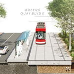
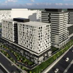
As well, with in-median LRT there are still unknowns. Will the service operate as promised, with full priority? Seeing our history with Spadina or Harbourfront, probably not. Will traffic (both vehicular and pedestrian) increase, thus warranting longer light cycles? Probably yes. Will new developments (condo, retail, office, etc) warrant new stops / intersections / traffic signals? Possibly. This is what has happened with East Bayfront. Even downtown new traffic lights and intersections are added to already small blocks...this will happen in the suburbs, too. In-median isn’t like a heavy rail subway. Stops are cheap, and probably will be added to new grocery stores or major developments.
 
Having maps that ignore each other is pointless. It would be like having a road map of Ontario that only shows 400-series highways and ignores roads that are below 80KM/H maximum. That's just silly and doesn't help with navigation. There can be separate maps (especially if it is difficult to show details on one map) but the maps should at least reference each other. I think gweed's map strikes a great balance in that regard.

Very good analogy. Connectivity is a very important thing to show, although it needs to strike a visual balance. There needs to be enough information about surrounding systems to show how the TTC system connects to them, but they shouldn't be so visually prominent that they distract from TTC services. This is precisely why I chose to show connecting services in grey, which is a very passive colour.

Eglinton belongs on the map. The other planned LRTs have too narrow stop-spacing--to be honest, it just looks messy and I don't like it. You have to draw the line somewhere. The underground portion of Eglinton 100% belongs on the map. The surface section is debatable (show it the same, show it skinnier, show it at all). SELRT, FWLRT, St Clair, etc, I don't think belong on the map. Maybe I'm too caught up on aesthetics, but I care what the map looks like.

The problem with Eglinton in particular though is you can't just show the tunnelled portion. What good is a map that shows that the train stops at Don Mills when it fact it continues on to Kennedy? I can definitely understand the desire to "draw the line somewhere", but that can be done in other ways other than simple inclusion or exclusion, such as thinner lineweight, not showing stops and only showing the existence of the route, more passive colours to not draw the eye as much, etc.

Thanks, Re the Qs: 1. I’m glad you noticed those stations. Basically I don’t care for generic station names. Queen East or something is a tad boring, and IMO we’d be selling ourselves short. Unlike post-war areas, or municipalities using numbered streets or blocks - Old Toronto has a rich and interesting history to draw from. Trefann (I misspelled it as Treffan) is a small street around Queen/River, but Trefann Court is also an area neighbourhood with its own long history. I’m not sure the origin of the name, but it seems interesting enough.

Scadding is a small street around Lower Sherbourne, but the Scadding family was quite well known in TO over the last two centuries. If I’m not mistaken, he owned a good chunk of the land around there. And I believe I saw an old map not too long ago showing that he owned a toll bridge at Queen. But basically I’d much rather an obscure name like Scadding than, say, “Sherbourne South”.

I can certainly appreciate the desire to get away from boring "generic" street names, but I think that names should be a geographic area as well. For example, with the DRL along King or Wellington using the name "St. Lawrence" is a great way to not have it after a street name, but use a name that is still geographically meaningful for most Torontonians. Same as if a future subway line had a station called "Kensington". When you go for something abstract like "Pioneer Village", it just confuses people.

2. Good point about the letter bubbles. I wanted to add them, particularly after seeing the TTC prototype include them. But I felt my map may’ve been getting too cluttered. I think without a large subway network including branches or express/local service, it should be easy enough to get by without it.

Good point about the clutter. I just think as the TTC shifts more towards the numbers (and potentially letters) people will be looking for those symbols for way-finding more than anything else. People won't be looking for "Bloor-Danforth Subway - Westbound to Kipling", they'll be looking for "The green bubble with a 2 in it, Westbound to Kipling".

3 Long answer: there are a few projects I didn’t include like Jane LRT, Don Mills LRT, Waterfront West, Scarb-Malvern, etc. They seem to have fallen off the radar somewhat, and I tend to lump Yonge North with them.

Yes, but unlike those other projects, Yonge North was listed in the "Next Wave" identified by Metrolinx. Yes, it's not at the front of the queue, but unlike those other projects, it's at least IN the queue, right behind the DRL.

Short answer: I don’t agree with extending Yonge, and didn’t want it on my map. I believe the projections are grossly inflated, and extending Yonge is both unwarranted and a mistake. I’m still holding out hope that Metroinx will come to their senses and offer a DRL-Richmond Hill line hybrid this Spring, and mothball plans for Yonge North. How current ridership along that corridor can supposedly make a ten-fold or more quantum leap in twenty years is preposterous, and just another example of the flawed logic used to continually extend our scant few lines (while ignoring real priorities).

Fair enough, haha. I agree with you, I'm just saying that if your map is a representation of what is "officially on the books", so to speak, then it should be on there.

4 I just fig’d it’d be logical for TTC to offer Airport Express service from Kipling/Eglinton if there’s SmartTrack in place, instead of Kipling/Bloor. Not that I believe in SmartTrack’s oddball Eglinton section. But it seems a good station to have an Airport bus.

I think there's merit in having the Pearson Bus hit both lines. It'll draw better ridership that way, and increase connectivity options.

5 Short answer: I couldn’t fit it in without moving lines and changing the placement of station names on Line 1. But I justified this with the fact that Spadina isn’t all that fast, and maybe shouldn’t be on the map (even though I’d prefer to have it there).

Yeah, I ran into that same problem, which is why I widened the YUS U and put the University line names in the centre of the U, so that it wouldn't interfere with Spadina. I'm just saying that it's pretty much in the same group as QQW and St. Clair.
 
If the LRTs were planned to operate as fast as the subway there wouldn't be so much consternation about including them. The fact is that they are not. The only LRT that is subway-speed is Eglinton, and even then only in the tunnel.
 
Eglinton belongs on the map. The other planned LRTs have too narrow stop-spacing--to be honest, it just looks messy and I don't like it.

I'm working on a 70.5 inch x 11 inch TTC rapid transit map that includes all stops and stations on Lines 1 though 7, SmartTrack, TYSSE, YN and DRL. I've been able to fit all stops and stations on the map, using the same font size and a similar font on the official TTC system route (didn't use the same font as I didn't feel like paying $30 for the licence). Using a latitudinal scale a little less than 2 inches:1 kilometre, I fit all the stops on ECLRT, FWLRT and SELRT without conflict. Longitudinally, I had to compress and expand the map in certain locations.

After working on this, I have to wonder why the TTC didn't include all the LRT stops on the new rapid transit map. I suppose the designer couldn't get all the stations on the map before the TTC wanted to announce it's new signage. Adding hundreds of kilometers of track and all 190 of our existing, under construction, and officially proposed rapid transit stations is surprisingly tedious and time consuming.

20131023-Map-Subway.jpg
 

Attachments

  • 20131023-Map-Subway.jpg
    20131023-Map-Subway.jpg
    37.6 KB · Views: 1,391
Last edited:
I'm working on a 70.5 inch x 11 inch TTC rapid transit map that includes all stops and stations on Lines 1 though 7, SmartTrack, TYSSE, YN and DRL. I've been able to fit all stops and stations on the map, using the same font size and a similar font on the official TTC system route (didn't use the same font as I didn't feel like paying $30 for the licence). Using a latitudinal scale a little less than 2 inches:1 kilometre, I fit all the stops on ECLRT, FWLRT and SELRT without conflict. Longitudinally, I had to compress and expand the map in certain locations.

After working on this, I have to wonder why the TTC didn't include all the LRT stops on the new rapid transit map. I suppose the designer couldn't get all the stations on the map before the TTC wanted to announce it's new signage. Adding hundreds of kilometers of track and all 190 of our existing, under construction, and officially proposed rapid transit stations is surprisingly tedious and time consuming.

View attachment 43552

I'm sure it's very tedious and time-consuming but we thank you for doing it! I'm sure that you remembered (unlike the TTC) to remove the Weston/Black Creek stop and to add Bayview to the Eglinton line on the map.

Looking forward to seeing your finished product.
 
Eglinton belongs on the map. The other planned LRTs have too narrow stop-spacing--to be honest, it just looks messy and I don't like it. You have to draw the line somewhere. The underground portion of Eglinton 100% belongs on the map. The surface section is debatable (show it the same, show it skinnier, show it at all).
You would seriously consider not showing the surface section of Eglinton, despite it being a continuous line, where people not on the short-turns will continue along the route? That's just ridiculous. How is that an effective map at all? Maybe we should just write "HERE BE DRAGONS" in the area beyond the tunnel portal?
 
Last edited:
@Gweed. Yes, I might have to widen the Line 1 U. I want the B/D stations between Yonge and the DRL to be level, so as to match the stations between Yonge and U/S. I think it would look more balanced that way, considering Yonge is the centre of the map. But re: Spadina. I may include it, but if I don’t I may also exclude St Clair while I’m at it. What I might keep is Harbourfront and East Bayfront, considering there’s an airport and it could be useful to tourists visiting the waterfront.

Re: Yonge North...I guess it would make sense for me to include it. I've already stated that part of the reason I dislike the current rectangle map we have now is how distorted and odd it will look with the Vaughan extension. But particularly with Yonge extended three stations farther north of VMC. With it shown more to-scale, I think people would better understand how far out some of these suburban extensions really are.

@TM. Sounds good, looking forward to it.

And re: the Boston map that was discussed earlier. I think what was posted was more of a general transit map, but not what would appear in the subway system. When looking online, it seems what is shown in stations excludes the key bus routes and many of the stations for the local branches of the Green Line. But their BRT is still shown.

https://flic.kr/p/9ZQ8kW
 
You would seriously consider not showing the surface section of Eglinton, despite it being a continuous line, where people not on the short-turns will continue along the route? That's just ridiculous. How is that an effective map at all? Maybe we should just write "HERE BE DRAGONS" in the area beyond the tunnel portal?

*I* would seriously consider how it should be shown. I said the at-grade portion was *debatable*, i.e. we've been debating it. I do not have all the answers.

I think the option that makes the most sense that I've seen is showing it skinnier the way they do in Boston for the green line.
 

Back
Top