Toronto YC Condos -- Yonge at College | 198.42m | 62s | Canderel | Graziani + Corazza

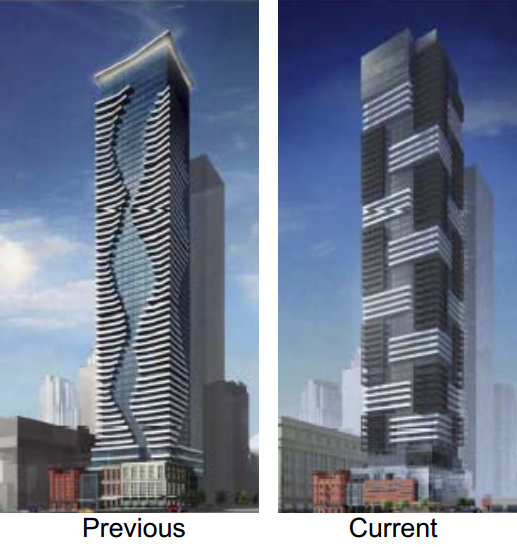
But does a building need to be "graceful"? I can think of some really great designs that are clunky and all the more interesting for it.

Grace refers more to articulation of design elements than simplicity. The movement and balance of building components are essentially what composes a successful design. No doubt that variations in motifs and facade treatments should be celebrated but it still comes down to individual analysis of quality. In terms of this proposal, the revised plan IMO shows little innovative vision. The series of protruded glass cubes are a mere emulation of much more successful developments currently in the city. Teeple's Picasso & oneeleven Bathurst exhibit much more refined execution with greater sense of flow and proportion. The cornered arrangement of balconies is an insignificant attempt at creating visual interest, recently seen in the much maligned King Blue development. Overall, I consider this rendition to be a lame composition of derivative concepts in a ungraceful manner.
 
It's funny you mention Picasso because although I LOVE that design, I have always found it to be awkward and potentially "half baked" towards looking graceful, but not quite there. It's always struck me as a bit awkward and clunky, and I find it to be very interesting and futuristic as a result.
 
Last edited:
After reading all the comments of the DRP I had to agree overall. The developer is attempting to shoehorn in rather large proposal without enough consideration of setbacks or important details at grade. I liked their reference to "parcelization" of store fronts and wider sidewalks.

I think their feedback is more about refinement than redesign, despite the vote.
 
Grace refers more to articulation of design elements than simplicity. The movement and balance of building components are essentially what composes a successful design. No doubt that variations in motifs and facade treatments should be celebrated but it still comes down to individual analysis of quality. In terms of this proposal, the revised plan IMO shows little innovative vision. The series of protruded glass cubes are a mere emulation of much more successful developments currently in the city. Teeple's Picasso & oneeleven Bathurst exhibit much more refined execution with greater sense of flow and proportion. The cornered arrangement of balconies is an insignificant attempt at creating visual interest, recently seen in the much maligned King Blue development. Overall, I consider this rendition to be a lame composition of derivative concepts in a ungraceful manner.

One could say the complete opposite. What you're arguing basically boils down to your personal taste.
 
I think the new design is an improvement over the lousy curves of the original, but I'm not expecting miracles from G+C. It'll probably look like a checkerboard Couture, which isn't much to celebrate or scrutinize, in my books. Still, it's not University Plaza, so I'm just the littlest bit relieved.
 
We can't judge it unless we see a holistic picture of a design, ud. A building is designed from the inside out. What good is a nice exterior concept if the design and the spaces just don't work?
 
I think you're taking yourself too seriously. Obviously this is a condominium project. I would say 95% of them are just concrete shells with the majority of the aesthetic "design" focused on the exterior. Take any number of floorplans--I've looked at thousands--on your average Toronto condo to get the idea. What is the real difference between an aA & a G+C project? Yes aA thinks more about placement of structural members etc but really all they're doing is getting the exterior design sorted.

We are all judging an exterior conceptual rendering here at 460 Yonge. Yes the floor plans have been released but really, is that what we've been commenting on???!

I think your idea of how buildings are designed is rather typical for Toronto...ie "it's all about my unit, man!" so boring! 99% of condo units are identical really. Think outside of the box!

As for how the building works with real humans--ie "flow"? Yes I do consider that and you'll see more of it in when I get the 32GB desktop...
 
Last edited:

460yonge by Traavis007, on Flickr

Is this in sales then? It's a very masculine design and would anchor that intersection well. It's a welcome departure from the usual condo designs we get. The very last thing Toronto needs is a sea of forgettable Vancouver style condo towers.
 

Back
Top